Thought to have originated in France in the twelfth century and is most commonly associated with the Middle Ages in Europe, Gothic architecture — known by such flourishes as rib vaults, pointed arches, flying buttresses, and looming spires — is a dramatic style of building historically used for churches and cathedrals…
8 Iconic Buildings Re-Imagined In Gothic Style
…but only one hundred years ago, ‘Gothic Revival’ was reborn in the United States, with the style making a comeback at prestigious sites — such as Yale University and the Tribune Tower in Chicago. However, not every building in the 20th century received a Gothic makeover.
This article from Angi gives a glimpse into what eight famous buildings in the United States — all of which are so recognizable by millions of people that imagining them any other way is difficult at best — would have looked like if they were designed in the style of Gothic architecture.
I have been given express written permission to use the images and the verbatim text from the aforementioned article in this article. Typically — in an article such as this one — I would add brief notes; but although I studied Gothic architecture on a limited basis while I was earning my Bachelor of Fine Arts degree at one of the top art schools in the world, I am not knowledgeable enough about that style to add any value to the information which is already here.
1. Golden Gate Bridge — San Francisco, California
Engineered by Joseph Strauss and Charles Ellis alongside architect Irving Morrow, the art deco flourishes of the Golden Gate Bridge establish it as a landmark that was dreamt up in the 1920s — even if it did not open until 1937.

The chevron design elements and organic form lighting were Morrow’s response to the Exposition Internationale des Arts Décoratifs et Industriels Modernes of Paris, 1925, when the art deco movement was established. But when those curves and panels are replaced with the rigor and — let’s face it — pointedness, of the Gothic revival, the Golden Gate ends up looking somewhat… British?
2. Terminal Tower — Cleveland, Ohio
Drawn-up in the Beaux-Arts style by architects Graham, Anderson, Probst & White, the towering 1930 landmark in Cleveland is already rich with neo-Gothic and neoclassical elements — such as the steeply-pitched roof and arches…
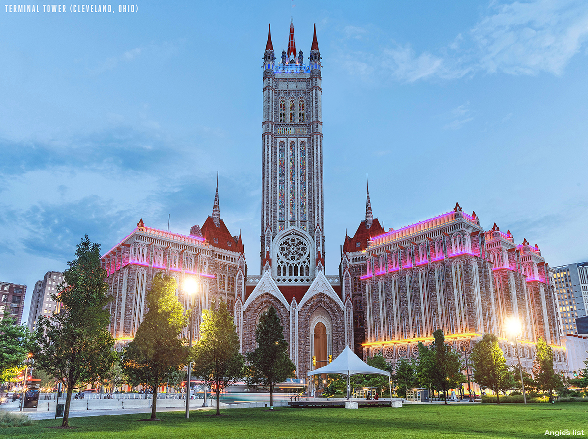
…but the addition of brightly-lit stained-glass and extra pinnacles is just what the rather stern old building needs for a new lease of life.
3. The Space Needle — Seattle, Washington
Edward E. Carlson’s iconic needle has a bold enough outline to withstand whatever cosmetic changes our designers add to it. The 604-foot futurist structure was originally painted with shades in keeping with its 1962 World Fair debut’s space-age feel: Astronaut White, Orbital Olive, Re-entry Red, and Galaxy Gold…

But the Space Needle still cuts quite a figure in Gothic grey. Its base provides support through structural pointed arches, but it’s the intricate mesh of the quatrefoil and clover-shaped windows as you reach the top that would make our version worth the visit.
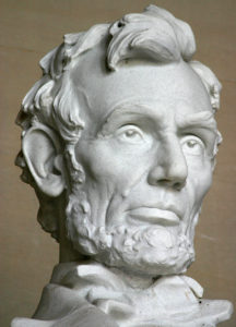
4. Lincoln Memorial — Washington, District of Columbia
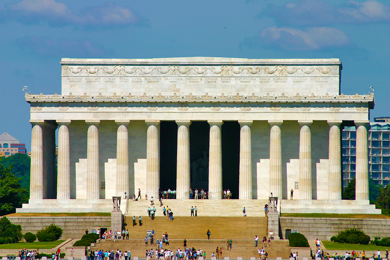
Inspired by his studies in Europe, Henry Bacon drew up his design for this 1922 monument to Abraham Lincoln in the Greek Revival or neoclassical style. But his choice of various types of stone to construct his Parthenon tribute building was symbolic. Materials such as Massachusetts granite and Alabama marble created a ‘union’ theme that would have pleased Old Abe.
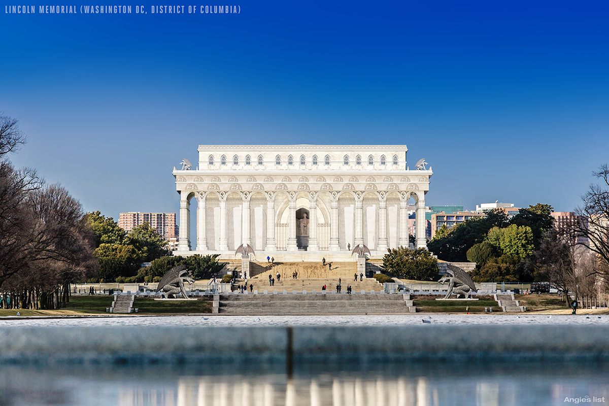
Our redesigners have kept the stone feel, but added clover windows and imposing-looking gargoyles atop those Doric columns for a bit of Gothic shock-and-awe.
5. Solomon R. Guggenheim Museum — New York, New York
The Solomon R. Guggenheim Museum opened to the public on October 21, 1959. It took 16 years for architect Frank Lloyd Wright to finalize the design for the Guggenheim. In this time he produced six separate sets of plans and 749 drawings in total.
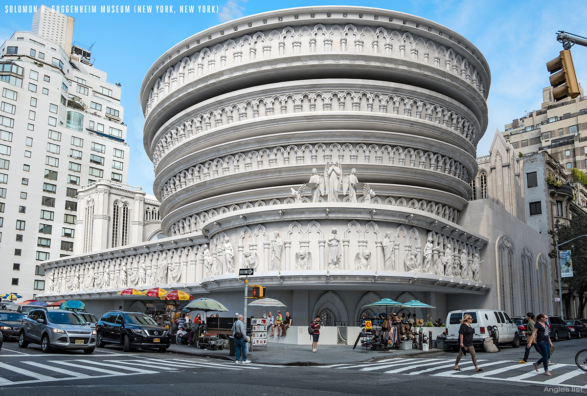
There’s not a hint of Gothic inspiration in Wright’s eventual modern design; so to re-imagine this beloved building necessitated a total overhaul. Rows of columns spiral around the circular floors, the first floor is decorated with a host of gargoyles and the entrance is granted pointed arches. Our design is a truly terrifying clash of contemporary and medieval.
6. United States Air Force Academy Cadet Chapel — Colorado Springs, Colorado
The Air Force Academy’s centerpiece as we know it is a modernist statement, structured around 17 glass and aluminum spires that are each composed of 100 tetrahedrons.
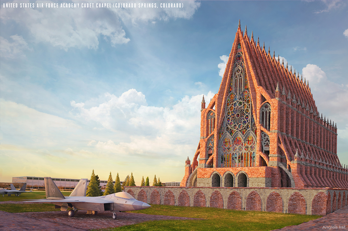
The chapel’s architect, Walter Netsch of Skidmore, Owings and Merrill, invoked some of modernism’s most striking ideas for his 1963 masterpiece; and Netsch’s dramatic spires themselves reference Gothic architecture. All the same, our switch back to stone and inclusion of a major frontal oculus takes away the Cadet Chapel’s key feature of contemporaneity in favor of the medieval.
7. Transamerica Pyramid — San Francisco, California
San Francisco’s second highest building was designed by William Pereira and debuted in 1972. The Pyramid borrowed some of the fashionable materials of the time: concrete — 16,000 cubic yards in the foundation alone — glass and steel towards a futurist tower that stands quite apart from its neighbors.
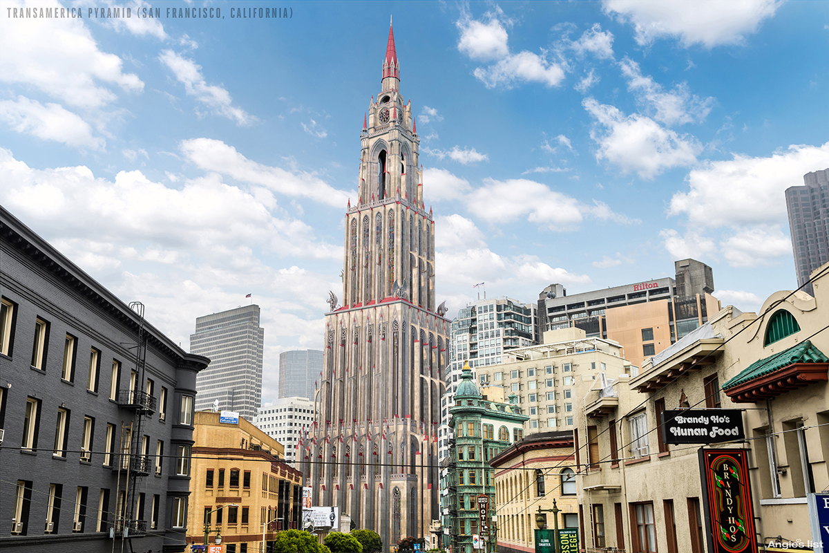
When the 1989, 6.9-magnitude Loma Prieta earthquake struck, the Pyramid shook for more than a minute, its tip swaying almost a foot from side-to-side. Whether the Gothic pinnacles and gargoyles of our rendering would hold on tightly in such conditions, we can’t guarantee!
8. The Chrysler Building — New York, New York
The Chrysler Building may be an ostentatious landmark, but it had a stealthy start in life: built between 1928-30, architect William van Alen managed to keep its 125-foot spire secret until 90 minutes before the grand unveiling.
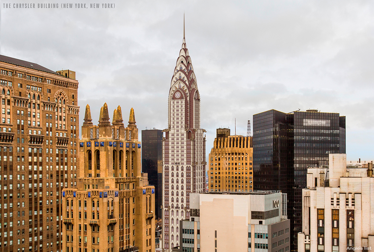
The spire pushed the art deco building’s height to 1,046 feet, nudging it past what used to be known as The Bank of Manhattan to briefly become the tallest building in the world. The Gothic makeover of the Chrysler Building pays tribute to that ambition, its pointed windows seeming to direct the skyscraper, rocket-like, to the stars.
Summary
After a spate of articles posted here at The Gate pertaining to deals as a result of Black Friday, Cyber Monday and Giving Tuesday, I thought that a Weary Wednesday could use a lighter article — and switching up the architectural style of iconic buildings such as these reveal the strength not only of the respective design schools, but of these specific architects at work. Although some buildings are inseparable from their styles, others are so brash as to shine through whatever façade we might add.
I have driven over the Golden Gate Bridge, went to the top of the Space Needle, been to the Lincoln Memorial, visited the Solomon R. Guggenheim Museum, and have seen both the Transamerica Pyramid and The Chrysler Building from the streets in San Francisco and New York respectively; and I thought that applying the Gothic architectural style to these legendary buildings was an interesting exercise…
…but I think I would rather leave them alone just the way they are, just the same…
Photographs of and inside the Lincoln Memorial ©2010 by Brian Cohen.
