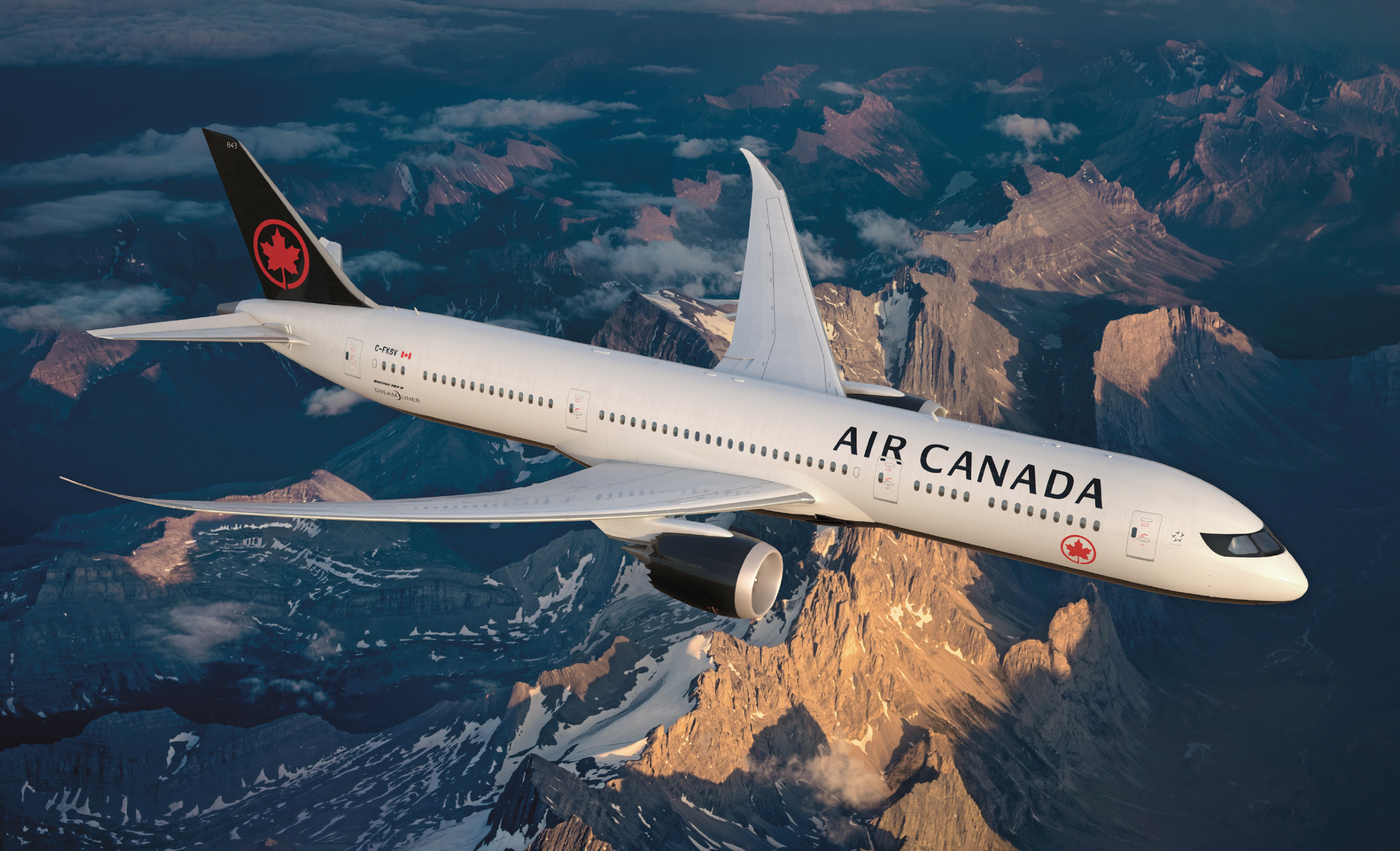
“S lightly underwhelming but it does look clean, smart and I think elegant” is what FlyerTalk member yvrcnx opined pertaining to the new livery unveiled by Air Canada, which is the latest airline to do so — as well as introduce new uniforms — on Thursday, February 9, 2017.
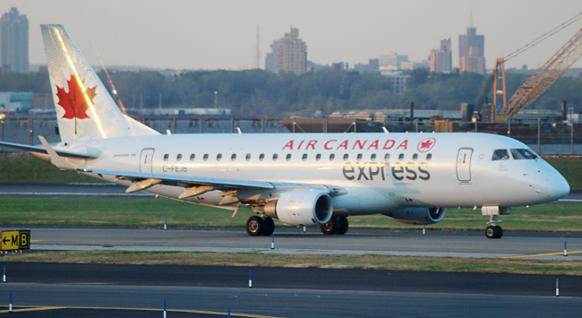
The most recent former livery is shown on an Embraer ERJ-175SU airplane operating as Air Canada Express in the above photograph.
Air Canada Unveils New Livery and New Uniforms
“2017 marks the 150th anniversary of Canada and the 80th birthday of Air Canada, our nation’s flag carrier”, according to Calin Rovinescu and Benjamin Smith — who are respectively the president and chief executive officer and president of passenger airlines of Air Canada — in this illustrative guide called Our Nation’s Carrier. “On this landmark occasion, our airline is aiming higher and reaching further to strengthen our position as a global, customer-focused organization with a truly Canadian spirit.”
The new livery is a classic design which places a smaller version of the red maple leaf logo — known as the Air Canada Rondelle — below the windows towards the front of the aircraft; while a larger version is prominently displayed on a black background on the tail of the aircraft as well as underneath the aircraft and on each engine of the aircraft. The national flag of Canada is now affixed next to the airplane registration number near the rear of the aircraft; while the understated official logo of Star Alliance is displayed near the windows of the cockpit.
The livery of the fleet of airplanes which are part of Air Canada rouge will remain markedly different, emphasizing red instead of black with an enlarged version of the Air Canada Rondelle in white partially displayed on a red background on the tail.

Christopher Bates — who is a fashion designer who was born in Vancouver — partnered with Air Canada on the design of the new uniforms for employees, as shown in the above photograph. Every element was designed with safety and style in mind, and the colors were selected to complement the new livery.
Changes to Liveries of Other Airlines in Recent Years
When an airline introduces a new livery, it risks changing its identity — especially when customers who possess a die-hard loyalty to an airline and do not like change — but are revisions or overhauls in liveries and uniforms really necessary?
“I’m not sure what was wrong with the old one”, wrote Gary Leff in this article pertaining to the new livery unveiled in September of 2014 by Southwest Airlines at View From The Wing. “I don’t know anyone that buys airline tickets based on the paint job of the planes. I get that you need to paint planes when airlines merge, to put the right company name on them. And the composite materials of the Boeing 787 didn’t work with American’s old unpainted metal finish so they needed at least those planes which they hadn’t gotten yet to get a new paint job. Still, I’m a bit of a skeptic.”
As the chief executive officer of Southwest Airlines, Gary Kelly — what is with all of the Garys in this industry?!? — explained the rationale of the timing for a new identity and branding in this statement:
Forty-three years ago, Southwest launched a low-fare revolution that is still alive and well today. Ignited by a Maverick Spirit and a passion for serving others, we set out to do things differently than the other guys. Today, the world is a much different place than it was back in 1971. Our industry landscape is hardly recognizable, and our Customers’ travel habits have evolved. Southwest has evolved too — but we have never stopped smiling.
We’ve been hard at work over the past decade transforming Southwest to be just as relevant and successful for the next four decades. We enhanced our cabin interiors, installing WiFi and offering free live TV onboard (thanks to DISH®!). With the Boeing 737-800 series aircraft, we’re bringing on larger airplanes that are better suited for longer flights. We expanded in big markets like New York City and Washington, D.C. and revamped our Rapid Rewards® Frequent Flyer program. We acquired AirTran Airways, and we’re in the final stages of integrating our two airlines to become one by the end of this year. The AirTran integration set the stage for Southwest to launch international service for the first time in our history, which we did in July. And next month, a federal law (the Wright Amendment) restricting where we can fly domestically from our home airport of Dallas Love Field will be lifted — giving us the freedom to serve more nonstop markets from our hometown.
With all these exciting changes happening, we thought it was time for a new visual expression of our brand — one that marries our past to our present and sets the course for where we’re headed in the future. So this month, we’re introducing a modern, new look. You’ll see it throughout your experience with us. Our new logo showcases a Heart — fitting for a Company whose very core has always been fueled by the heartbeat of its People. Our collective heartbeat is stronger and healthier than ever, and that’s because of the warmth, the compassion, and the smiles of our People. This Heart symbolizes our commitment to you that we’ll remain true to our core as we set our sights on the future.
What started as a revolution has undergone an evolution. But we haven’t changed what we stand for: low fares, a convenient flight schedule, and the friendliest Employees in the world. Our Purpose is to connect you, our valued Customer, to the moments that are most important in your life, through friendly, reliable, and low-cost air travel. That was true in 1971, and it’s just as true today. So, while our look may be new, our DNA is the same — with the big Heart and big smile you have come to LUV. Thanks for coming along for the ride!
This article written by Terry Maxon — who retired in September of 2015 — of The Dallas Morning News delves into greater detail about the “bold new look” of Southwest Airlines…
…although Southwest Airlines had been suffering somewhat of an identity crisis, as it is no longer the low-cost leader amongst commercial airlines in the United States, according to this article written by Justin Bachman of Bloomberg Businessweek:
Yet there’s a less-heralded, but far more important, change at the carrier credited with bringing affordable air travel to the masses: It’s no longer the industry’s low-cost leader. Just as Southwest has grown—becoming America’s No. 4 airline—so have its costs. Today, Southwest has per-mile operating costs that come close to its three larger rivals, American Airlines Group (AAL), Delta Air Lines (DAL), and United Continental Holdings (UAL).
Part of Southwest’s rising cost issue is jet fuel, which averaged $3.16 per gallon for the company last year, up from $1.80 in 2007 when it had long-term contracts that kept its fuel costs lower than at other airlines. Fuel now accounts for more than 35 percent of its spending, up from 29 percent seven years ago.
Perhaps the above quote might have been another reason for the change in branding?
Although I have years of experience in branding and design — my undergraduate degree was a Bachelor of Fine Arts in Communication Design from one of the top art schools in the world — I hesitated to comment on the new livery of Southwest Airlines simply because…
…well…I agreed with Gary Leff on this one…I simply do not like it.

Then again, I never liked the former livery — nor the colors — of Southwest Airlines either. I like the Helvetica typeface; but not as a logotype in all capital letters for Southwest Airlines. I much preferred when American Airlines used Helvetica for its logotype, as discussed and shown later in this article.
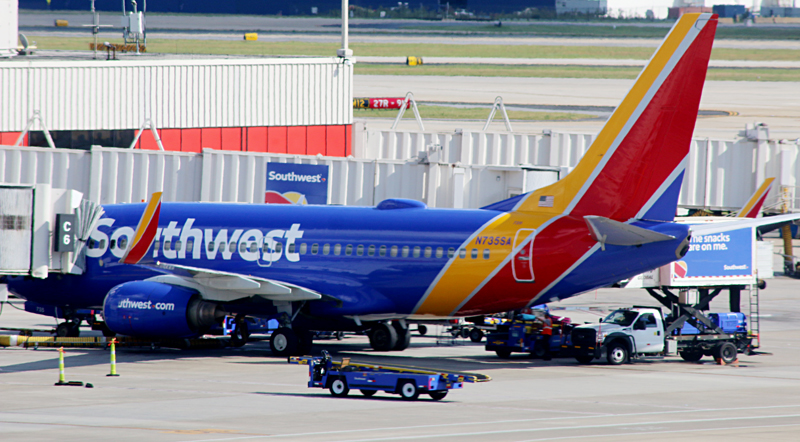
However — after giving it some time — I must admit that I do like the new livery for Southwest Airlines better than the former livery. Even though I still do not particularly care for it, it is more vibrant than the former livery — and from what I understand, the logotype was custom created and does not use an existing typeface. There is even a new “heart” logo. The “new bold look” does evoke playfulness, which is not what I look for in an airline.
“Hopefully Southwest Didn’t Actually PAY for Their New Paint Job’s Design”, Gary quipped in the headline of that article.
Oh, yes they did, Gary. Think at least six figures — if not seven — and I am not including such expenses as the painting of all of the airplanes in their fleet with the new livery. According to that aforementioned article in The Dallas Morning News, “Helping Southwest on the rebranding was longtime partner GSD&M as well as Lippincott, VML, Razorfish and Camelot Communications.”
With all of the people and companies involved, it would have been interesting to see all of the other designs and livery schemes which were rejected.


For me, airline liveries in the 21st century do not seem to evoke flight to me, for the most part. When the logotype for Delta Air Lines was revealed in April of 2007 — along with it incorporated into the new livery on a Boeing 757-232(WL) aircraft which no longer exists — I though that it was clean but boring; and the “widget” in different shades of red reminded me too much of the Citgo logo.

Let us not forget that new uniforms designed by Zac Posen are expected to be sported by employees of Delta Air Lines sometime in 2018.


I never particularly cared for the “globe” logo first used by Continental Airlines prior to its merger with United Airlines, which still prominently uses the logo today. The United logotype is rather boring and uninspired, in my opinion — even to this day. Many loyalists to United Airlines still lament the retirement of what became known as the “tulip” logo, which was designed by Saul Bass.

Remember when Alaska Airlines updated its logotype back in August of 2014? I personally would have preferred the former logotype with the revised leg of the k of the new logotype; but still with the rough edges; and keep everything else the same in what I consider the distinctive image and branding of Alaska Airlines…

…but then Alaska Airlines introduced its new livery in January of 2016 — along with my thoughts:
I have no argument against the addition of accent colors to the refreshed branding — in fact, I agree with it — but Tropical Green and Breeze Blue just do not work for me. It is like Hawaiian Airlines incorporating the colors of winter destinations into its branding. I would have instead used colors which emulate Alaska — or even the Arctic — such as a deep yet brilliant Iceberg Blue, for example.
It is not a terrible branding scheme — I thought that the latest iterations of the branding of US Airways was an abomination and amongst the worst in airline branding, quite frankly — but it could have been better, in my opinion. The branding is just too clean — and somewhat sterile — for an airline which is supposed to evoke Alaska.
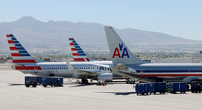
I generally liked the new look of the livery overall when it was introduced by American Airlines back in January of 2013; but “although it is clearly a representation of the American flag, I do not like the tail design at all. It is too busy, and its placement on the aircraft seems awkward at best — but it is certainly better than the current disaster that is supposed to double as a tail design used on US Airways aircraft, in my opinion. I must admit, however, that of all of the design elements used in the new look of American Airlines, that hideously busy tail will stand out when compared to the tails of other airlines at an airport.”
I still do not like what appears to be a busy and cluttered design on the tail.
My initial thought when I first saw the new logotype of American Airlines was that it was cleaner and more modern than its former iconic logotype, designed by Massimo Vignelli using the classic Helvetica typeface:


The bolder versions of the Frutiger and Whitney typefaces were bolder than the American Sans typeface, so I went with the lighter versions for comparison purposes.
My point is not so much that the typefaces are similar; rather, I believe they are too bland despite their clean look. To me, the logotype of an airline should evoke movement, not staid and motionless. This is why past logotypes of airlines were usually italicized — but apparently that now is considered a dated look. Mark my words: italicized logotypes will return sometime in the future.
As for the logo itself, it did initially remind me of the current ribbon logo of Air France. The white and grey space in the center of the logo is meant to evoke the stylized head of an eagle — which has long been the “mascot” of American Airlines.

Then there is Spirit Airlines, which switched to its fourth livery back in September of 2014 to its hideous taxi-cab yellow monstrosity with the logotype which appears as though it were designed by either a child who started kindergarten or a deranged drug addict.
One thing I must admit: you cannot miss any of those airplanes bathed and drenched in French’s yellow mustard.
Summary
Together with new uniforms for members of the flight crew, improved international cabin standard and enhanced on-board products, the new livery represents the future of Air Canada through distinct references to Canadian culture, heritage and evolution — yet in a world where new livery unveilings seem to happen more often, Air Canada has chosen to take a classic route which also evokes its history rather than completely change its identity.
As to the amount of money which was spent on the new livery — well…that has not been revealed publicly at the time this article was written…
…but this is one of those rare times where I actually like the new livery and the new uniforms of an airline. The new brand overall for Air Canada is clean and elegant but without eschewing its familiar identity, as it is instantly recognizable as Air Canada; and it is one of the better livery and uniform designs in recent years for a commercial carrier, in my opinion.
Source: Air Canada. All logos shown in this article are trademarks of their respective airlines and companies.
