Subway New York
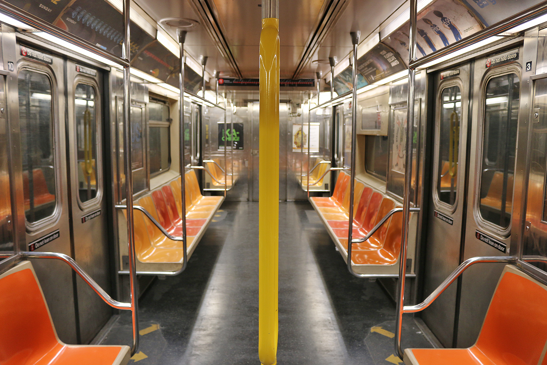
Photograph ©2022 by Brian Cohen.

New Subway Map For New York: What are Your Thoughts?

Train yourself to get around on the right track.

Subway maps are designed to help passengers navigate the system. As the Metropolitan Transportation Authority of New York recently released a new design for its subway map, what are your thoughts on the new subway map for New York?

New Subway Map For New York: What are Your Thoughts?

The subway map that had been in use since 1979 is what is known as the map that is based on geography by Michael Hertz and Nobu Siraisi from 1979; so it had been in service with minor changes over the past almost 46 years.

a map of a city
Click on the graphic above for a high-resolution source of the geographical version of the subway map. Source: Metropolitan Transportation Authority of New York.

The new map that was unveiled earlier this year is known as the subway diagram and is shown below…

a map of a subway system
Click on the graphic above for a high-resolution source of the diagram version of the subway map. Source: Metropolitan Transportation Authority of New York.

…but the new diagram is not actually new, as much of the design is based on the design of the 1972 version of the subway map, which was designed by Massimo Vignelli.

For additional information on the evolution of the subway map for the city of New York, this article that was written by Roger van den Bergh for Print magazine offers a nice retrospective — as well as historical photographs of older subway maps.

Final Boarding Call

Although the late Massimo Vignelli was a respected designer, I tend to prefer the geographic version of the subway map for the city of New York, as it is somewhat more accurate overall — but I do not dislike the diagram version of the map, as it is “cleaner” and has its own strengths.

What are your thoughts?

Photograph ©2022 by Brian Cohen.
  1. I am not well-skilled with subway maps. But as a casual user, the new one doe sseem easier to read and decipher to someone unfamiliar with the area.

  2. The new angular version has advantages in that it emphasizes the difference between similar lines, like the red 1, 2, and 3. However, the older map is a better geography lesson.

    Similarly, GPS in cars now give reasonably good directions but results in drivers having no clue if there’s no GPS.

    With the new map, LaGuardia Airport almost seems walking distance to the subway if you miss the Q70 bus but, in reality, way too far to walk. In contrast, the old map shows the Q70 bus route is somewhat long to the subway station. The old map also shows how close some of the lower Manhattan stations are. Sometimes, it’s easier to stay on the same line and walk. For example, Park Place on the 2 or 3 is very close to City Hall on the R or W so just stay on the same train and walk once out of the subway rather than transfer lines to get to the station closest to the address.

    1. In short, the old map incorporates some geography outside the subway system, which helps. However, the new map has almost no clues for outside geography but shows similar lines separately and more clearly (like differentiating between the red 2 and 3).

      In the old days, there was not much numbering but names were used, like the BMT and the 7th Avenue IRT.

      Actually, these two maps could almost be a candidate for “what is wrong with this photograph (map)” except the answers would be serious, not joking.

  3. The new one is far easier to read for casual users/tourists, and that is probably best. In many ways, the maps are practically unnecessary nowadays since we have very smart phones.

Your email address will not be published. Required fields are marked *

Subscribe To Our Newsletter

Join our mailing list to receive the latest news and updates from our team.

You have Successfully Subscribed!