Driving east from Las Vegas back to the greater Atlanta metropolitan area meant that I would be passing by a Tru by Hilton hotel property; and as I had never stayed at one, I thought I would try it out — especially as I was to earn 1,000 bonus Hilton Honors points during this promotion, which has since expired.
My First Stay at a Tru by Hilton Hotel — and The Verdict Is…
This is probably the most extensive and detailed review of a Tru by Hilton hotel property — which includes at least 70 photographs — so please be advised that this review is lengthy.
Tru by Hilton is hotel brand number 13 for the multinational lodging corporation, which was first announced in January of 2016. It is a mid-scale concept brand whose first hotel property is the Tru By Hilton Oklahoma City Airport — which is not only where I decided to stay; but it was also the grand opening of hotel property number 5,000 for Hilton on Thursday, May 25, 2017 at 8:30 in the morning.
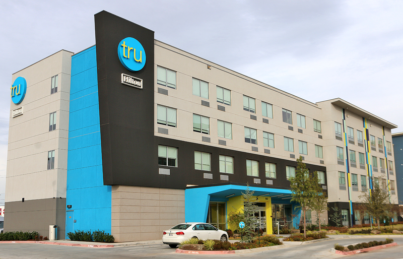
I pulled up to the hotel property after a long day of driving on Interstate 40 from Albuquerque.
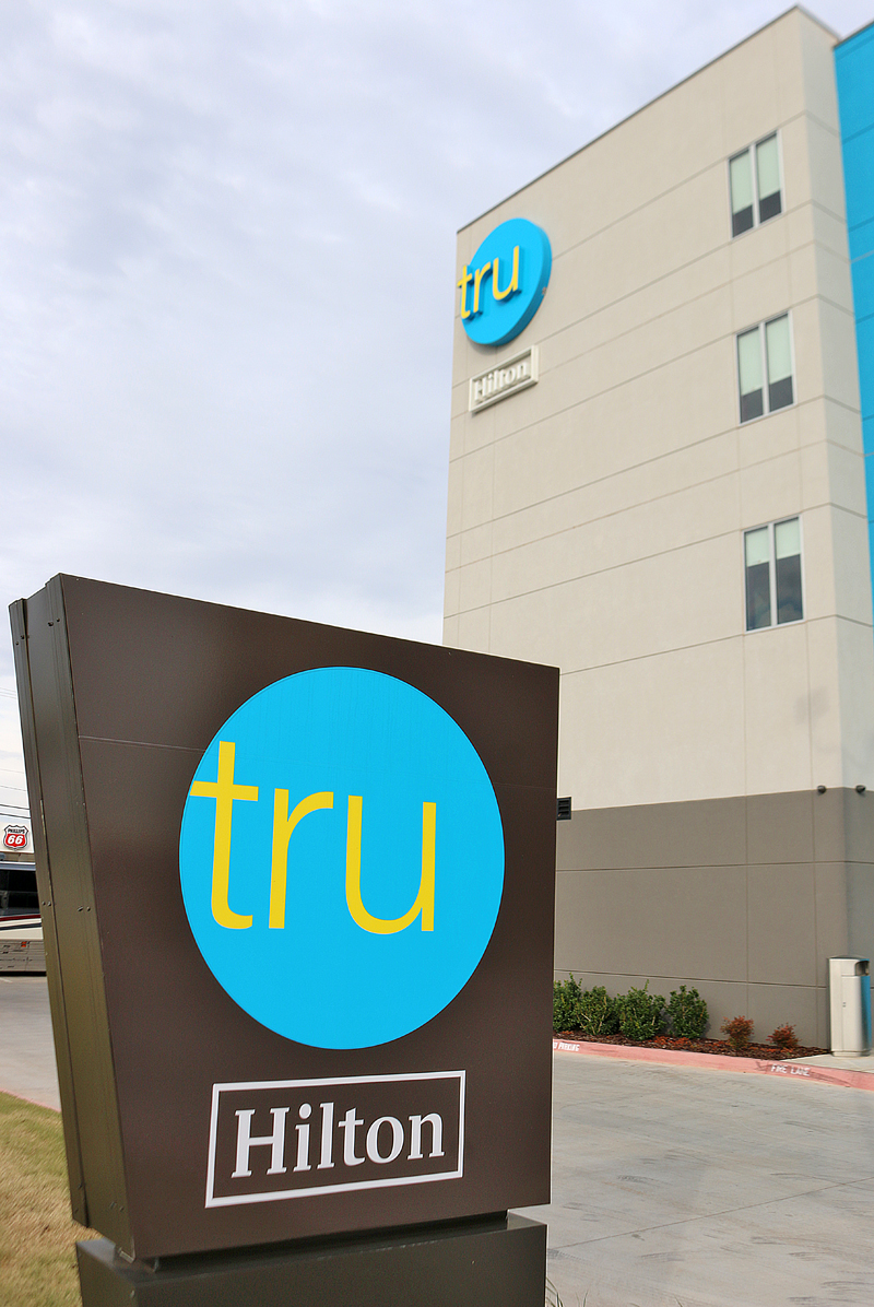
The branding of this hotel property was difficult to miss.
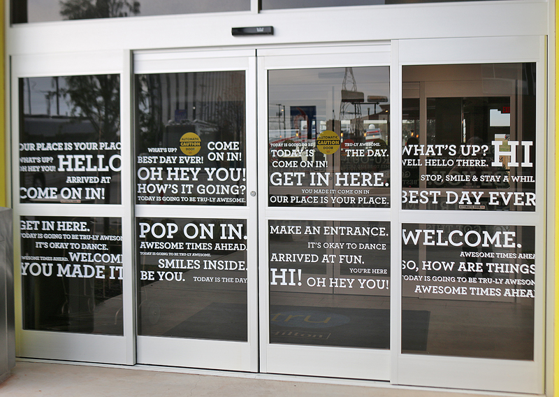
After parking the car in the parking lot — which had plenty of open spaces despite part of it being blocked off due to a Marriott hotel property being constructed adjacent to this hotel — I was greeted by these doors which were filled with statements such as “Today is going to be Tru-ly awesome” and “Get in here.” I thought this was a little much.
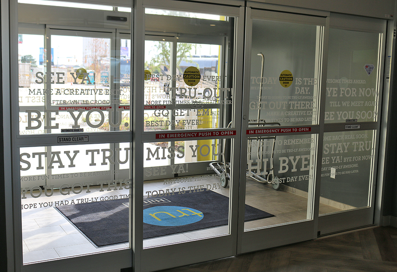
After walking through the front doors — which opened for me automatically — I turned around and realized just how difficult was reading what was applied onto them.
The Lobby
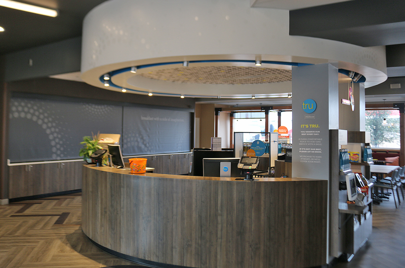
I turned back around; and the front desk was the first thing I saw, with two friendly members of the staff — who were wearing bright blue Tru polo shirts — cheerfully greeting me.
I later found out that the two grey screens on the left in the background behind the front desk were hiding the breakfast area, which would be open the next morning.
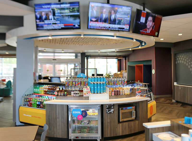
The unconventional front desk — which guests can walk completely around — is equipped with a “social media wall with real-time content to foster engagement among guests” above it; and a market open 24 hours per day, seven days per week. Snacks and cold refreshments, healthy light meal options and sundries are offered for purchase; and a microwave oven is hidden away for use by guests. Single-serve wine and beer is also available — subject to state and local laws where you must be of legal drinking age.
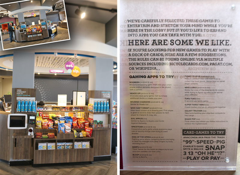
The front desk is one area which comprises the Command Center, which is centrally located. It is part of the first floor area which was originally to be known as The Hive, but that thankfully seems to have been abandoned; and it is an experience which is more than a mere lobby with 2,770 square feet of open space — containing unique ways for guests to engage with others or spend time alone — in one of four distinct zones for lounging, working, eating or playing.
Suggestions are available on a printed sheet of paper as to what games to play…
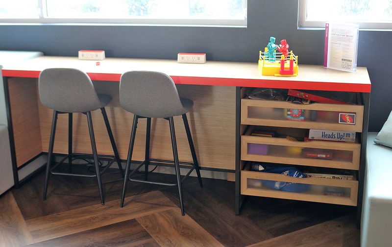
…in an area known as The Play Zone, which is part of the lobby area and is filled with table games.
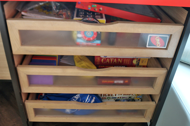
Games and toys are stored in drawers for use by any guests.

The pool table is the centerpiece of The Play Zone. The aforementioned drawers filled with games and toys are off to the left.
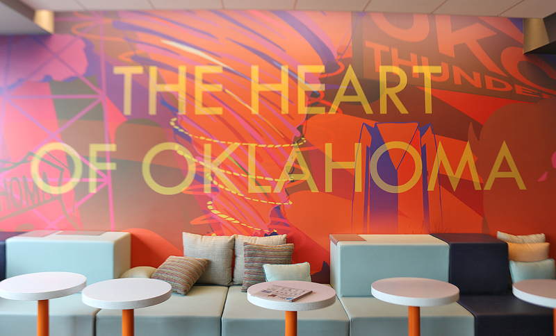
One wall of the lobby area is customized specifically for this hotel property.
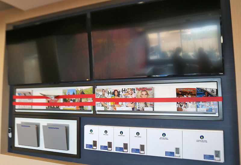
The Play Zone also features two large flat-screen televisions featuring satellite television programming — as well as tiered seating inspired by stadiums. Magazines and newspapers are also available.
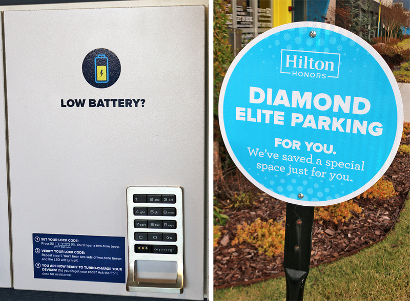
Under the large television monitors are areas where you can charge the battery on your cellular telephone or other comparable portable electronic device. Special parking spaces are available outside for members of the Hilton Honors frequent guest loyalty program who have earned Diamond elite level status.

Two guests are seated at a counter which can double as both a work space as well as a place to eat or drink…

…and it separates The Play Zone from was to be known as The Command Center, which includes the front desk.
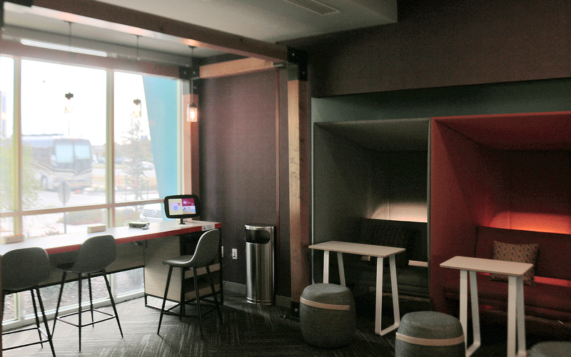
Work space is available in the form of counter spaces near or at windows around the lobby area — as well as moveable desks. Tablets are available on which to work. Plenty of electrical outlets with USB ports abound throughout the first floor area.
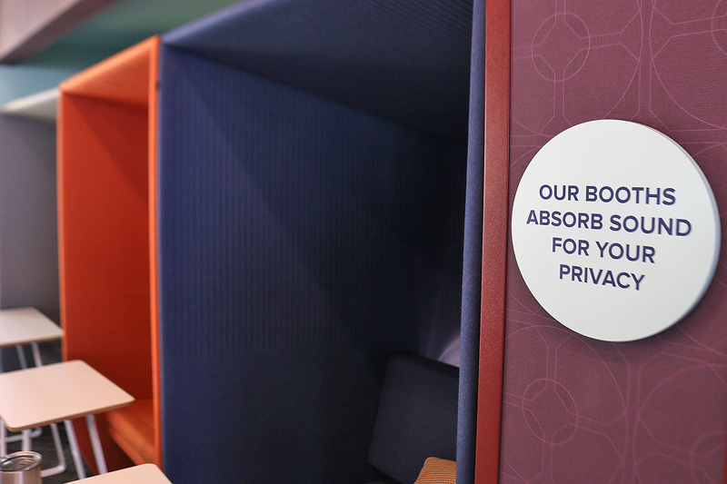
If you want relative privacy and quiet in the lobby area, booths are available — and they absorb sound. I sat in one for a few minutes; and I did experience a realm of semi-privacy — but I do wonder if the experience would be similar if the lobby was crowded and noisy.
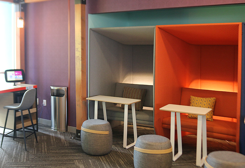
Each privacy booth not only has a moveable desk; but also seating shaped like barrels on which a companion can sit across from you. The cushioned bench in each privacy booth has a pillow; and two people can sit on a bench simultaneously.
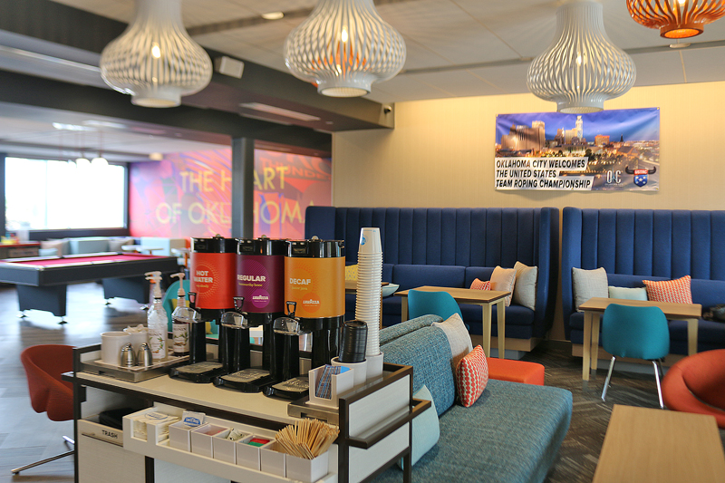
This view of the ground floor is located just to the right of the front entrance after walking through the doors; and it is rather spacious…
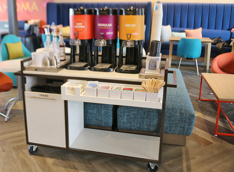
…and everything you need for coffee is available on a moveable cart — including hot water, cups, stirrers, and condiments and syrups to flavor your coffee.
Fitness Center
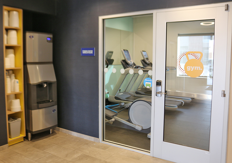
The entrance to the fitness center is around the corner from the aforementioned wall with the two large televisions, magazines and newspapers, and the charging stations for portable electronic devices.
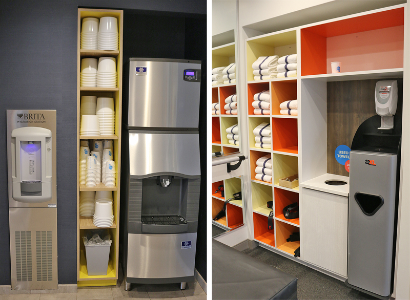
Before entering the fitness center is a purified water machine with which you can fill up your bottle or other container — and if you do not have a container, plenty of cups are available. An ice machine with plenty of ice buckets is also available. A towel station is just inside the fitness center stocked with plenty of towels — as well as a place to drop used towels.
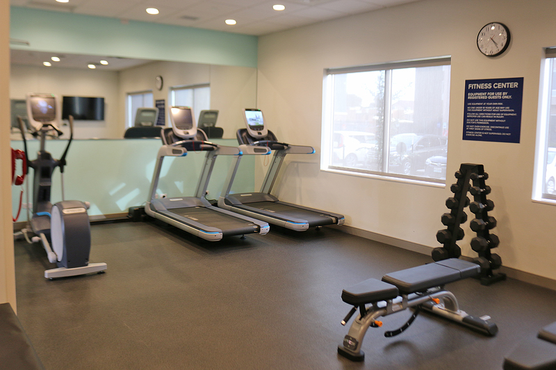
The fitness center has different types of equipment…
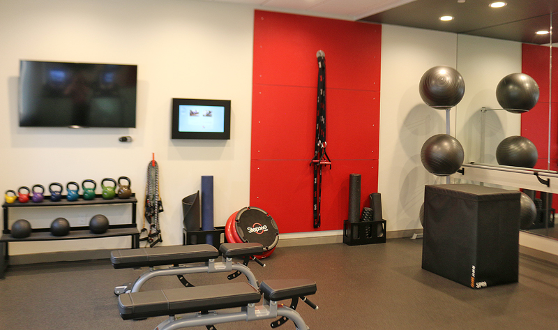
…and even has its own television on the wall.
Public Washroom

Although the entrances to the unisex public washrooms look rather plain on the outside..
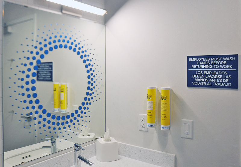
…the inside is a — shall I say — little less plain. The design of the mirror is enough to cause one’s head to spin…
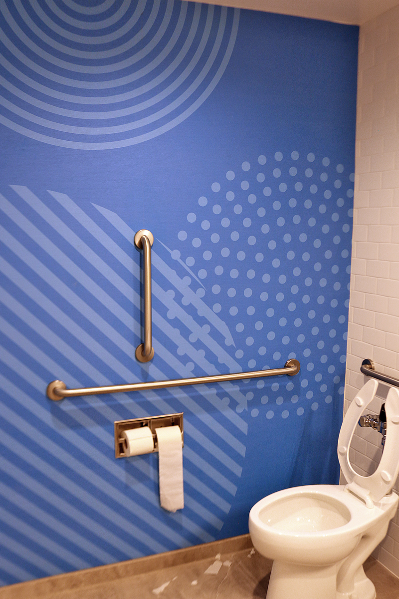
…but the design of the wall of the public washroom beats the mirror in that regard. Those metal bars are probably there to keep a person with vertigo from dizzily spinning after seeing that wall rather than for use by disabled people.
Good thing a toilet is readily available with the lid up if you get nauseous enough to suffer from reverse peristalsis.
Elevators
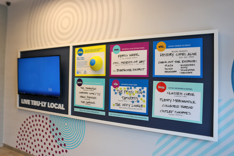
Across from the elevator on the ground floor is a board which provides information — both printed and via a television monitor.
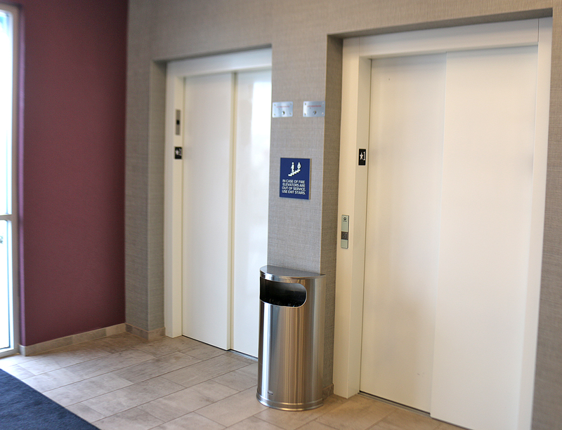
I took the elevator to the fourth floor to access my room. I was surprised that the doors were a simple plain white, instead of adorned with more of the Tru by Hilton graphics which are prevalent everywhere else.
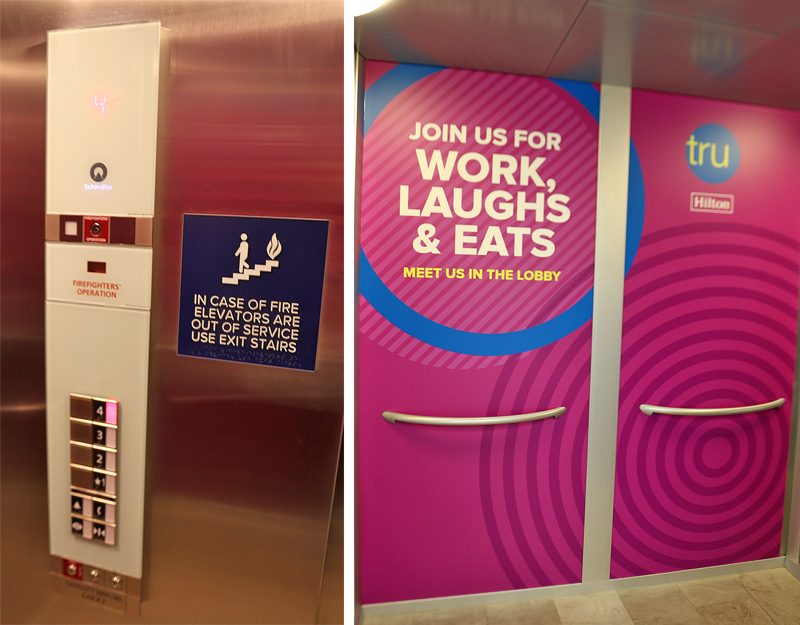
These are the views of the inside of the elevator.
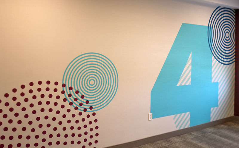
When the doors to the elevator opened on the fourth floor, this wall greeted me — and there was no mistaking at which floor I had arrived.
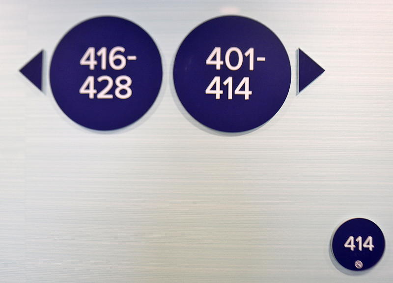
Directions to the rooms were easy to read.
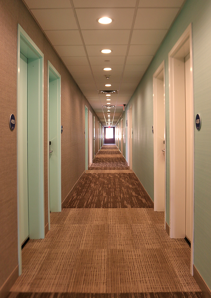
I walked down the hallway to access my room for the night.
The Room
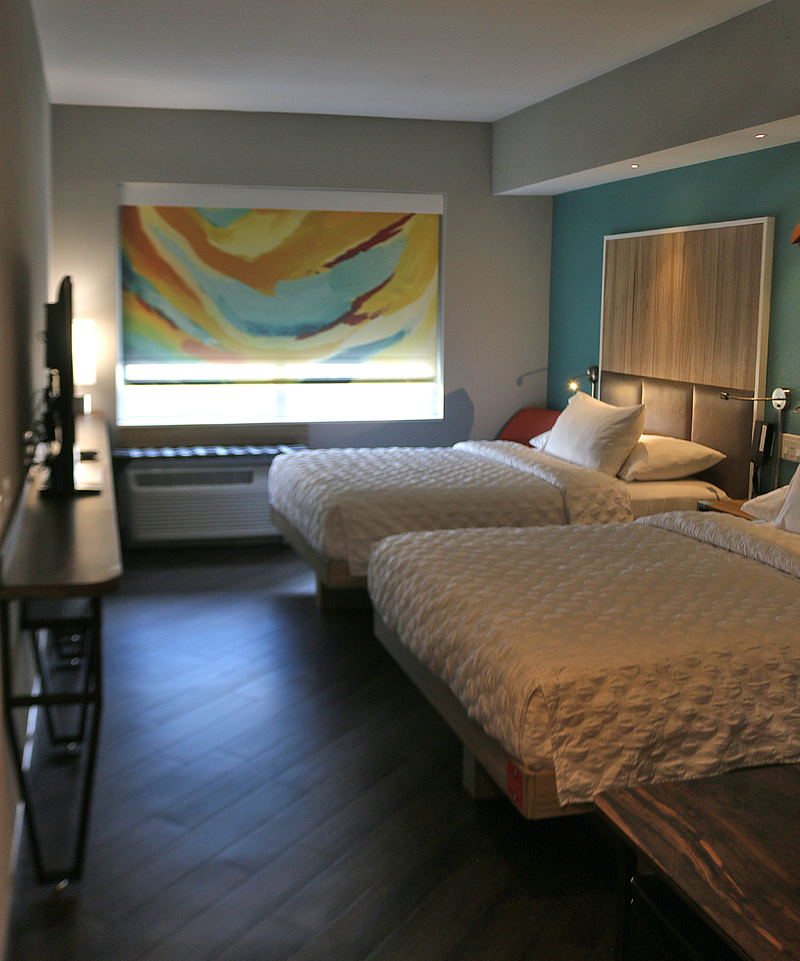
The window was equipped with a colorful translucent shade for privacy while simultaneously still allowing light to enter the room; while a white opaque blackout shade was behind it.
Due to the window shade which was partially closed, the room seemed rather dark — and not very large, either. It seemed narrower than a typical hotel room.
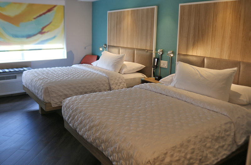
The beds were reasonably comfortable, as I did sleep well. I am still undecided about the color of the wall by the beds, as I was not all that fond of it — but it was not exactly the worst color I had ever seen, either. It did help to give the room a decent accent.
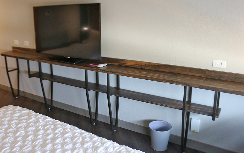
No desk was available in the room — just two long narrow rough wooden counters which were basically useless.
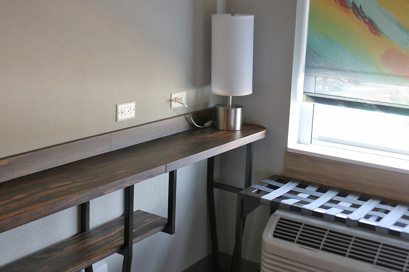
I saw an area which looked like a place to put a chair and use the upper counter as a desk — with the assumption of the reason why a lamp was located on the counter in that corner of the room.

I found a chair between the bed and the window.

I moved the chair over to that area, which was not easy due to the narrow space between the bed and the wall at which the window is located; but it was too close to the climate control unit — and the counter was too high to use as a desk. The lower counter did not have enough space to open a laptop computer — let alone enough width to support a laptop computer.
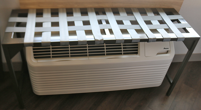
I was not sure if this was a luggage rack of some sort — as straps were the only means of support — but when loaded, it significantly impedes air flow from the climate control unit.
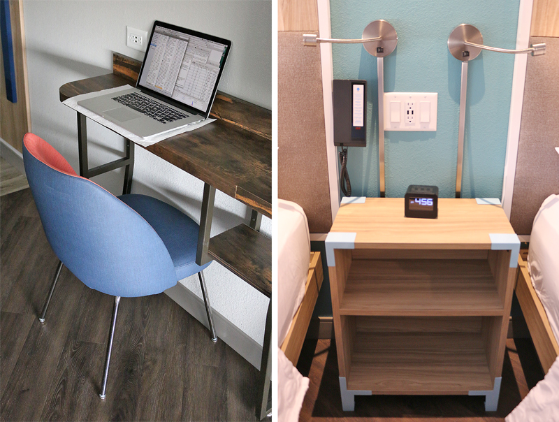
The part of the room which best emulated a work area was when I moved the chair to the other end of the long upper counter — but there was barely room between the counter and the bed; and the upper counter was still too high. The reason for this dysfunctional design disaster is because guests are encouraged to work on desks located in the lobby area instead of their own rooms.
I prefer to work in the comfort of the room in which I am staying — perhaps after a shower but before going to sleep as an example. Why would I want to take the elevator down to the lobby in order to be able to work in a public area on my laptop computer?!?
I liked the USB ports which are embedded in the same face plate as the two electrical outlets. In fact, a few other electrical outlets in the room were also equipped with USB ports, which was quite thoughtful and useful. A telephone was located on the wall to the left of the face plate.
A nice feature which is typically found in higher-end hotel properties is an adjustable spotlight for each bed which was available above the nightstand between the beds…
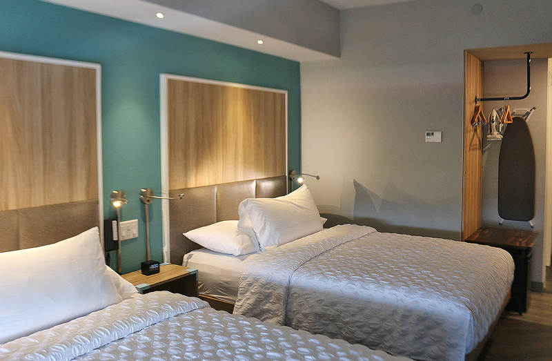
…as well as at the far ends of the beds. I also liked the recessed spotlights in the soffit above the beds. Still, the room was rather dark overall at night because only one real lamp was in the room near the window.

Some of the collateral material for Tru by Hilton includes, from left to right: the identification circle for the flat-screen television; the plastic key to the room; and the Do Not Disturb sign. Interestingly, the room contained no pen or pad of paper, as you must request those items at the front desk, where a whole brick of pads and a plastic tub of pens are available — and yes, they are branded with the Tru by Hilton logo; so I do not understand why they are not placed in each room.
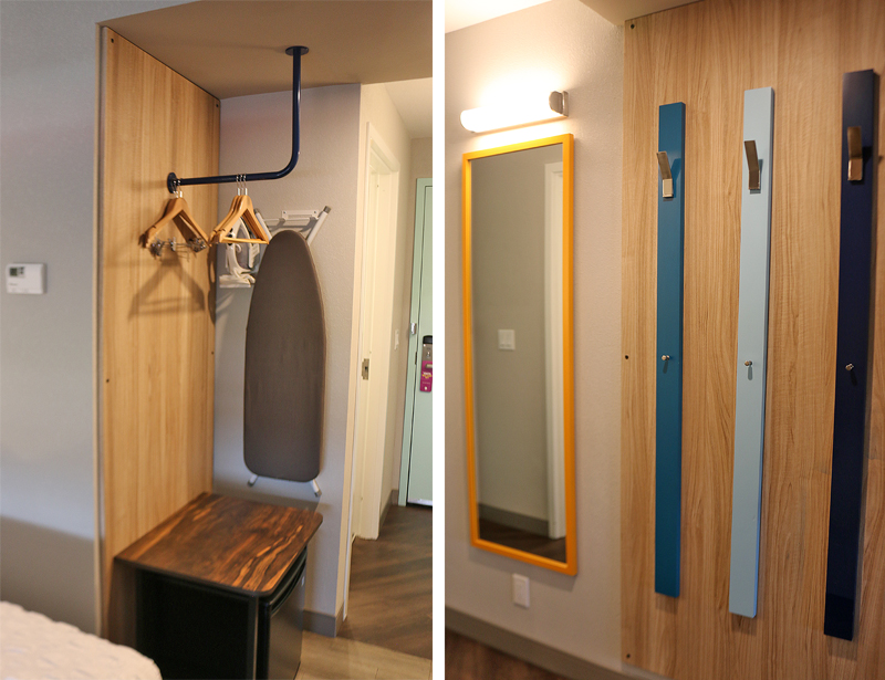
The “closet” was nothing more than an open area with a few hangers, an ironing board with an iron hanging on the wall; and a surface on which to place belongings. Underneath that surface was a miniature refrigerator, which was unexpected. The wall on the opposite side near the entrance to the room had an eclectic set of colorful wall hooks and a full-length mirror.
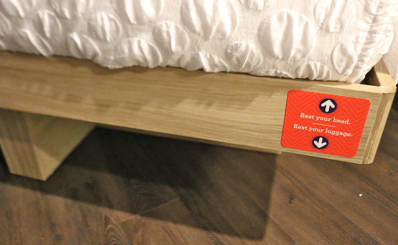
If the “closet” does not have enough room for all of your belongings, a space underneath one of the beds is specifically designed to place a piece or two of luggage. I had mixed feelings about this: I do not like to place my belongings on the floor if I can help it. Then again, I cannot imagine this part of the floor becoming as dirty as other parts of the floor mainly because no one can walk on it — unless, of course, someone stores their shoes underneath it. This space may also be difficult to use for someone with back problems or other ambulatory issues.
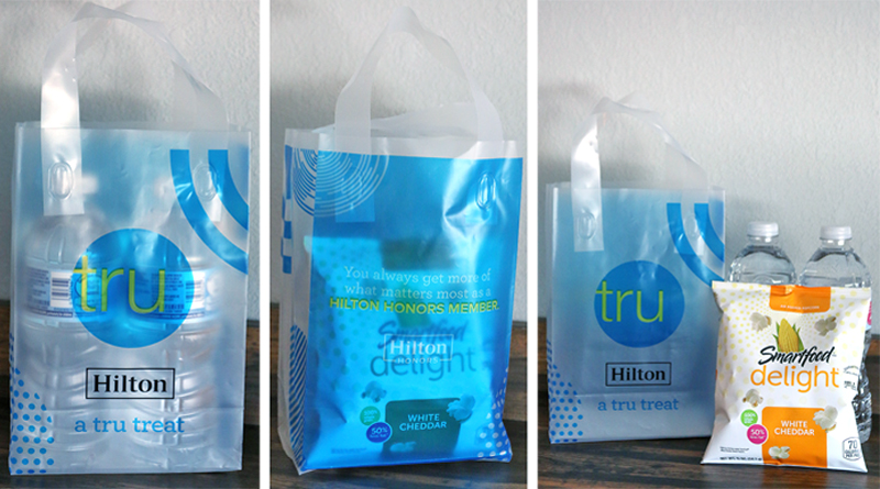
I received a translucent plastic bag which contained two bottles of water and white cheddar cheese flavored chips, which was a nice touch. The upper counter — or shelf — actually served a purpose for me when I placed the bag on there for photographs.
The Bathroom
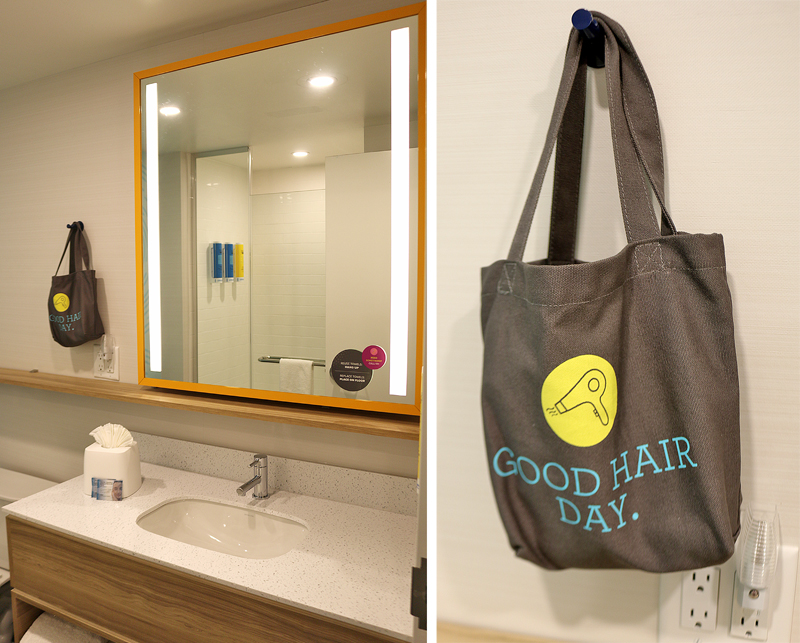
The bathroom looks rather plain upon walking into it — but a long shelf is located underneath the mirror and is useful for placing toiletries on it. An electric hair dryer is stored in a bag hanging on a hook on the wall, ready for use by the guest.
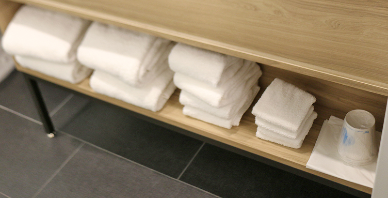
Plenty of towels are located underneath the vanity of the sink — as well as paper cups and a plastic laundry bag.
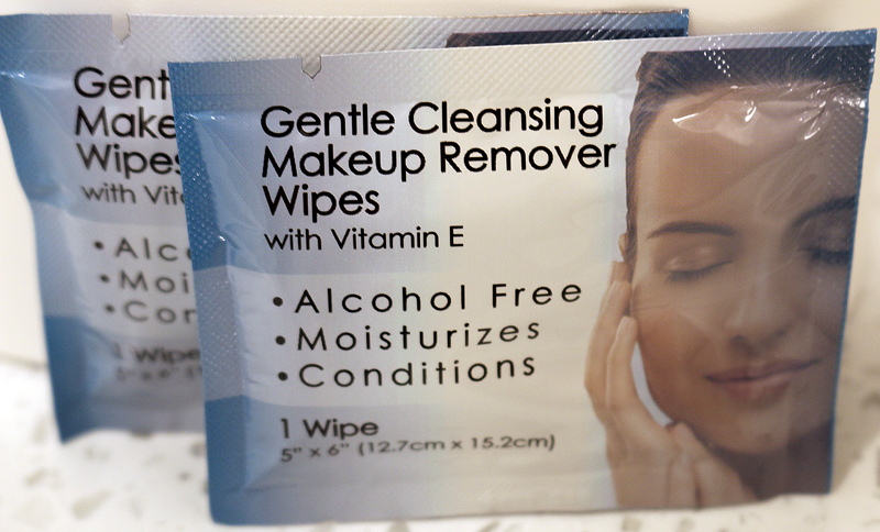
Two packages of gentle cleansing makeup remover wipes — with vitamin E — were included in the bathroom leaning against the box of tissues.
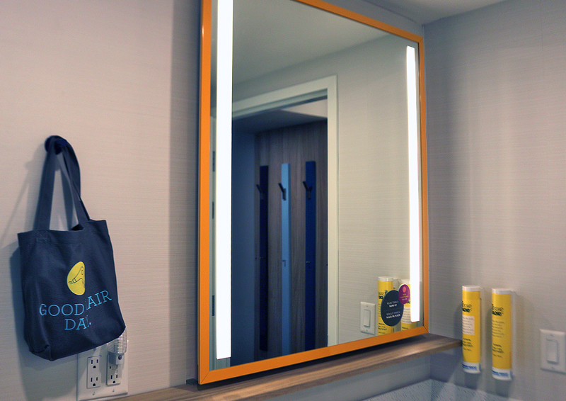
A nightlight which automatically illuminates is plugged into the wall next to the bag containing the hair dryer…
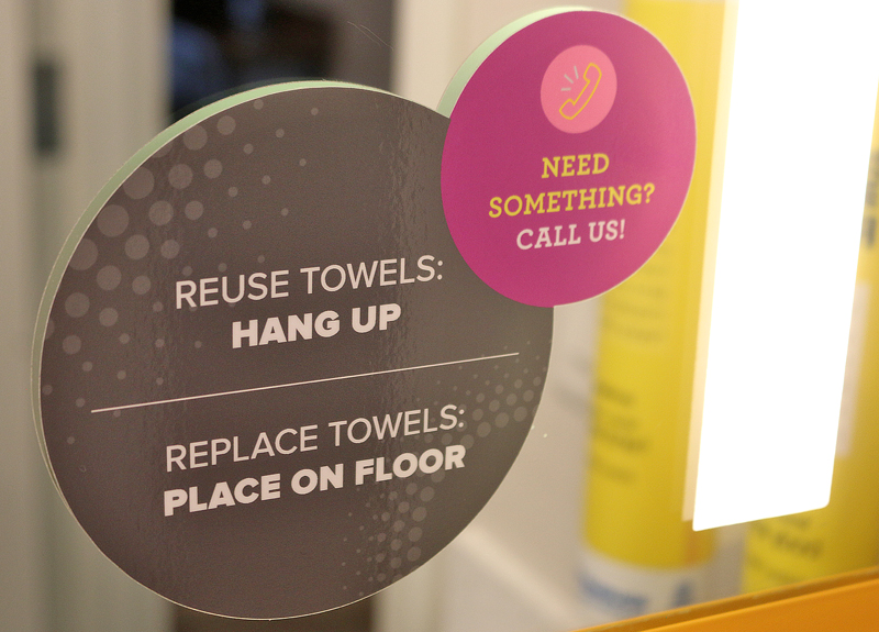
…and affixed to the mirror are labels which give instructions on what to do with used towels.
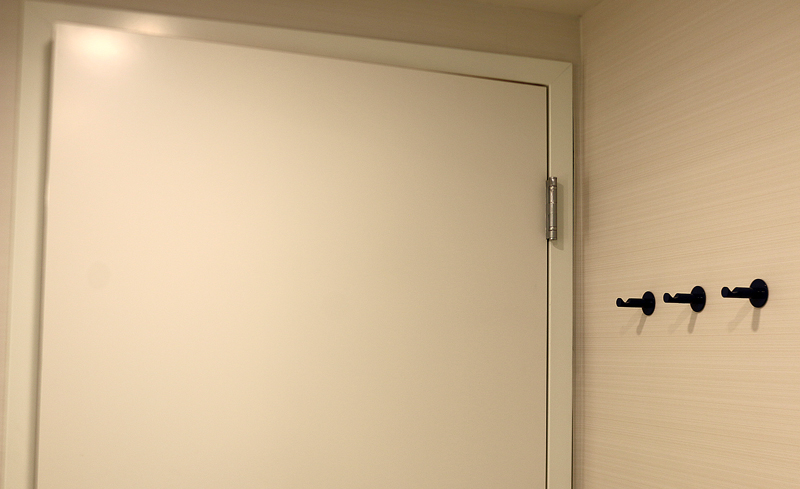
Three hooks are located on the wall behind the door of the bathroom — as opposed to the usual lone hook on the back of the door.
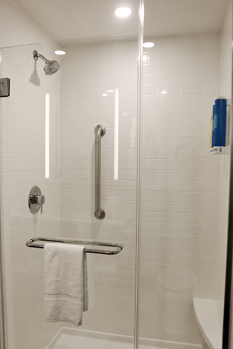
A floor towel hangs on the handle of the shower door. The shower itself contains a bench on which to place items; but it is not wide enough on which to sit for an extended period of time. The shower head is like a miniature rain shower when the water is turned on. No bath tub exists in the bathroom.
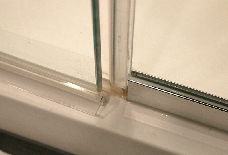
I like a good solid shower door, as it usually prevents water from spilling out onto the floor — but not in this bathroom, as the shower door would not properly close due to the poor fitting of the bottom of the glass door. Despite my best efforts, a puddle of water formed on the bathroom floor outside of the shower door anyway.
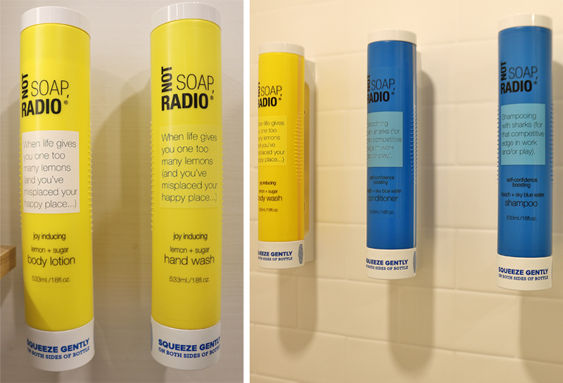
Two dispensers are located next to the sink, which contain body lotion and hand wash; and three dispensers are located in the shower area, which contain body wash, conditioner and shampoo. The products in the blue containers have a “confidence-boosting” scent called beach + sky blue water; while the products in the yellow containers have a “joy-inducing” scent called lemon + sugar. I was indifferent to the beach + sky blue water scent; but the smell of lemon + sugar was so sickeningly sweet that my teeth felt like they were rotting — and lemon is one of my favorite scents.
I also did not like how the product came out of the containers, as you have to squeeze both sides of the container itself for it to come out. Squeeze gently as instructed, and nothing happens; but too much came out when squeezing slightly less gently. Despite multiple attempts, I could not find a happy medium. The container is poorly designed overall.
I did not get the name brand of the products Not Soap, Radio — supposedly a form of practical joke and an example of surreal comedy which is actually not funny — and I found the statements printed on the labels of the containers to be both vapid and vacuous at best: “When life gives you one too many lemons and you’ve misplaced your happy place” and “Shampooing with sharks (for that competitive edge in work and/or play).”
Huh?!?

Although not as egregious as the aforementioned public washroom, the design of the wallpaper next to the toilet is busy enough to fool you into thinking that you are hallucinating. Who needs drugs, anyway?!?
The wall is a waste of space, in my opinion.
Views

The hotel property is conveniently located off of Interstate 40. I really did not mind this view, as I was quite glad that I checked into the hotel prior to “rush hour” so that I could look north and view the vehicles which struggled to head both eastbound and westbound in bumper-to-bumper traffic.
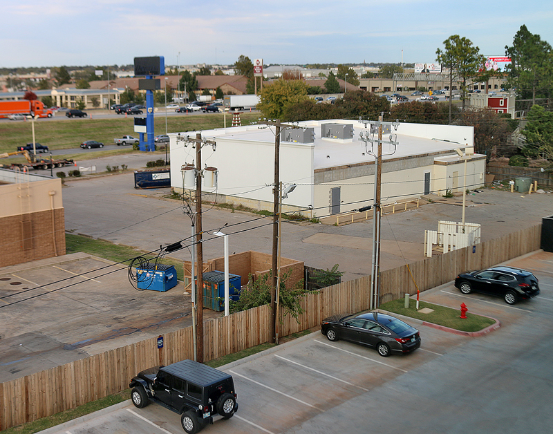
Another view of the eastbound traffic on Interstate 40 is behind the white building. In the foreground was another part of the parking lot on the opposite side of the hotel property from the main entrance.
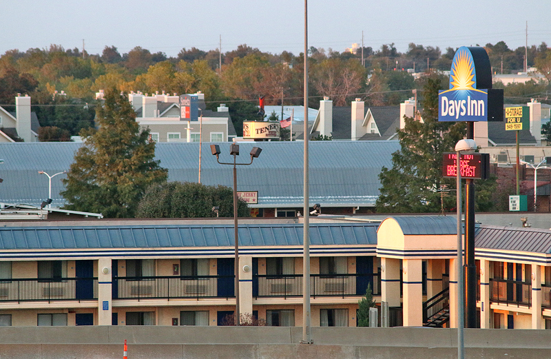
The view included a Days Inn, whose rooms apparently have external doors. It is located on the other side of Interstate 40.
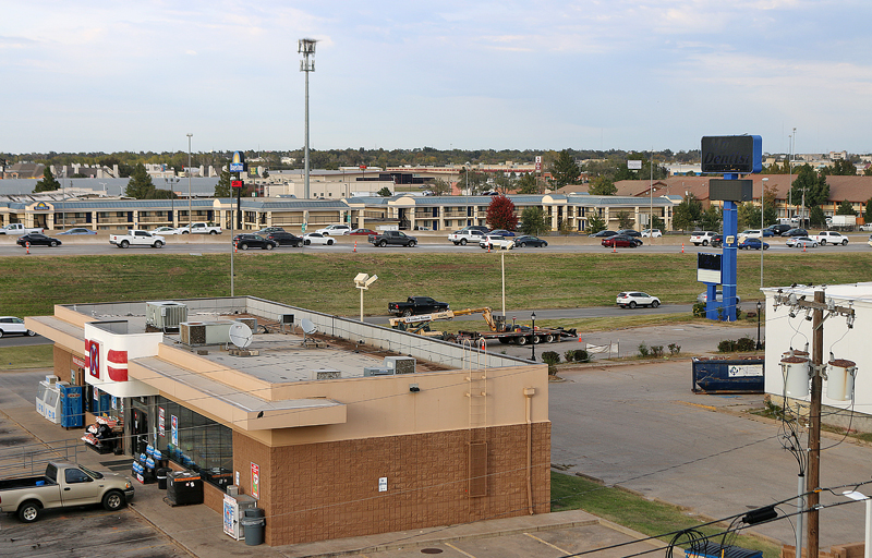
This view of a convenience store is not exactly the best view I have ever seen from a hotel room; but it is not the worst view either. I believe that the view from the room of this hotel property at which I stayed still is one of the contenders of worst view from a hotel room that I have ever seen.
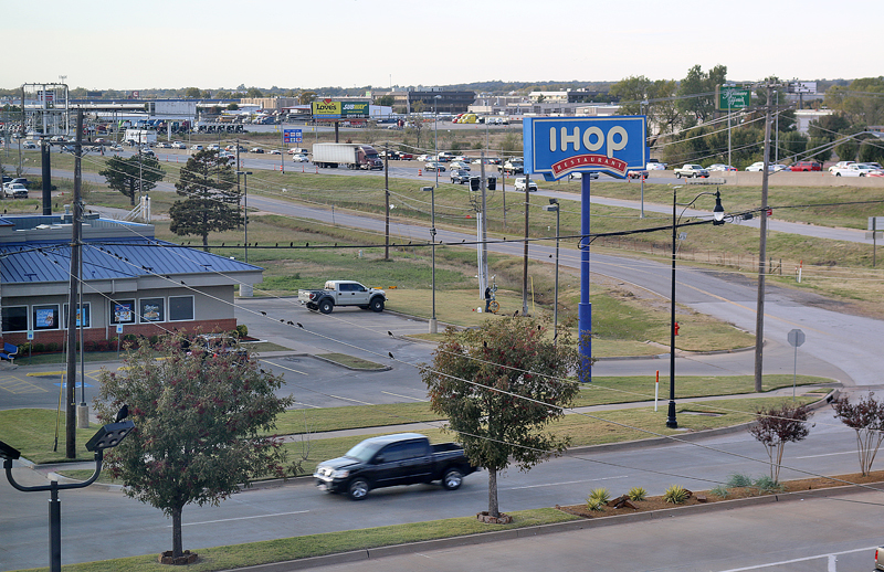
Looking towards the west, I guess I know where people go if they do not like the breakfast which is included in the room rate of this hotel property. More on that later in this article.
Breakfast
When one of the members of the staff saw me photographing around the lobby area, she came over and started speaking to me in a gregarious manner while giving me an impromptu and informal tour…
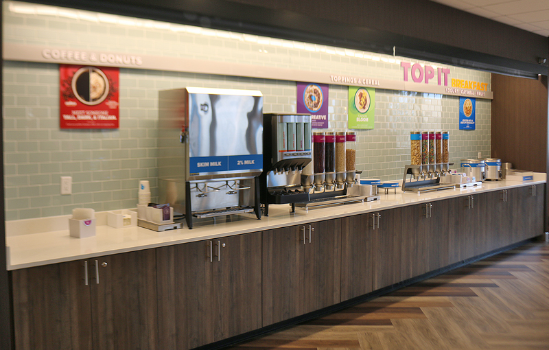
…which included pressing a button to raise the aforementioned two grey screens that hid the breakfast area, so that I may take photographs. I thanked her profusely, as that was a nice voluntary gesture on her part. She was quite proud of the hotel property in which she worked.
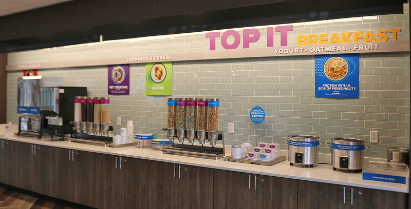
Although I appreciated it, the breakfast area was not fully stocked at that time because I was taking photographs in the late afternoon — but I decided to take advantage of the opportunity anyway in case the breakfast area was crowded with guests the next morning.
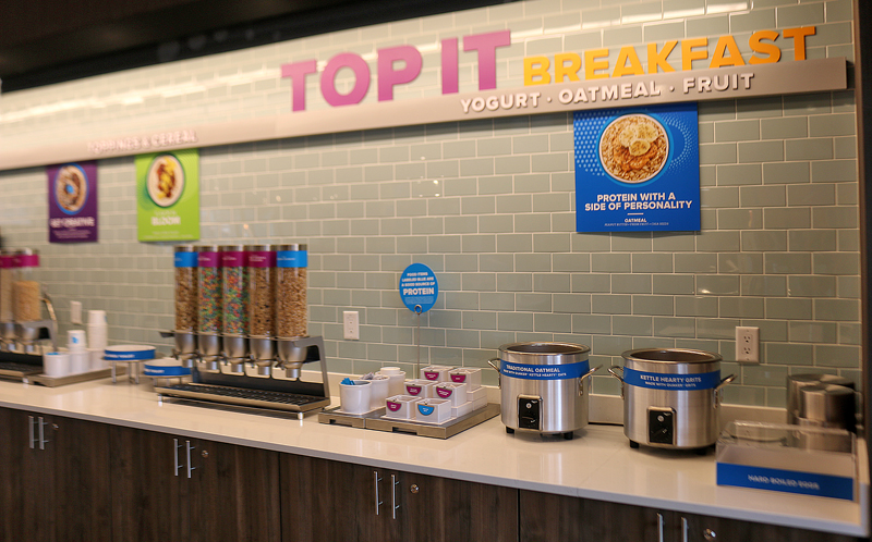
Instead of individually packaged yogurt, guests could simply scoop their choice of as much Greek yogurt or vanilla Greek yogurt as they wanted; and then add their favorite toppings at the toppings bar, which consisted of a choice of purportedly 30 toppings. Five different kinds of dry cereal were available in clear canister dispensers.
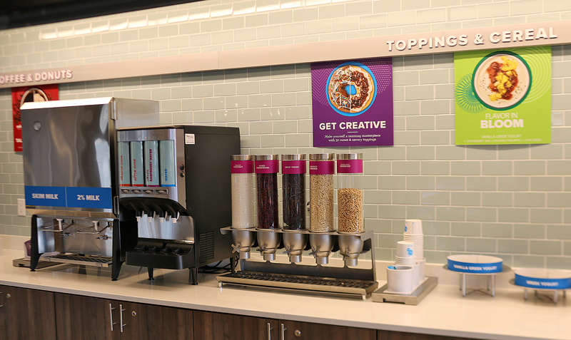
Cold skim milk and two percent milk were also available. The clear canister dispensers contained shredded coconut, dried cranberries, Oreo cookie pieces, slivered almonds, and plain Cheerios.
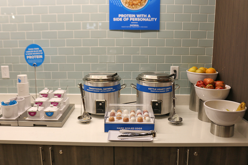
Hot oatmeal and hot grits were available for breakfast; as well as hard boiled eggs and fresh oranges, bananas and apples. You can top these food items with any toppings you want as well.
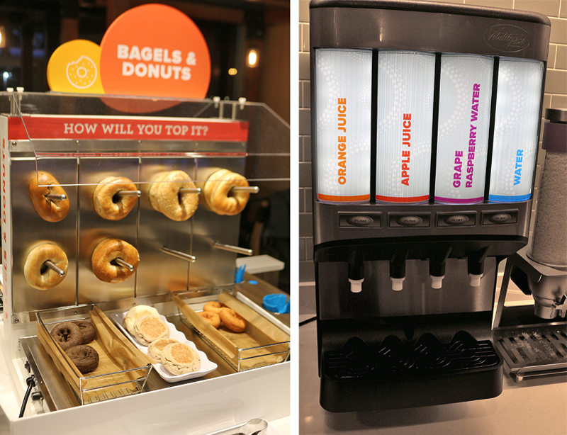
Assorted bagels and doughnuts are available at a separate station. I did not particularly like how they were just hanging out there unprotected from any flies or other vermin which may possibly be in the area — as well as anyone coughing or sneezing within the vicinity of that station, despite the sneeze guard at the top. The doughnuts were okay at best; and being originally from New York, my opinion about the bagels is biased and skewed — so I perhaps will move on from there.
Guests had a choice of cold beverages at the main breakfast counter: orange juice, apple juice, grape raspberry water, and plain water.
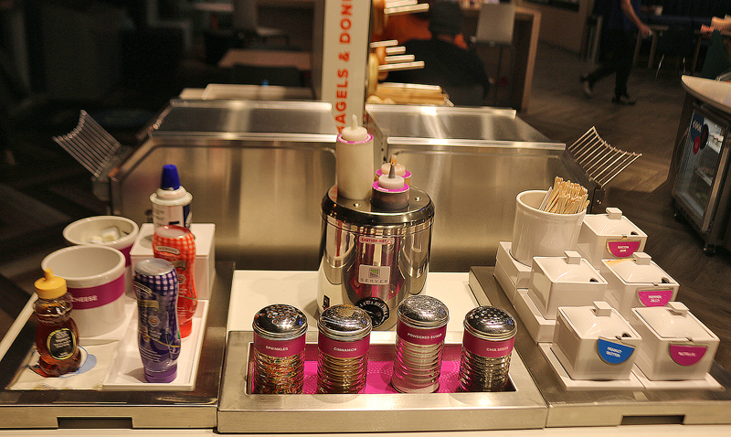
On the side of the bagel and doughnut station were assorted syrups, butter, cheese, honey, and whipped cream. In the center were sprinkles, cinnamon, powdered sugar and chia seeds. Toppings on the right included peanut butter, pepper jelly, bacon jam, and Nutella chocolate hazelnut spread. Behind the assorted warm bottled condiments were large toaster ovens through which you can toast your bagels — after you sliced them with the handy slicer, of course.
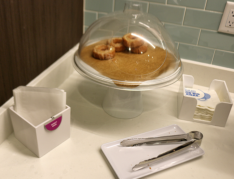
Guests are encouraged to take doughnuts for the road, as this is located not at the doughnut station; but rather at the far end of the counter for the breakfast area. Unlike the other doughnuts, these glazed doughnuts were protected by a plastic dome. Tongs and napkins were available to place the doughnuts into — what else — donut bags, which are on the left. I took two doughnuts for the road.
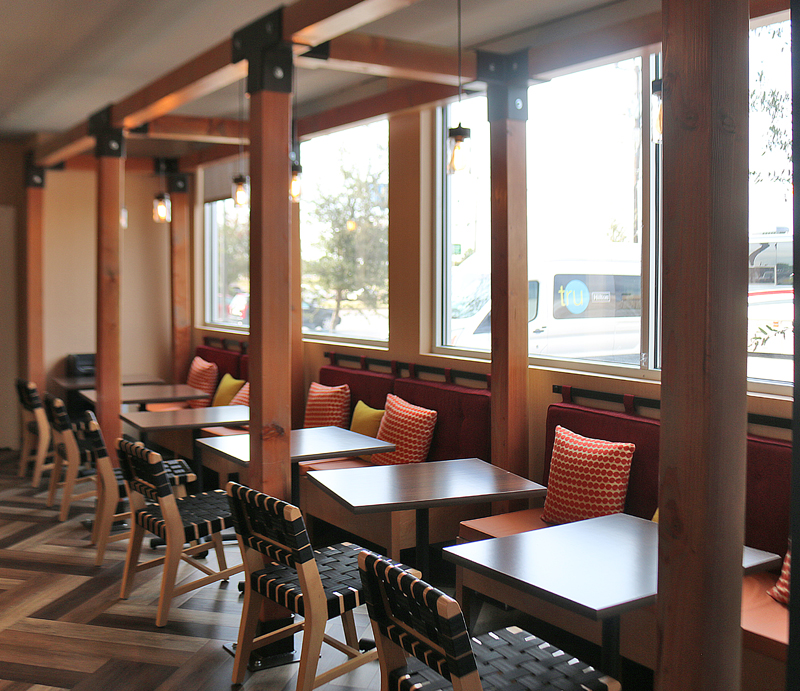
Plenty of chairs and tables were available in the breakfast area near the windows.
Summary
“Guests either love this place or hate it” is what the female member of the staff of the hotel property said to me. I can understand why.
I would not go so far as to say that I hate the concept of Tru by Hilton; but I would not be disappointed if I never stayed at one again, as it has too many deficiencies for me to want to return.
Highlights of my stay were the friendly and helpful staff; the purified water machine for all the complimentary cold water you want during your stay; the reasonably comfortable bed in which I slept well; and the USB outlets in the room. I can potentially see the games and the charging stations for portable electronic devices being useful; but I did not use them. Access to Wi-Fi is complimentary for everyone — regardless of elite level status — and a printer is available for use in the lobby area which can be accessed wirelessly.
I did not care for no reasonable space on which to work in the smallish room; the dispensers for soap and other liquid amenities; the breakfast overall; the overuse of busy superfluous graphics; and the room rate itself along with the low earning of Hilton Honors points. In some ways, the lobby reminded me of a hostel in Europe. Tru by Hilton is definitely not at the top of the list of places in which a “road warrior” traveling on business would want to stay.
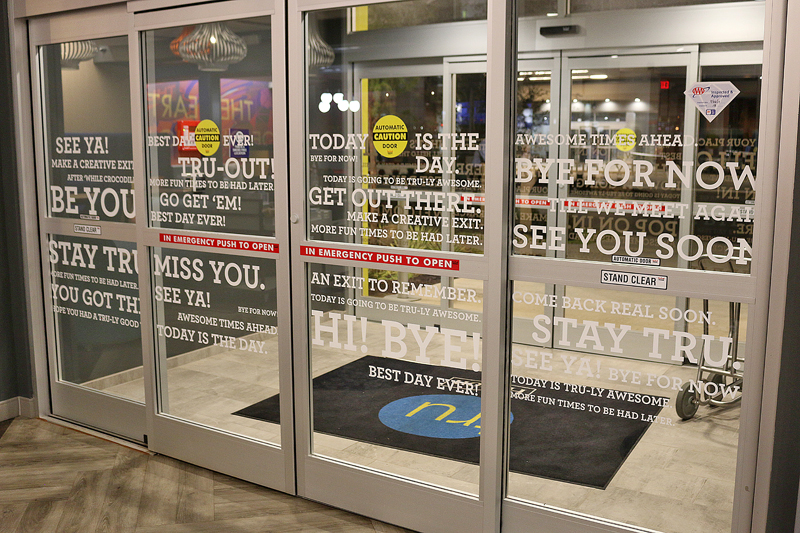
The glass doors at the entrance were much easier to read from the inside of the lobby when the outside was dark; but this is an example of overthinking the concept, as I believe that whoever did design the overall brand of Tru by Hilton tried way too hard to be stylish and different — especially with goofy names such as The Hive, which seems like the concept has thankfully abandoned. They failed, in my opinion.
At first, I thought the concept was perfect for families on a budget — until I saw the size of the room, which would be a tight squeeze for a family of four people: doable; but certainly not comfortable.
The room rate was not the least expensive in that area of Oklahoma City, as I paid $112.61, which included the room rate of $99.00 plus $13.61 in taxes — and I thought that that was too expensive for what I received in return. At least one Hampton Inn hotel property offered less expensive room rates; and yet I found myself thinking that I would rather have stayed at a Hampton Inn than this Tru by Hilton — including regarding the offerings for breakfast.
Despite the expensive room rate, I stayed at this hotel property for two reasons: to try out the Tru by Hilton concept and write about it for this article; and to earn 1,000 bonus Hilton Honors points during this promotion which lasted for a limited time.
Speaking of earning Hilton Honors points, keep in mind that you will only earn five points per dollar spent at Tru by Hilton hotel properties — and the official reason why is in this article which I wrote back on Friday, May 5, 2017.
Although it is certainly not a terrible concept by any stretch of the imagination, the only time I could see myself actively seeking to stay at a Tru by Hilton hotel property in the foreseeable future is if it is the least expensive option by a significant amount of money when compared to other options within a certain radius.
The hotel property is located approximately six miles west of downtown Oklahoma City; and despite its name, it is located 4.6 miles north of Oklahoma City Airport.
Tru By Hilton Oklahoma City Airport
802 South Meridian Avenue
Oklahoma City, Oklahoma, 73108
United States of America
1-405-609-3955
1-405-609-3966 Fax
All photographs ©2017 by Brian Cohen.
