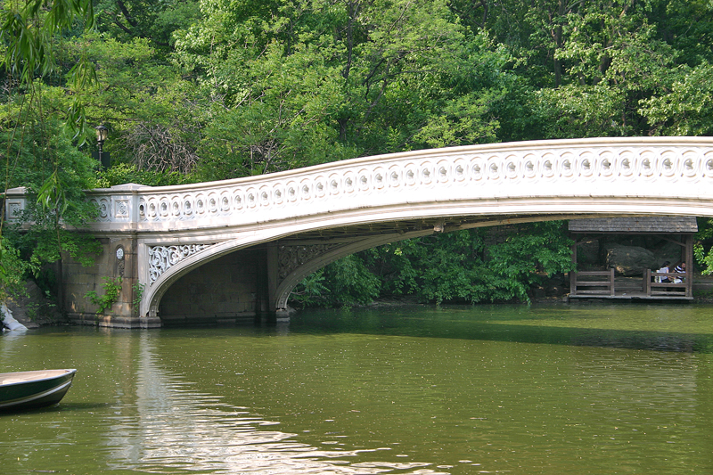
Central Park is an oasis in the otherwise concrete jungle of Manhattan — and at greater than 750 acres in area, you can lose yourself in portions of the park where the flora of the natural wilderness fools you into disbelief that you are actually in the heart of a major world city…
See The One Surviving Rejected Design of Central Park in New York
…but imagine entering a competition with which you could win $2,000.00 while simultaneously having the honor of your design selected to become one of the most famous public parks in the United States — and the world.
“On July 21, 1853, the New York State Legislature enacted into law the setting aside of more than 750 acres of land central to Manhattan Island to create America’s first major landscaped public park; they would soon refer to it as ‘the Central Park’”, according to information from the official Internet web site of the Central Park Conservancy. “The design, one of the great masterpieces of American art, was the result of the 1858 competition won by Connecticut-born journalist and agriculturalist Frederick Law Olmsted (1822-1903) and British-born and trained architect Calvert Vaux (1925-1895). They named their plan ‘Greensward’ for their preferred landscapes of sweeping meadows and vast water bodies designed to appear limitless, while brilliantly belying the Park’s long and narrow rectangle within New York City’s rigid grid.”
The rules of the contest were specific: the design for Central Park needed to include a parade ground, a fountain, a watchtower, a skating arena, four cross streets, and room for an exhibition hall. Olmsted and Vaux combined these elements into a winning plan that doubles as a microcosm for the State of New York itself.
The park is so recognizable by millions of people that imagining it any other way is difficult at best — but this article from Budget Direct Travel gives a glimpse into what Central Park would have looked like if one design by a runner-up entry was chosen instead.
I have been given express written permission to use the images and the verbatim text from the aforementioned article in this article. Typically — in an article such as this one — I would add brief notes; but I am not knowledgeable enough about Central Park to add any value to the information which is already here.
Runner Up Entry Number 4 by John J. Rink
The now-familiar design by Olmsted and Vaux was one of 33 entries — 32 of which never saw the light of day. All of those runners-up entries are thought to be lost forever — except for one design known as Entry Number 4 by John J. Rink, who was a park engineer.
This bird’s eye-view of Rink’s plan reveals the form of the park. It was to be divided into symmetrical shapes called grounds that rose and dipped according to the topography of the land. He makes today’s park look positively chaotic!
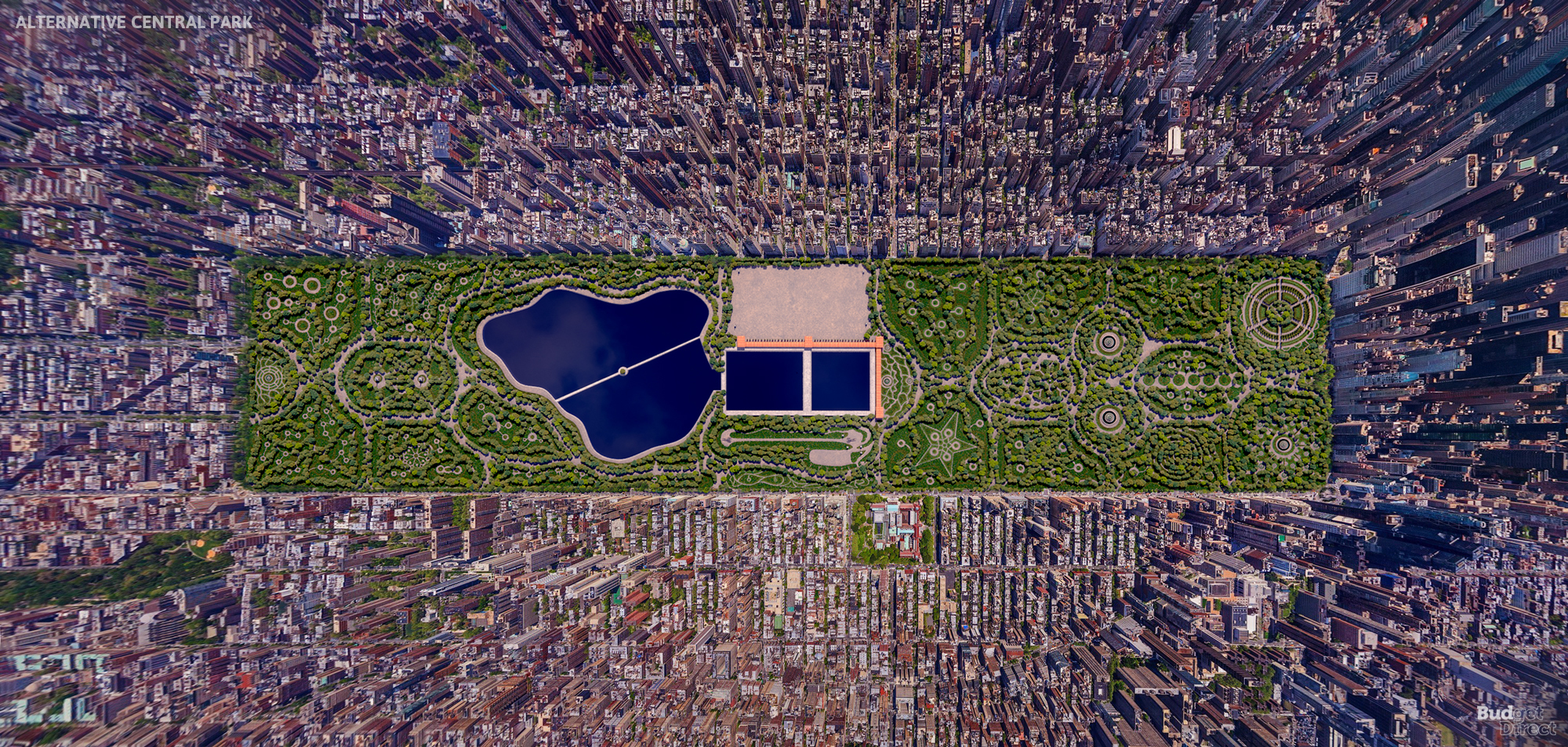
Rink’s watercolor drawing was labelled a “folk-art fantasy of Versailles,” in reference to the famous French palace. And there is something of the European fairytale about the way that today’s open spaces disappear beneath Rink’s spiraling tree-lined alleys and topiaries.
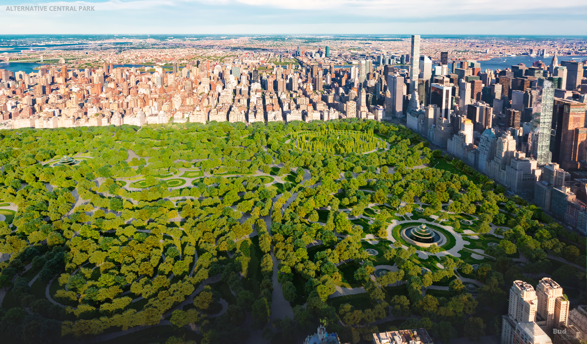
Put in the context of the city, it’s clear that New York cried out for a large green space like this. Central Park is an opportunity for locals and visitors to get away from the bustle and enjoy nature and culture. Today, the Metropolitan Museum of Art sits in the park just off Fifth Avenue; Rink’s design offered instead a two-wing museum at the south and east edges of his reservoir. It would have been almost as big as the Met.
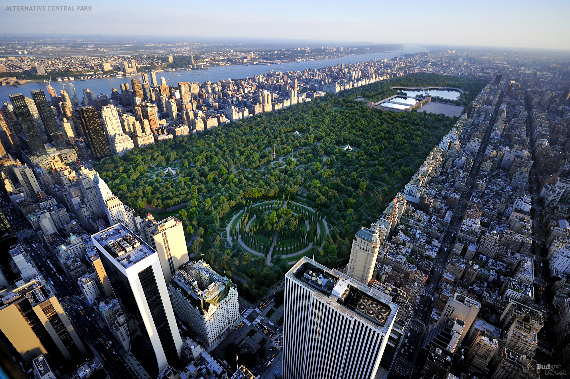
The Spirit Ground in the foreground appears to have a statue in John Rink’s rendering. In today’s Central Park, the closest statue to this would be the bust of the Irish poet, Thomas Moore. But Rink’s imagination was more patriotic: he named the roads, gates, and other elements after US presidents and patriots.
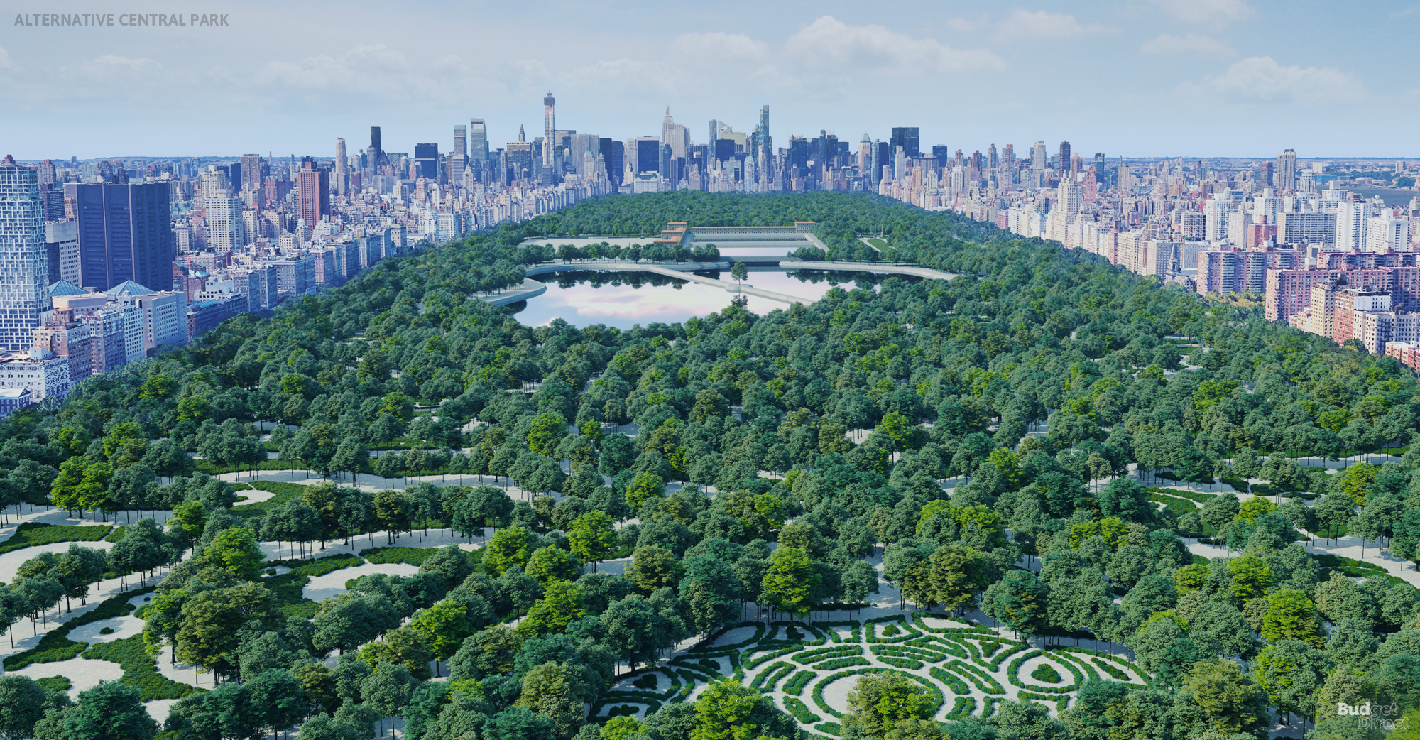
Rink was influenced by French garden design, in which water and reflections add symmetry and tranquillity to a space. In this image we see Rink’s Croton Lake and water reservoir. Beyond the reservoir is the parade ground that the competition called for: in Rink’s design, this is Central Park’s only open land.
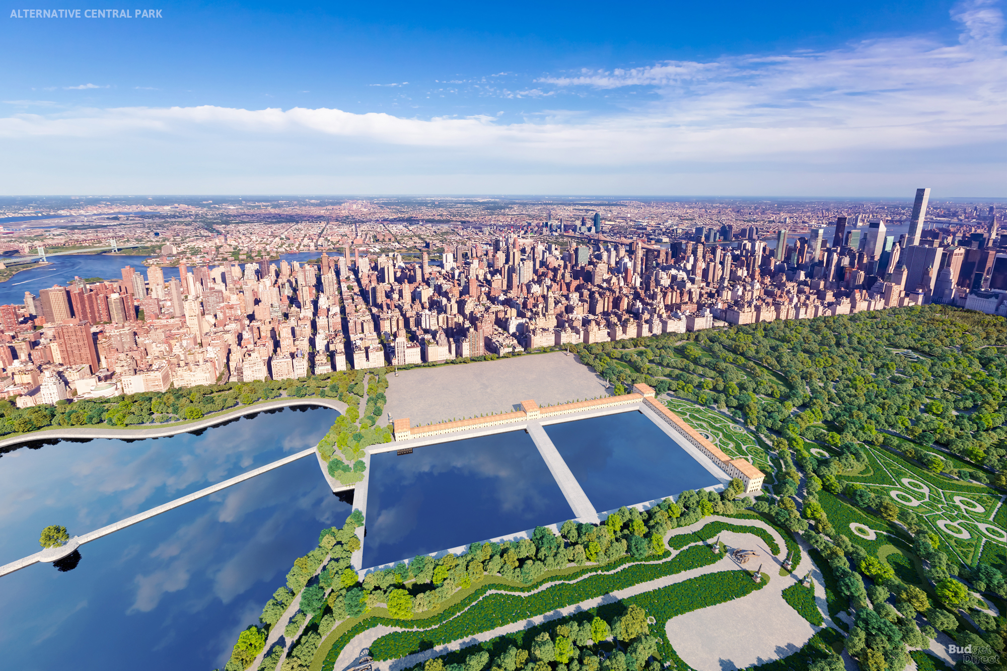
It is curious to note how modern the real Central Park looks, compared to Rink’s design — which is very much of its time. The park as it stands has evolved to become a far more natural-feeling place compared to the European-style grandeur of Rink’s plans.
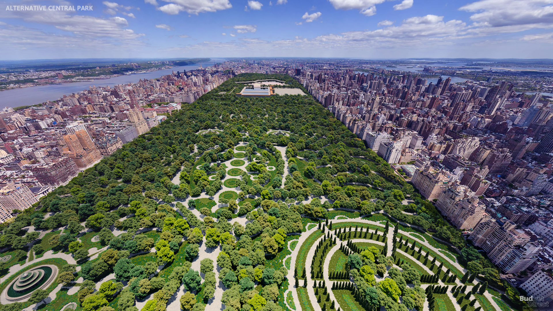
Some say that the park was originally suggested not to improve the lives of regular people, but because the land was otherwise unusable. Making it pretty would boost the value of surrounding land for New York’s powerful property owners. But today’s park is a wild and welcoming place where ordinary people can exercise, rest, and play.
Summary
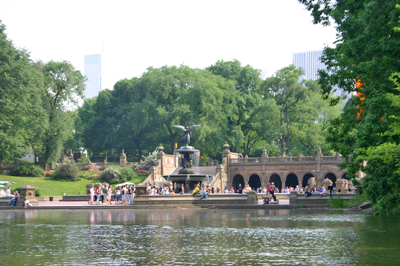
I have been to Central Park multiple times — after all, I was born and raised in New York — and I have been to Versailles. While I found Versailles to be quite impressive, I agree that Central Park should not have emulated that design. That European feel just would not have fit into the unique character which is New York.
If you take a look at the renderings, the trees appear to be oversized when compared to the buildings; and the pathways look like they are wider than any street in Manhattan. Even so, I prefer the more natural approach to the overall environment of Central Park.
For additional information pertaining to Central Park, please refer to the official Internet web site of the Central Park Conservancy, which is a private, not-for-profit organization formed in 1980 by a group of concerned citizens determined to improve the park.
Photographs as indicated ©2007 by Brian Cohen.
