
Note: This article pertaining to Updated Livery For Alaska Airlines was originally published on Monday, August 18, 2014 at 3:45 in the afternoon and has been updated.
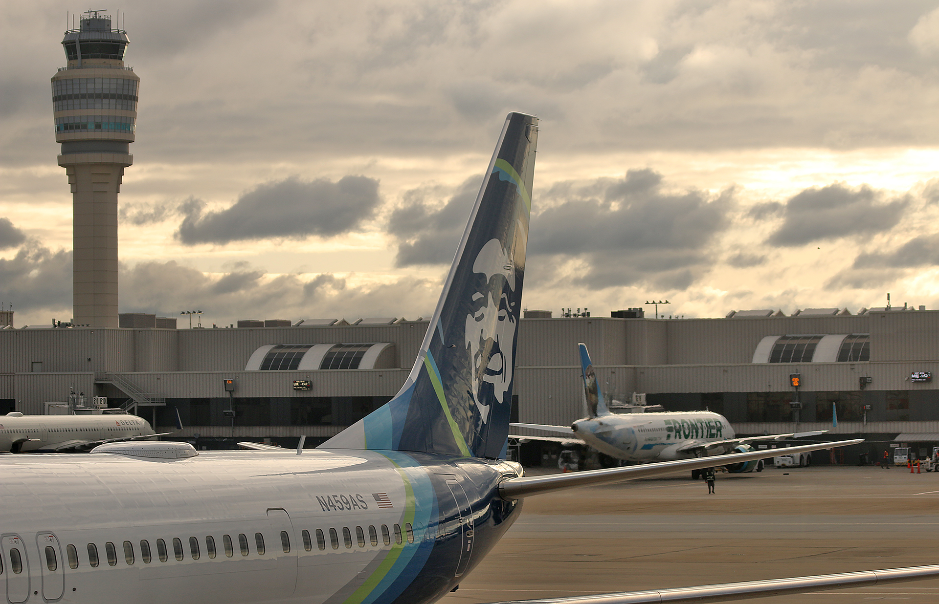
An updated livery for Alaska Airlines was revealed earlier this month of August of 2025 as the airline strives to achieve a global presence as two new international routes have been officially announced for Spring of 2026: between Seattle and Reykjavik and between Seattle and London Heathrow Airport — and 17 new Boeing 787-9 “Dreamliner” airplanes will be the first to sport the new livery.
Updated Livery For Alaska Airlines
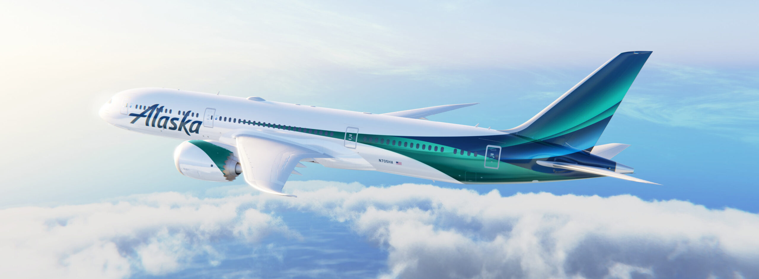
“As part of our exciting expansion into long-haul international markets, in August 2025, we introduced a new global livery–a bold visual evolution designed to spark awe and wonder around the world. This design showcases the natural wonder of the aurora borealis, a stunning phenomenon that captivates people across the globe”, according to this article that was posted at the official Internet web site of Alaska Airlines. “The aircraft represents more than a sleek new look–it’s a reflection of where we’ve come from and a bold step toward where we’re going. As we take flight around the world, this aircraft carries our story–and our guests–farther than ever before.”
The exterior design of the new Boeing 787-9 “Dreamliner” aircraft draws inspiration from the natural wonder of the Aurora Borealis — which are also known as the Northern Lights. This phenomenon captivates global audiences; and it is an experience that is well known across the state of Alaska.
- A palette of deep midnight blues and lush emerald greens channels the energy of the Northern Lights and spirit into the brand of Alaska Airlines.
- Flowing aura lines — which are seen in the current core livery and premium cabins — guide the design with light, motion, and flow.
- Thoughtful details that incorporate the heritage into the livery — such as an eye-catching horizontal stripe along the fuselage — which is a contemporary nod to the classic liveries of the 1970s and 1980s that bridges the past of Alaska Airlines into its future.
Logo Refresh in August of 2014
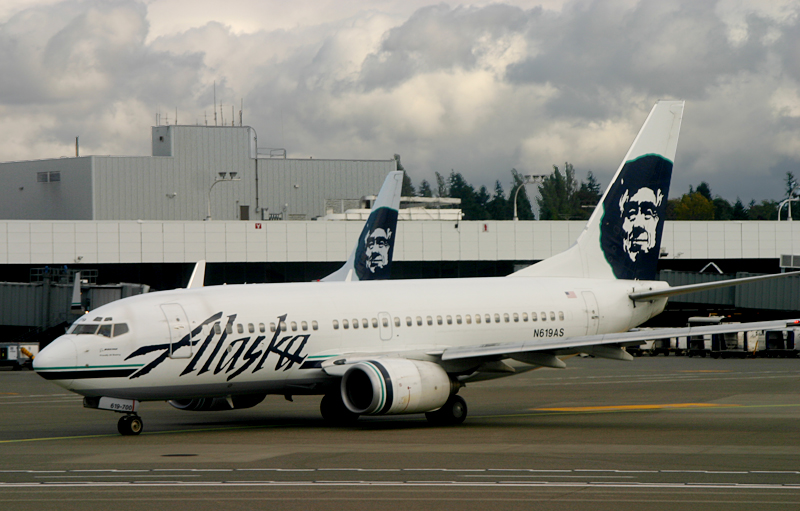
An updated logo for Alaska Airlines went into use in August of 2014; and this article announced the change on Monday, August 18, 2014.
The logo itself had been reversed from dark art on a white background to white art on a dark blue background. The edges of the logotype had been “smoothed” when compared to its predecessor; the gap at the top of the capital A had been closed; and the lower-case k no longer seemed like it was kicking a hole through the lower-case a — which I personally never understood.
The word airlines no longer was part of the logo, which is similar to the other major airlines that are based in the United States.
“Other than that k which was kicking a, I liked the former logotype of Alaska Airlines. It stood out from competing airlines and gave that rustic impression of the Alaskan wilderness. It was different”, I had originally written back in 2014. “I personally would have preferred the former logotype with the revised leg of the k of the new logotype; but still with the rough edges; and keep everything else the same in what I consider the distinctive image and branding of Alaska Airlines.”
Livery Refresh in 2016
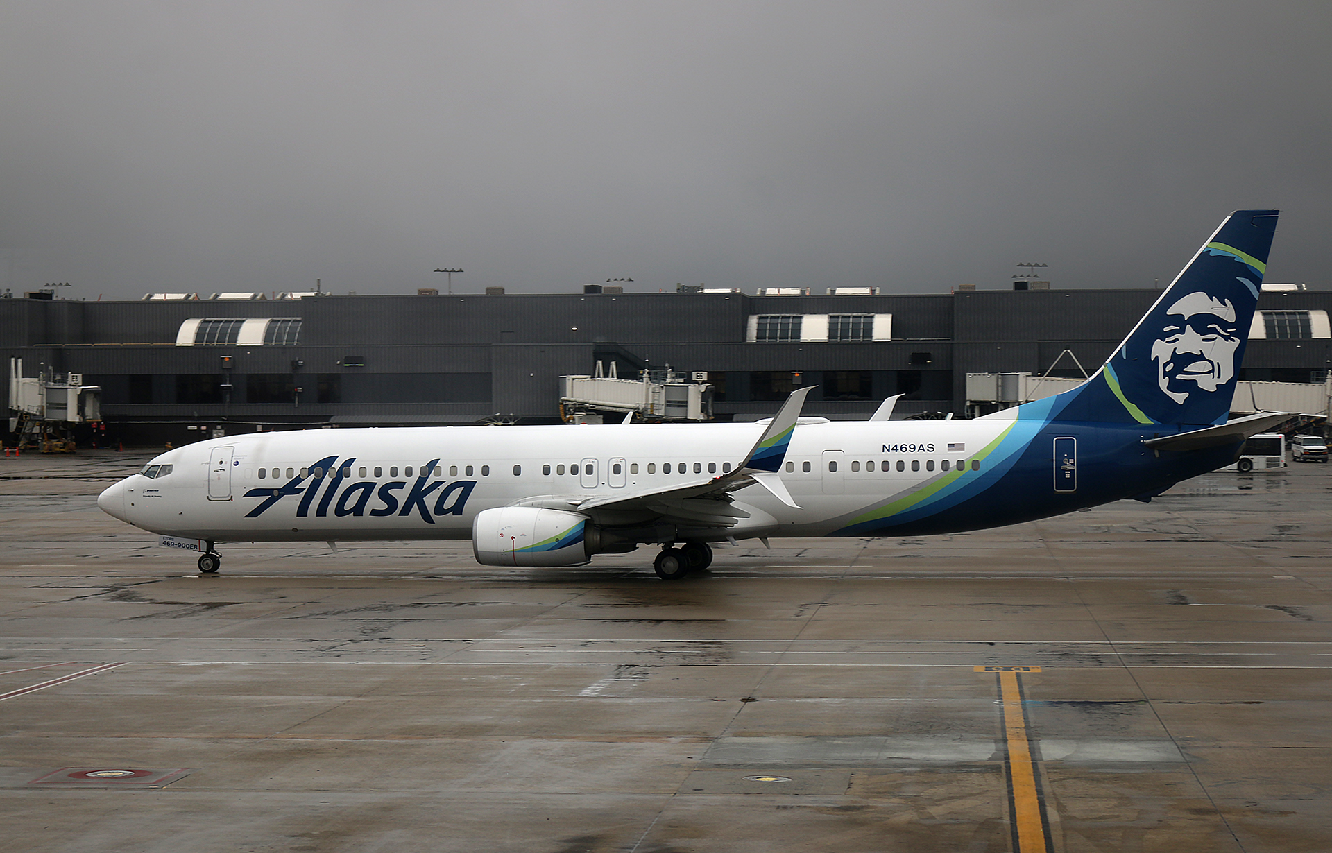
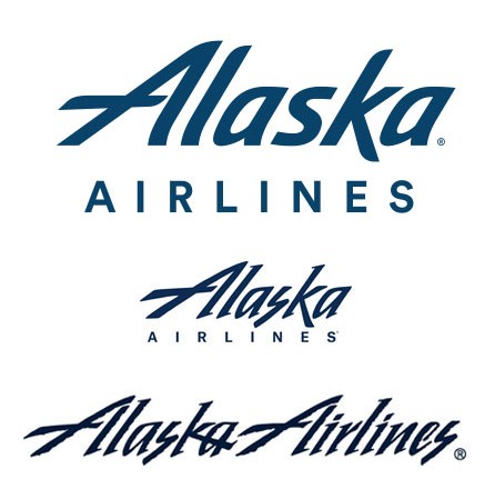
Two years later, a brand refresh from Alaska Airlines was unveiled to a crowd of approximately 1,800 employees on Monday, January 25, 2016, which shows a streamlining of the logo and the livery of its fleet of aircraft, as reported in this article here at The Gate With Brian Cohen. That refresh of the livery is what the airplanes of Alaska Airline adorn to this day.
As for the current logotype — which remains and will be incorporated with the new livery — I do not necessarily dislike it. However, the intent was to give it a cleaner and more sleek appearance; and it succeeded in doing just that — but that success is actually a failure to me, as it is the most boring of the three logotypes, in my opinion. I still prefer the aforementioned rustic look of the rugged logotype from before August of 2014. To me, that says Alaska better than any of the other logotypes displayed above…
…and what is with that clunky typeface known as Circular which spells Airlines underneath the current logotype? Similar to the intermediate logo, the font size should have been smaller; while the tracking of the letters should be increased.
What I personally would have done is kept the Alaska part of the logotype in a rugged form whose mere appearance immediately suggests Alaska, as if it were not for the retention of the Eskimo face, I would be convinced that the new branding of Alaska Airlines had lost its heritage; and I would have italicized the word Airlines in a less conspicuous yet more modern sans serif typeface with either a light, book or medium weight — perhaps Avenir or Futura as a couple of numerous examples which are superior choices to the current font…
The Alaska Native Is Nowhere to Be Found On the New Livery. Who Was He?
…but although the Alaska Native caricature will not be retained and incorporated with the new livery, the good news is that the Alaska Native — which is also known as the Eskimo face — is not disappearing.
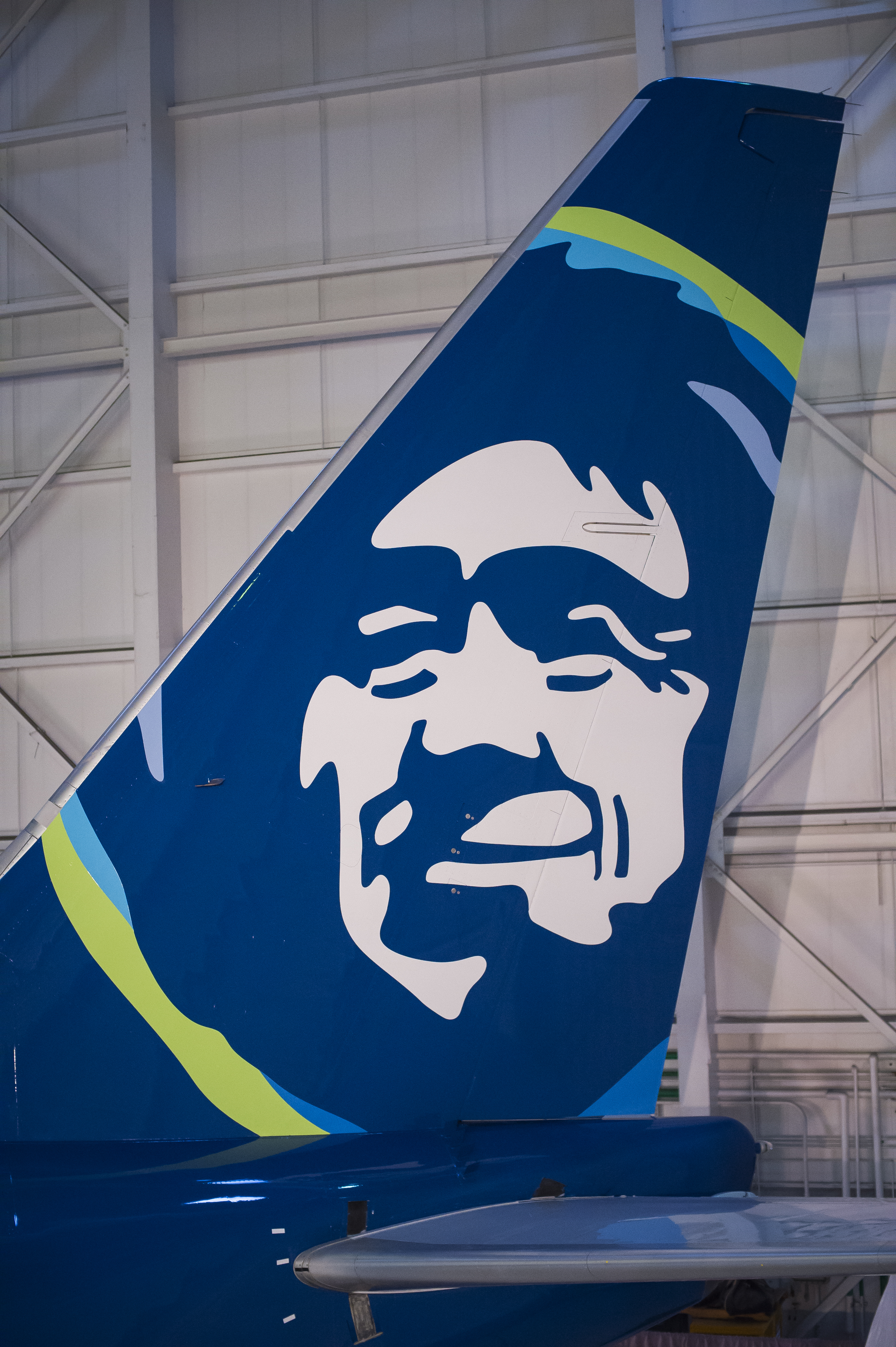
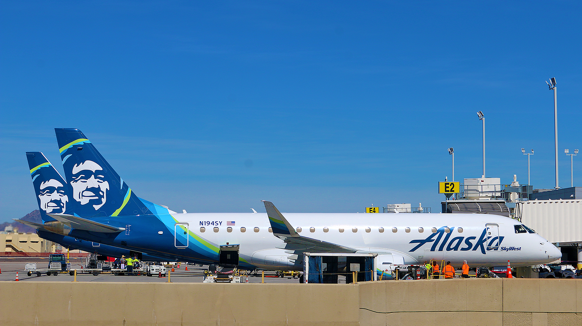
The Alaska Native face that is currently on the tails of the fleet of the aircraft — which first appeared in 1972 — will eventually be phased out. An apparent attempt to retire the Eskimo face back in 1988 in conjunction with a new logo for Alaska Airlines proved to be unpopular with many Alaskans.
“It may not be the best representation of an Eskimo, but it’s our Eskimo,” said Tim Kelly, who was a state senator for Anchorage at that time and has since passed away 16 years ago yesterday on Sunday, August 17, 2009 at the age of 65. “(Alaskans) feel an affinity with the airline. Alaskans feel it’s their airline.”
The same probably holds true today, as that Alaska Native face has a rich history. It was thought to be the portrait of Chester Asakak Seveck — a reindeer herder and an Eskimo dancer who greeted deplaning tourists at Kotzebue for years as a tour guide for Wien Air Alaska, the first airline in Alaska and one of the first airlines in the United States — who died on Sunday, January 18, 1981 at the age of 91…
…but according to the official Internet web site of Alaska Airlines, that face painted on the tails of the fleet of aircraft is also thought to be the portrait of Oliver Amouak, who was “an Inupiat Eskimo who was hired by Alaska in the late 1950s to perform in a traveling stage show called ‘It’s Alaska!’” and died in 1987.
We may never know the specific identity of the person on whom that Eskimo face is based — but the portrait currently has highlights of color around him on the current livery, as “his profile has been modernized and new vibrant colors added around his parka trim, which include Tropical Green and Breeze Blue, reminiscent of the tropical regions Alaska serves including Hawaii and Costa Rica.”
Moreover, the Eskimo face became overall more stylized and less realistic.
New deliveries of the Boeing 787-9 “Dreamliner” aircraft will be the first to sport the new livery without the Eskimo face; while current fleet ships will likely be painted as part of regular maintenance.
“The Alaska Native on Alaska narrowbody aircraft and Pualani on all Hawaiian Airlines’ aircraft flying to, from and within the Hawaiian Islands are not going away”, according to the aforementioned article. “They will remain unchanged as essential elements of our brands’ legacies and history.”
Final Boarding Call
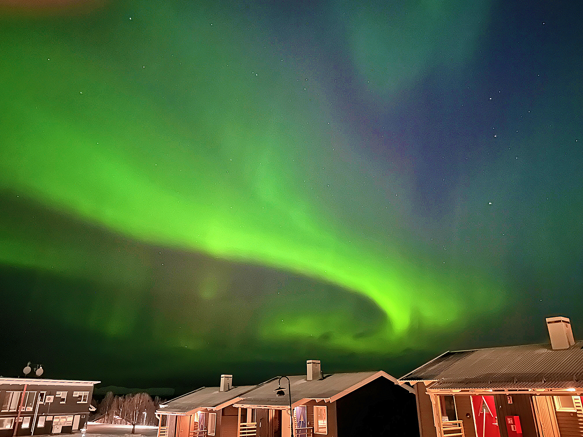
Although not during the two times I was in Alaska, I did experience the Northern Lights or Aurora Borealis in northern Finland and northern Sweden. Click on both of those links to see photographs and a short video.
Despite believing that a brand should be cohesive overall, I strangely like the exception of this particular idea of changing to the new livery on airplanes that serve international locations and the old liveries of both Alaska Airlines and Hawaiian Airlines on the remainder of the airplanes in the fleet. Both the Alaska Native caricature and the Northern Lights are indeed part of the heritage of Alaska Airlines — and unlike many other liveries, the new livery by Alaska Airlines is sleek, modern, clean, represents both heritage and movement, and uses a bold yet subtle color palette.
What are your thoughts?
The Northern Lights or Aurora Borealis in Sweden is featured in this article for the purpose of comparison to the new livery. All photographs ©2013, ©2022, ©2023, and ©2024 by Brian Cohen.
