Well, here we go again with the “secrets” about which you and I do not know — but although I was not surprised at much of the information imparted by the video, I did find it interesting to watch.
Interesting Video: Top 10 Airport Design Secrets of Which You Do Not Know The Purpose?
The ten topics included in the video are:
- Signs — The typefaces which are used; as well as the size of the letters and their placement in the airport
- Walkways — They are designed in a way for you to spend money while you are at the airport, as walking through the duty free shopping area just after you clear the security checkpoint is no accident
- The Golden Hour — This is the first hour after clearing the security checkpoint but boarding the airplane at the gate for the flight when you are most likely to spend money, as it is the time when you are the least worried and stressed out at the airport
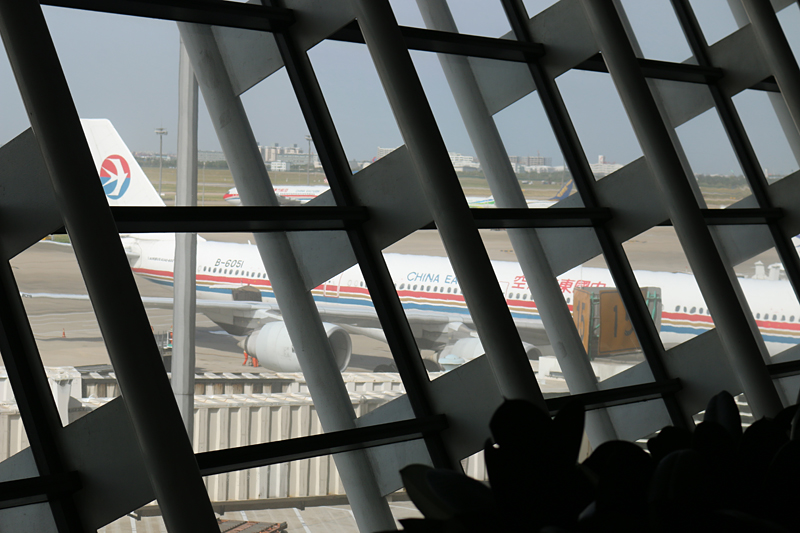
- Windows and Lights — Natural light from outside creates an ambient atmosphere inside of an airport with lots of windows, which purportedly prompts employees to work more and passengers to spend more money
- Departures and Arrivals — Because of gravity, unloading baggage downward to the lower level is easier than attempting to have belongings carried up to the upper level, which is why the Departures area is typically on the lower ground floor of an airport
- Mobile — More can be done from your portable electronic device within an airport
- Security — Airports are supposedly designed to be more secure in an attempt to lessen the possibility of being the target of a terror attack
- Floors — Markings on the floors are designed in concert with signage to help you get to where you want to go as easily as possible; and there are reasons why floors in main traffic areas are typically finished with hard surfaces but carpeted at the gate area
- Art — Works of art are not solely for aesthetic reasons
- Queues — Instead of many shorter queues, there are fewer lines which are longer; and one of the reasons is fairness: first come, first served
Summary

I thought the video was interesting; but I was not impressed.
As a frequent traveler — or perhaps you do not have much travel experience — I am curious as to your thoughts pertaining to the video from the YouTube channel of Be Amazed, as I am sure that some of the “secrets” are not a secret to you.
All photographs ©2014 by Brian Cohen.

