In past articles in which your participation was not only requested but also helpful and humorous, I did not give the answers to questions which I have posed to you; so this article is the eighth of a series to do just that — along with links to the aforementioned articles…
Answers to Past Articles — Part 8: Hilton Garden Inn Hampton Inn, Zebras With No Shadows, Traffic Signs
…and the links are embedded in the titles of each section as well as within the sections themselves; so please click on the links in each section to take you to the original article.
Also, a feature has recently been added to this particular series of articles: the Favorite Answer will usually be the correct answer by a reader of The Gate — along with a Favorite Comment from the same article which I found to be funny or informative.
What is Wrong With This Photograph? Part 36
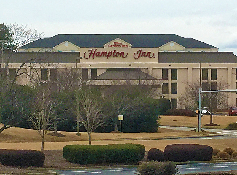
Actually, nothing is wrong with this photograph — but from where I happened to be standing, what I saw appeared to be one building housing the Hilton Garden Inn Hampton Inn hotel property. The way the Hampton Inn hotel property was positioned in front of the Hilton Garden Inn hotel property, the two buildings appeared as one — especially as the color schemes for both buildings seemed similar enough to complement each other.
The illusion did not appear as though this was a dual-branded hotel property, which has become a trend in recent years with different brands of the same lodging company — although some dual-branded hotel properties do involve the brands of different lodging companies, albeit rarely occurring. One interesting example is Hilton Worldwide and Hyatt Hotels Corporation announcing as partners in sharing a new hotel property with almost 300,000 square feet and 413 rooms, which was expected to be opened sometime during the autumn of 2017 and would be built in a development known as The Wharf on the shore of the Potomac River in southwestern District of Columbia.
Favorite answer by swag: “The game is ‘What is Wrong With This Photograph’, not ‘What is Wrong With These Signs’. So…
“Trick pic. Two buildings. The HGI is behind the Hampton (check the window tops on the HGI, just peeking out). I guess that’s why ‘a certain point in a parking lot’ matters.”
Favorite comment by Larry Mc: “Since both Hampton & Hilton Garden Inn are hotel chains owned by Hilton, Hilton Worldwide had an internal competition amongst its brands to rank themselves and Garden Inn reared its head and said ‘Ha! I’m above you Hampton’”
What is Wrong With This Photograph? Part 37
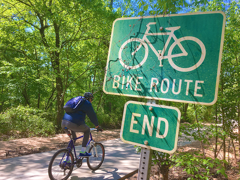
As I was walking on a trail, I noticed the bike route sign in the photograph shown above — and for some reason which is still unknown to me, the bike route simply ended.
The photograph below shows that there is no place for a bicyclist to turn off somewhere — except to turn around or walk the bicycle forward, which seemed to be ignored by bicyclists — and the trail after the end of the bike route actually appeared to be in better condition and more conducive to riding a bicycle!
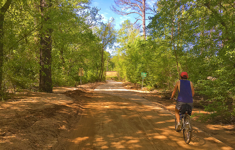
Favorite answer by Barry Graham: “Seems to be the start of the bike route, maybe it got turned round?”
Favorite comment by colleen: “I was expecting one of those RoadRunner/Wile E Coyote moments when he would be pedalling long after he launched from the cliff.”
What is Wrong With This Photograph? Part 38
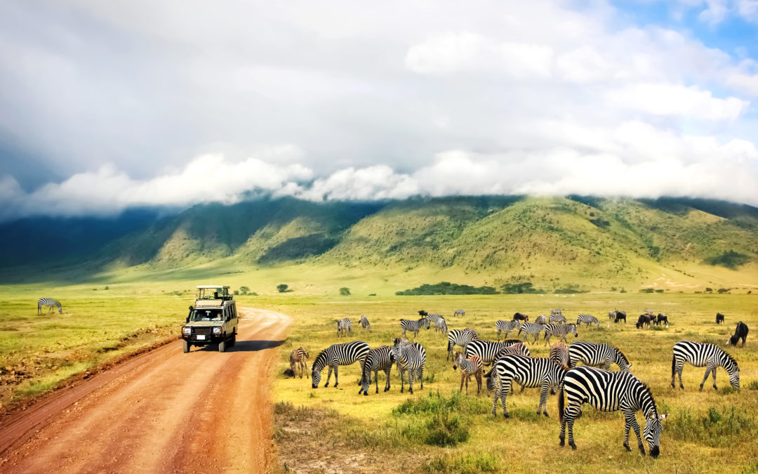
As I have been on safari in the past — details and photographs about my safari experience are found in links to past articles, which are listed later in this article — the title of this article called Save Money On African Safaris Using Points And Miles! at Miles to Go caught my attention…
…and when I saw the article, I noticed that at least one thing did not seem right with the photograph shown above — which was featured in the aforementioned article that includes an audio program hosted by Edward Pizzarello — so I asked him for permission to use the photograph in this article, to which he replied in the affirmative.
None of the zebras in the photograph have shadows; the vehicle has a shadow which no other object in the photograph seems to have; the perspective of the zebras themselves appear to be different than that of the landscape itself; and the zebras look sharper than the rest of the items within the photograph.
Favorite answer by Conny: “The zebras were photoshopped in. Their shadows are missing.”
Favorite comment by Robert L. Miller: “Part of this photo is in black and white, while the rest is in color.”
What is Wrong With This Photograph? Part 39
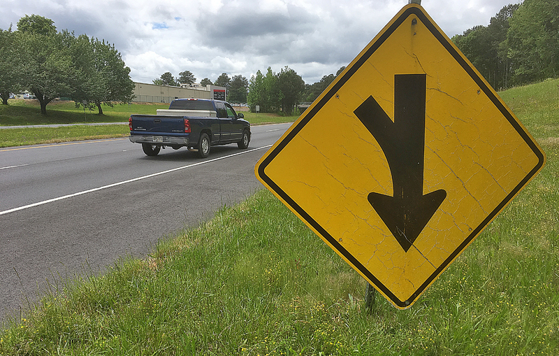
I recently drove a short distance near where I am based in order to run an errand — and I saw this traffic sign showing a symbol warning of merging traffic ahead. However, the sign lost the fastener at the top, which caused it to flip upside down and create a humorously weird “new” sign.
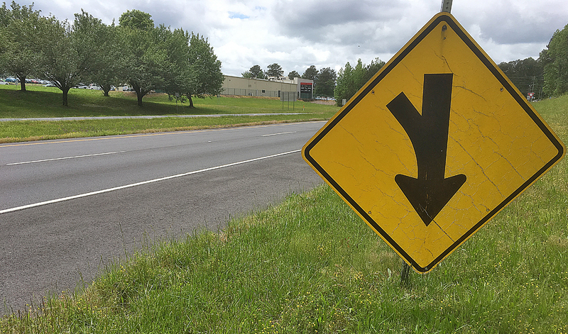
Favorite answer by derek: “The arrow suggests that one is going down the wrong way of a one way street.
“The sign looks like it’s up side down.”
Favorite comment by John Maynes: “Signs are able to get COVID-19 – this one is on the mend but it will be back stronger than ever once over it.”
What is Wrong With This Photograph? Part 40
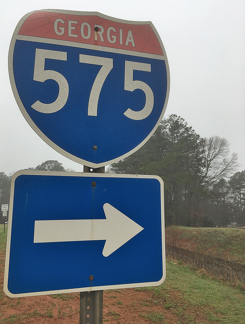
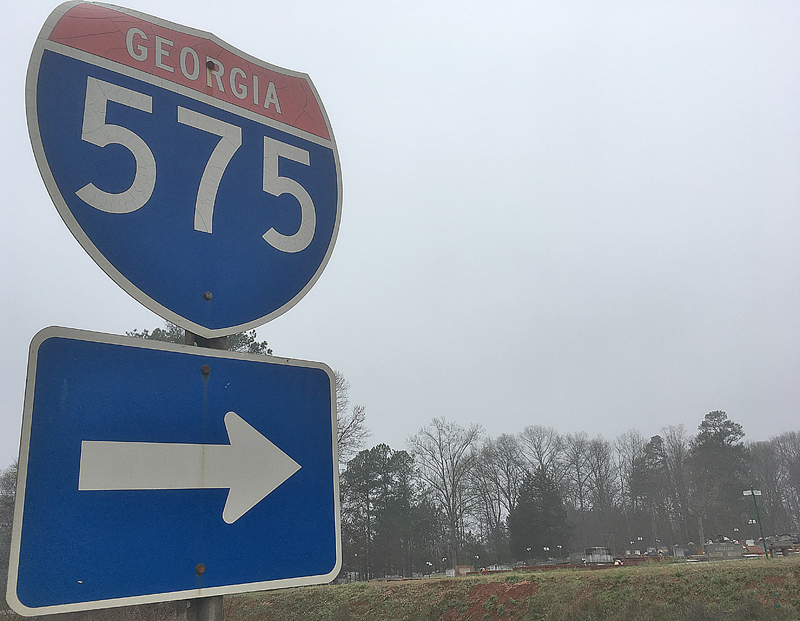
I have never seen an Interstate highway route sign quite like this one before: the area in red is supposed to have the word INTERSTATE in it; but instead, GEORGIA is in that space instead — and it therefore does not conform to the standards of the Federal Highway Administration of the United States as outlined and detailed in the Manual of Uniform Traffic Control Devices.
That the sign itself is faded and cracking in some places does not help matters. It likely should be replaced.
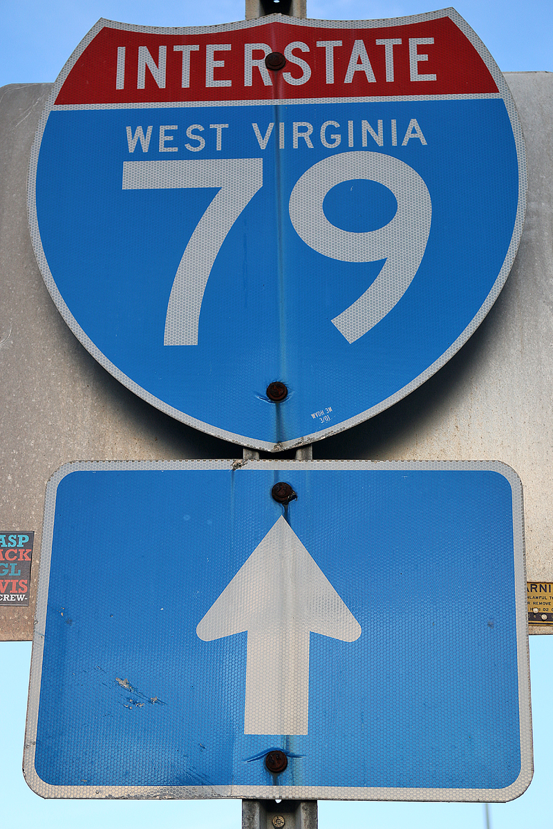
In addition to the standard by which the design of the sign is required to adhere, an available option is that “Interstate Route signs may contain the State name in white upper-case letters on a blue background” as according to Section 2D.11 Design of Route Signs of the Manual of Uniform Traffic Control Devices.
Indeed, sometimes the name of the state is on an Interstate highway route shield — and if it is, it is located above the number in smaller letters but below the red field, as demonstrated in the photograph shown above…
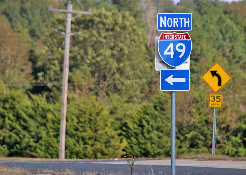
…whereas in the example in the photograph shown above, the state is not printed on the sign.
Favorite answer by Brutus: “‘Interstate’ should be written in white letters in the red section. ‘Georgia’ should be in small white letters in the blue background above ‘575.’.”
Favorite comment by Ben LeRoy: “My understanding is this is a trademark violation. It should only state ‘Interstate’ in the red area. From some quick reading the federal interstate ‘shield’ is the only trademarked road sign in the US and should not show a state name as part of the Eisenhower Interstate System.”
Summary
More answers to past articles will be forthcoming in future articles; and answers to past articles in the What is Wrong With This Photograph? game — which have already been answered — include:
- Answers to Past Articles — Part 1: Muffin Flavor, Beverage Machine, Pickle, Map, and Steak
- Answers to Past Articles — Part 2: Airport, Lounge Sign, Fish Sandwich, Bed Bugs, and Airplanes
- Answers to Past Articles — Part 3: McDonald’s, Lavatory Door Sign, Ice Cream, and Speed Limit Signs
- Answers to Past Articles — Part 4: Noodle Noddles, Gasoline Prices, Traffic Signs, and How Many Spices?
- Answers to Past Articles — Part 5: US Airways Magazine, Fan Feeback, and Highway Signs
- Answers to Past Articles — Part 6: Weird Map, Mask and Goggles, Deal of the Week, Bicycle on Hill, and Electrical Box
- Answers to Past Articles — Part 7: Chicago Hot Dog, $11.2 Million Mistake on Can, Yield Sign, and 2019 Novel Coronavirus Edition Photographs
Unless otherwise noted, all photographs ©2017, ©2019, and ©2020 by Brian Cohen.
