
As The Gate approaches its anniversary of 15 years in fewer than three weeks, it has abandoned a layout which was used for almost seven years as part of a theme which was so outdated that it was no longer supported by its creator.
Welcome to The Gate. Newly Designed.
The Gate had been recently experiencing a number of technical glitches which could no longer be fixed. Some of them had patches which helped; but they were only meant to be temporary and not used on a permanent basis…
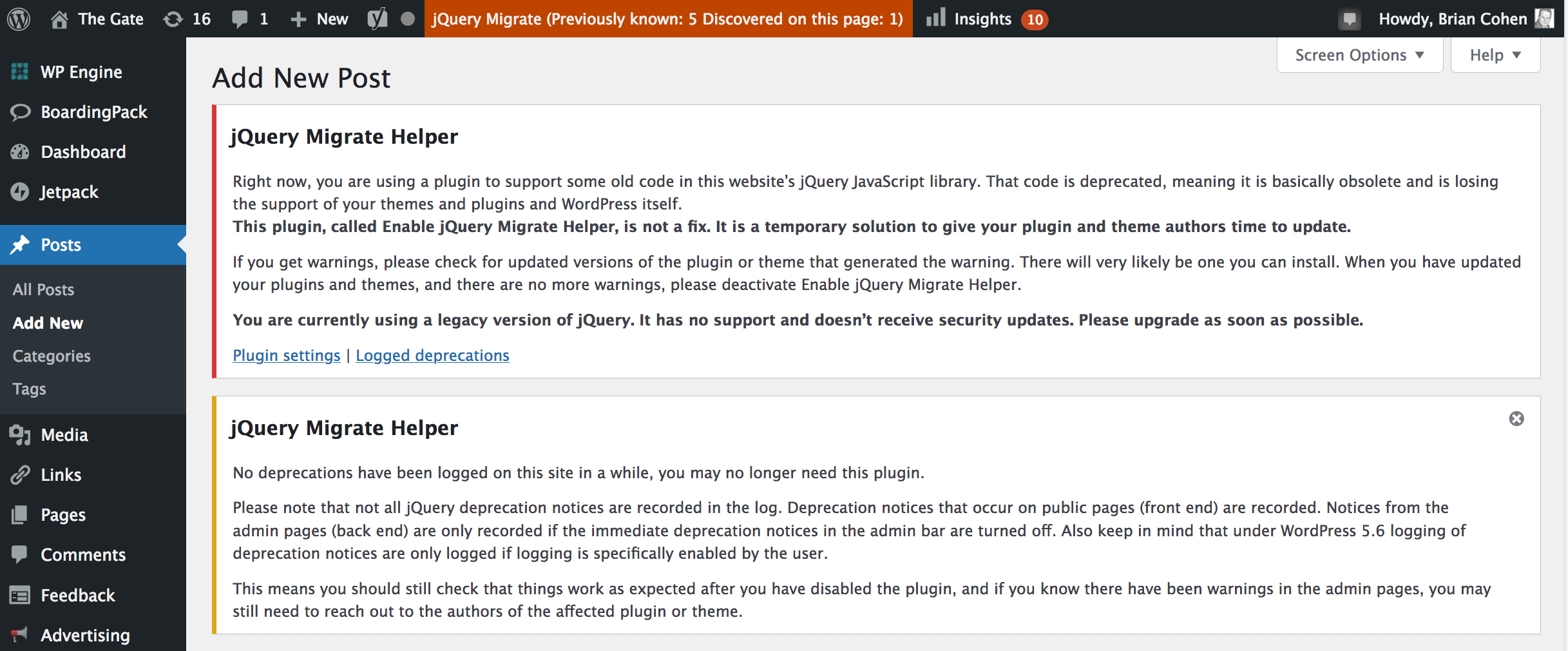
…which meant that the theme which powered The Gate needed to be replaced — and along with that, a redesign which was sorely needed.
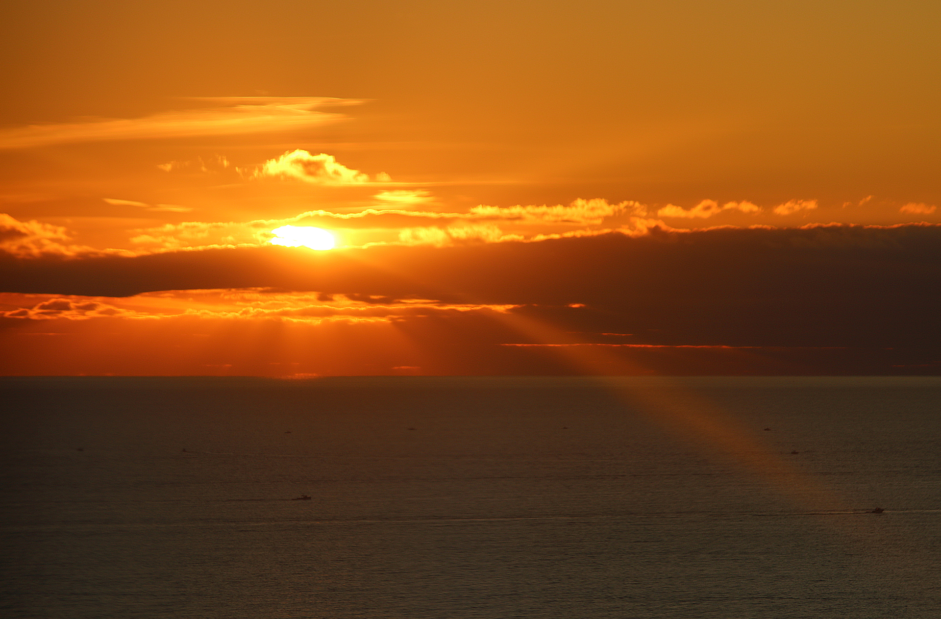
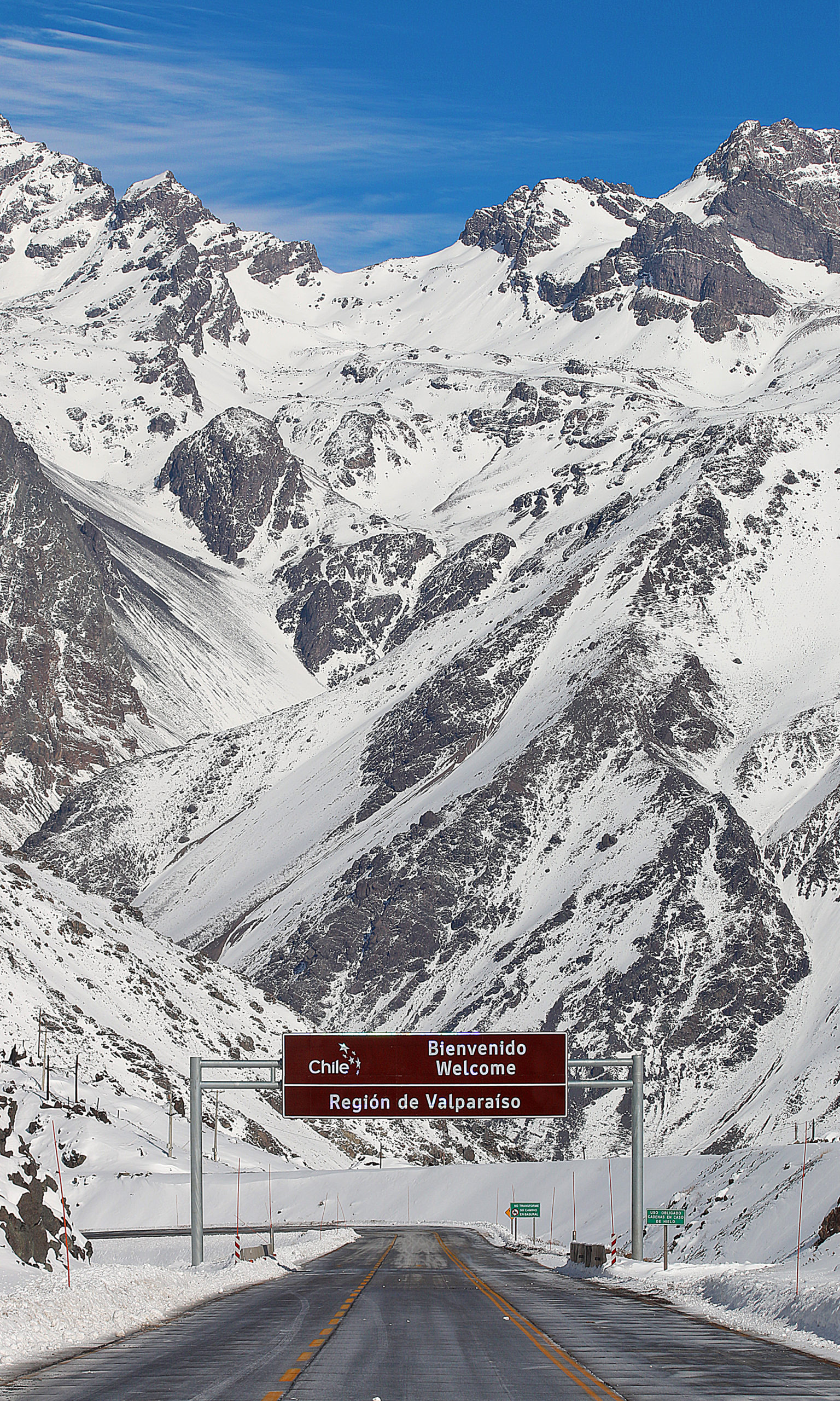
I did not want The Gate to look just like any other weblog on BoardingArea, as this was a chance to create something a little bit different. In addition, I literally have hundreds of trip reports and reviews — which I intend to call my experiences from here on in — from over the years, with literally thousands of photographs to accompany them. As a graphic designer and photographer who earned a Bachelor of Fine Arts degree at Parsons School of Design in New York — as well as studied for a month in Paris and three weeks in Côte d’Ivoire — the former layout design was not conducive to highlighting my photography; so I chose a layout which placed more emphasis on photographs in a cleaner design…
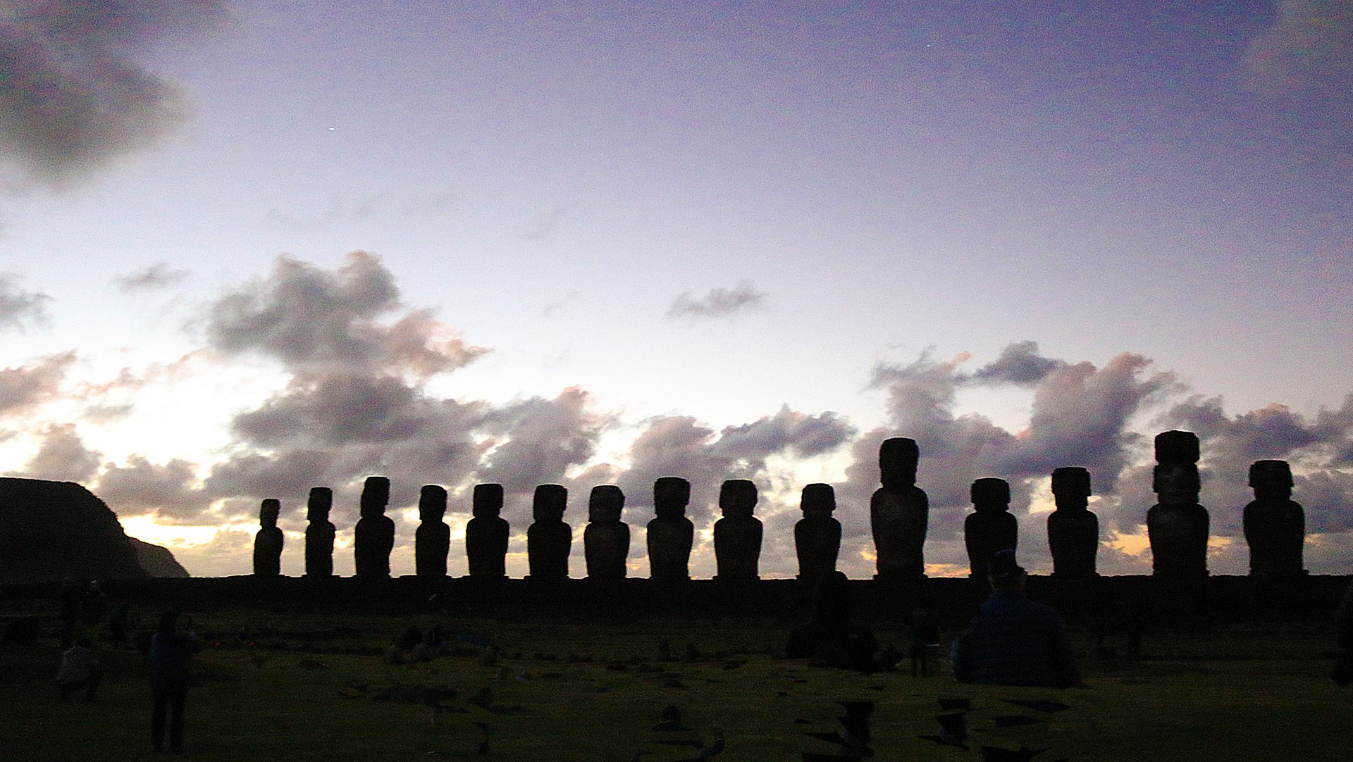
…especially as I estimate that at least 85 percent of the photographs which are used at The Gate are taken by me. Many other weblogs — including at BoardingArea — use stock photography.
Also part of that clean design was the elimination of the sidebar on the right side, which included a Search field, a button to subscribe to the official newsletter of The Gate, advertising, a list of the top posts and pages, a list of recent comments, a list of archives by month, a list of categories, and a list of tags. Those items were either relocated elsewhere — or eliminated altogether. I wanted more white space — which is also known as negative space in design terms — to help accentuate the actual content itself.
Within the former design, discerning the advertising within the articles themselves from my photographs proved to be difficult at times. The new design helps to differentiate them better.
I also selected typefaces which also help to give The Gate an overall look which is more recognizable while simultaneously adding contrast.
Gone is my photograph from the official logo, as it was taken years ago and was getting too old. I explain in this article why I chose to use a photograph of myself in the official logo of The Gate. I believe that with the new layout and design, I have been able to transfer the identity of The Gate without needing to use my photograph any longer, as photographs become obsolete as time passes.
Final Boarding Call
I decided to abandon Summary as the name of the subheading of the last item in each article, as sometimes the “summary” was longer than the remainder of the article itself — plus, not all content which was included in the Summary was an actual summary. Instead, I thought I would use a term which is used at the gate at an airport prior to boarding the airplane: “Final Boarding Call”.
Tweaks will likely be implemented over the coming weeks to help further improve the design and layout of The Gate.
I truly appreciate your support of The Gate over the past 15 years…well — almost 15 years; and I look forward to your continued support. Thank you.
All photographs ©2017 and ©2019 by Brian Cohen.
