a person's head with text
The Gate with Brian silhouette

I Do Care About What You Think — The Photograph of Me

“I’m sure he’s a wonderful person, but that photo/banner still bugs the crap out of me. It’s entirely gratuitous. I’m sure he doesn’t care what I think, but Brian, if you’re reading, maybe consider changing it to something else?”

I realize I most likely am opening that proverbial can of worms by responding to this comment posted by FlyerTalk member nineworldseries — but I do care about what people think.

In fact, listening to what readers think is ironically why I chose to use a photograph of myself as part of the branding of The Gate. My thought process was that I wanted to use a photograph of myself as a symbolic way of assuring readers that I stand behind the articles which I write and post; that I am not hiding behind some pseudonym and yet another blue logo on BoardingArea; and that I am held accountable whenever I post incorrect information or commit an error — which unfortunately happens at times, no matter how diligently I attempt to prevent that from happening.

The use of a photograph of me is also supposed to emulate something similar to the identity of a column in a newspaper. It is a unique way of instantly identifying who wrote the content you are about to read…

…but things did not go exactly as planned.

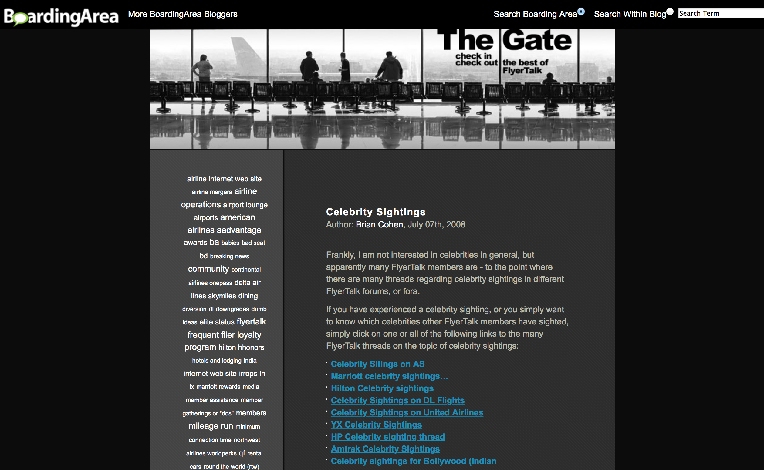
The Move From FlyerTalk to BoardingArea

The tagline to The Gate from its debut in August of 2006 to Thursday, July 31, 2014 was “Check In Check Out the Best of FlyerTalk”; and FlyerTalk was no longer going to be the sole intent of the theme and purpose of The Gate, as I wanted to inject more of myself and my experiences into the articles which I write.

Screen shot of The Gate from July 7, 2008.
The Gate at BoardingArea from July 7, 2008.

While discussions were ongoing pertaining to The Gate moving back to BoardingArea, this was the design of the front “page” of BoardingArea as late as Friday, June 20, 2014.

Screen shot of BoardingArea from June 20, 2014.
BoardingArea from June 20, 2014.

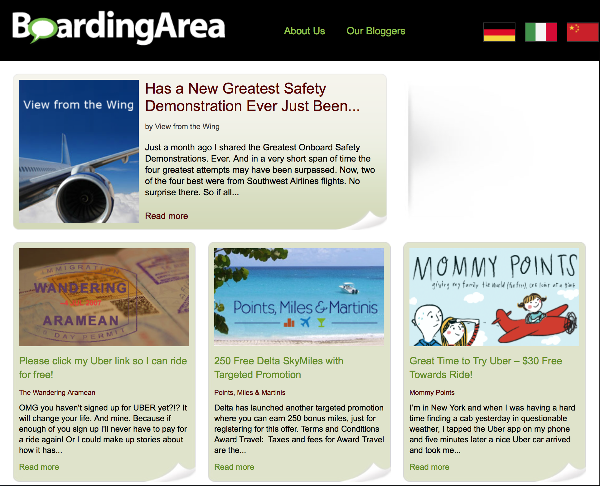
Look at how small were the graphics identifying each weblog.

With that in mind, I took the black-and-white background from the original logo and faded it while placing a color portrait of myself in the foreground, as I wanted something which would uniquely identify me — especially as I became the only writer for The Gate.

On Friday, July 18, 2014 — as part of an e-mail message I sent to Randy Petersen — I wrote that “I toyed around for a few minutes with a very rough idea — not the final art — for a graphic for The Gate; and I just wanted to know what are your thoughts.” This led to the final graphic which currently identifies The Gate

…but I initially thought that when The Gate debuted its return to BoardingArea on Friday, August 1, 2014, it would be a small graphic similar to the sizes you see in the aforementioned screen shot.

Instead, I saw this gigantic photograph of myself due to the fact that the front “page” of BoardingArea underwent a significant design change. Mortified is the word which immediately comes to my mind when I saw just how large was that photograph of me.

I am not by any stretch of the imagination narcissistic in any way; and the use of my photograph as part of the logo of The Gate is not meant to be gratuitous — but with a photograph of me that large on the front “page” of BoardingArea, I can certainly understand why some people might feel that way.

The Problem With Branding

The problem with branding is that you cannot simply switch from one identity to another, as that affects your audience. The Gap and JC Penney are two of many companies which attempted changes to their brands — not that their more familiar branding was exactly the best ever in the corporate world — and met what could have been disastrous results had they not reverted back.

Because of the moves which The Gate has experienced during its history — debuting at FlyerTalk in August of 2006; moving to BoardingArea as one of its original weblogs on Thursday, December 27, 2007; moving back to FlyerTalk on Wednesday, May 4, 2011; and returning to BoardingArea on Friday, August 1, 2014 — I have had to build and rebuild readership four times, as The Gate suffered from an identity crisis from all of those moves. Because of this, I am naturally hesitant to effect yet another change — especially as readership has steadily increased.

Also, there is the possibility in the not-too-distant future that BoardingArea might undergo another change in design on its front “page” — and if that is the case, I would rather wait until after that happens before refreshing and updating the logo of The Gate.

I will have to eventually update the logo of The Gate anyway, as the photograph of me currently being used is now several years old — but I just do not want that logo to be yet another generic reference to an airline gate or points or miles or travel. I want for it to be unique and instantly identifiable.

Summary

I am always open to constructive feedback. If you have any ideas on what you think would help improve The Gate, please let me know…

…because even though I might not always agree, I do care about what you think.

  1. since you asked…

    you have a rather large forehead in the picture. not sure if it’s really that large IRL, but the picture give off that impression

    1. Well, no one has told me that when they meet with me, lopere; but I do not believe that my forehead in real life seems rather large — especially as I have some experience in acting and modeling.

      Might it be the photograph — and the angle at which it was taken — giving that impression? I am not sure…

  2. Brian,

    This is a coincidence, because I was just thinking about writing you about this very subject. While I think you’re a perfectly nice looking guy, that huge photo of you looming over the top of your blog is very off-putting to me. As an advertising professional, I don’t think it is communicating trustworthiness, but is instead communicating that you must have be very narcissistic, even though that is not at all what you’ve been attempting to communicate. Because of this, I think the damage it has been bringing to your brand is much greater than changing would be. And don’t forget that companies successfully re-brand all the time, changing their logos, or even changing their entire identity, as Allegheny Airlines did in 1979 to US Airways! If it were me, I’d change it!

    1. You have expressed valid points, Rick — and I cannot argue with them. I appreciate your input…

      …but as an advertising professional, to what would you change it — without it being another generic image or logotype which does not differentiate it from other weblogs?

      1. “but as an advertising professional, to what would you change it”

        Unfortunately, I can’t give you an easy answer! Effective logo and identity solutions usually come about after a good deal of time and effort is expended. But if you can’t come up with a great new idea, than maybe an acceptable compromise answer would just be one of scale. Even just making the existing headshot smaller while keeping the other existing graphic elements would be better than the present design, in my opinion.

        1. I earned a Bachelor of Arts degree in communication design in New York, Rick; so I know all about effective logo and identity solutions — when it comes to other people…

          …but when it comes to myself — well — it is like the cobbler without shoes; which is why I asked you for your opinion.

          I would think that you probably understand how difficult it is to have yourself as a client…

  3. I vote for removing the picture or adding a rug on the forehead. 🙂 Seriously, the photo is kinda odd to me, but either way your blog is great! Keep up the good work, Brian.

    1. I smiled at that, Gene.

      I would like to think that the content is what is truly important; but Rick commented with some valid points — and if changing the image will mean more readers, I am more than willing to do it…

      …but change the image to what?!?

  4. I like the photo. I’m a visual learner and I quickly associate it with your blog. I also notice Shawn Coomer’s Photo at the bottom of Miles to Memories blog and quickly associate it with him. I read a lot of blogs and listen to a lot of podcasts. One thing I’ve learned from them is that most people (not all) like the back story or the soap opera aspect. They want to be able to relate to you personally like they know you. The photo helps as do personal experiences.

    1. Portraits and headshots are somewhat like fingerprints — they are unique.

      Like Rick, you have also brought up some cogent points to consider.

      Thank you, DaninMCI.

  5. To me, your picture conveys honesty and an almost folksy demeanor. Offputting? What a load of crap. Also to opine that you have a large forehead is preposterous and pathetic. How many people 1) have the balls to put an actual picture of themselves instead of some silly avatar or a picture of Curly or some silly caricature, and 2) how many people look like you at your age?

    Your picture is fine just like it is. You’re a handsome guy who obviously takes care of yourself. If someone is put off by it then he/she should really consider getting a life. I’ve heard Trump is offering a 2 for 1 sale so if you don’t indeed have a life maybe it’s time to consider getting one.

    Blind Squirrel

  6. At first i felt the same – almost put-off by the large picture. But as I’ve spend more and more time reading the content of The Gate, the photo has given me a feeling of transparency, honesty – almost trustworthiness.

    If I see another f*cking picture of champagne in F/J seats/lounges i will honestly puke – i stop reading those blogs. So what I see is that you have risen and set yourself apart. Keep up the good work and don’t change the photo.

    1. I could not help but laugh when I read the line about photographs of champagne, Coffey77!

      I can assure you of no photographs of champagne at The Gate — for the simple reason that I do not drink alcoholic beverages.

      Thank you for posting your thoughts. I appreciate them…

  7. Yeah I kinda agree that having the photo at the top of the blog is a bit off putting. My suggestion is keep a small photo at the bottom as a kinda signature of sorts and pick a new banner that is indicative of the new brand you want to convey. That way you are still putting your face (and reputation) on every article but it doesn’t smack you in the kisser every time you load and article. To be honest I really like your blog and think that pic does put off that narcissistic vibe (almost trump like some would say) where if I read your blog you don’t seem to actually hold those views yourself. Just my two cents.

  8. I think from a branding perspective you should keep a photo but it should age with you or at least change from time to time. Evolution not Revolution. I do not think the photo is good or bad but as you have made it part of your brand…well it’s part of your brand and nothing wrong with that.

    I like the blog and I read it because of the content…the photo/branding serves to remind me of the quality of the content. Without the experience of the content, I don’t think the photo would either put me off or attract me to the blog.

    That said, we all age and with time and I think the WSJ has a really good approach to this.
    http://topics.wsj.com/person/A/biography/1432

    1. Reading your comment — along with some of the other comments — gave me an idea, The Diamond Z

      …an image just flashed through my head: a full-body image of me walking out of an actual airport gate holding my carry-on bag, with the title as the main element. This way, I still get to stand behind my brand without appearing narcissistic; there is an image of a gate; and it will still differentiate from the branding of other weblogs.

      I may have to create a rough draft of what I envision, as it is difficult to convey merely using words.

      I agree with the aging part. I am older now than when the photograph of me was taken several years ago — although I do not feel like it — and I have no problem with aging as long as I am having fun, traveling and enjoying life.

      No, I do not want it to look hokey; but I would like for it to be professionally shot and yet appear candid and natural.

      I will read the link which you have provided. Thank you, The Diamond Z.

      1. I mistakenly thought your link was an article, The Diamond Z; but I see that it shows a rendering of a photograph of Scott McCartney of The Wall Street Journal, which does what I believe is a great job with what were the photographs of all of its writers.

        BoardingArea actually does something similar with any “blogger” who submitted a photograph. I submitted a different photograph of myself — and the result turned out worse than I expected.

        See for yourself, as I look quite angry or put off for some reason:

        http://boardingarea.com/our-bloggers/

        Keep in mind that each time you click on the above link, the placement of the images changes randomly; so my image will not be in the same position each time you visit…

  9. I don’t see anything wrong with the logo. If you were to change it though, I would still use a similar picture, just with more of a smile. Show more of a friendly vibe. I know that can sometimes be viewed as a negative as far as you not being serious enough, as there is always a balance between sincerity, and comedy. I don’t think the current one is smug or bad but I think you could just appear more friendly in it. Just my two cents. Keep up the good work.

  10. I read your blog from time to time, but not very often. Mainly because I stopped reading a lot of blogs years ago. I happen upon an article from time to time and do think that you do an excellent job on the blog. I also think that your response to the original remark was well done.

    I will have to say, that I do have the impression of the picture being very big. Whenever someone talks about your blog, I instantly see your picture in my head, so it has been effective that way. However, when I study the picture, it isn’t that big – it is the size of the picture in relation to the people in the background. This gives me the feel of a floating head and I think that this also seems to give the impression of a larger forehead. While I like the idea of using a full length picture, I like the idea of updating your head shot and working with a different banner design a little bit more.

    1. You might be onto something with regard to perceptions caused by perspective and the possible optical illusions as a result, Katherine.

      That is a very good point to consider; and I appreciate your…er…perspective as well as your thoughtful suggestions. Thank you also for the positive comments.

  11. Haha – very brave to take this on !

    As a long time reader – I have to say at first your mug shot annoyed me – but I’d read just to mutter quietly to myself about how much your logo looked like you we’re going to sell me a house.

    Your topics however are genuinely interesting and I’m over that phase of hate reading ! But seriously, I’m sure there are others similar to me, and I’m sure you’d benefit from being a little more neutral – I know and trust the writings of many other boarding area bloggers – and I can tell immediately when a guest blogger makes an appearance.

    TheGate is your brand – step back and let it grow!

    1. I too can tell not only when there is a “guest blogger”, John W; but also when the content of an article is “sponsored.”

      Thank you for your thoughts and opinions — about which are definitely worth thinking…

  12. My comment, that I am sure OliveOil on FT will dump, was:

    “The BBB should never have come into existence.

    Clearly the M O D eration is atrocious.

    It is no wounder FT is asking for help of what to do next.

    Close this board would be step one! ”

    But your work on FT on the DL board is quite good btw as well as your fellow MODS but still needs work. If INTERNET BRANDS is smart they would close down the BBB or Blog Bashing Board if they want FT to have any chance to return from the gutter it is becoming.

    1. I think it is important to note that many comments — no matter how abusive they may seem — usually have some valid basis to them, René.

      Also, no one is immune from being the target of negative comments — no matter for which media company one writes or what is said in the article or video. This includes the most respected writers for the largest media organizations.

      In my opinion, it is important to weed out the abusiveness and see what the commenter is attempting to say; and I then do my best to learn from that thought and apply it to the future.

      Feedback is a gift; and I would rather receive negative feedback — preferably constructive — than no feedback at all, as that would mean that no one is reading The Gate.

      1. Amen to that Brian. Feedback is a gift indeed. Thank you for sharing your thoughts; I admire you wanting to put a personality and face to your blog as a way to stand by what you write. Kudos!

        1. Thank you so much for your comment, itsaboutthejourney.

          I hope you are doing well. Too much time has passed since I last saw you…

  13. I don’t mind the header – you’re a handsome guy and I’m sure it helps to attract some eye balls from the fairer sex (and others). : )

    But here is a legitimate concern – when you travel, do you want to be recognized as a travel blogger – and possibly get better service and treatment? Or would you rather have experiences as an anonymous traveler and thereby, provide a more unbiased review?

    I won’t be surprised if most large airlines and hotel chains have some famous bloggers’ photos up on their “Top 10 Bloggers To Be Nice To” on their wall. That’s why I take reviews by Gary, Brian K., Lucky and such with a grain of salt (and sand) – because I’m pretty sure they get preferential treatment for being well-known bloggers and have large number of followers and readers.

    Just my 2 cents. (But free for you, Brian!)

    BTW: I appreciate that you’re not pushing credit card sign-ups and other links down our throats. I tweet and write reviews on TripAdvisor and other places to share what I’ve learned and experienced with others, not as a financial means to travel some more. I cannot fault others for doing so as I do find some of their advice helpful and valuable but for my part, I prefer to be altruistic about it.

    Keep up the good job, Brian C. and we’ll see you in 10 years’ time to celebrate your 20th anniversary.

    1. Believe it or not, TOM, I never actually thought about recognition simply because I have never had a desire to be famous in any way; and I have never been treated special simply because I write about travel.

      I have had a few trips over the years which were paid by a “sponsor” of some sort — but I have always been up front with them, letting them know that my reviews will be honest. I even tell them that that is actually good for them, as my criticism is usually constructive. Giving a shining and glowing review just because they paid for a trip serves no one any good, in my opinion — and the trust of readers of The Gate is more important to me than any compensation…

      …so if the day ever came where someone recognized me and tried to give me special treatment, I would either report honestly on it or refuse it altogether. I really do not need a suite to enjoy a hotel stay; I do not drink alcoholic beverages; a seat in the premium class cabin is nice but not a requirement for me to travel; and a number of amenities and benefits would be wasted on me because I probably would rather not use them.

      I admire your altruism, TOM. Mine is more of a blend of altruism — I still participate regularly on FlyerTalk, as one example, and without even a link to The Gate even though it is permitted — and compensation, as I am building up The Gate so that I may travel more and give more trip reports and reviews. There is no hidden agenda here.

      Your last line made my day, TOM. I plan to be around for the 20th anniversary of The Gate

      …and please feel free to post your experiences in the Comments section of any article which you believe is related. I enjoy when we all share our travel experiences.

      Thank you so much, TOM.

  14. Scrap the photo. It’s much too large and in-your-face, it’s narcissistic, and it does nothing to enhance your credibility. A number of your readers are put off by it, so why keep it? Kudos for soliciting input.

Your email address will not be published. Required fields are marked *

Subscribe To Our Newsletter

Join our mailing list to receive the latest news and updates from our team.

You have Successfully Subscribed!