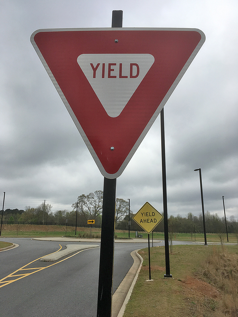
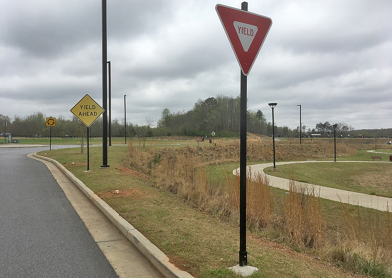
I have been walking a lot lately — think miles of walking, especially as the springtime weather has been conducive lately to being outside to enjoy a pleasant morning, afternoon, or evening — to escape from the continued madness which is the 2019 Novel Coronavirus pandemic…
What is Wrong With This Photograph? Part 35
…and as I was walking along a street, I found something which did not immediately catch my eye because I was not driving a vehicle.

For this edition of this popular game, can you guess what you believe is wrong — or, at least, quite bizarre — with this photograph?
Please submit your answers in the Comments section below — and I enjoy reading creative answers.
Thank you in advance. As always, I cannot wait to read your answer and feedback.
Summary
Past articles with which you can participate and play along with the What is Wrong With This Photograph? game include:
- What is Wrong With This Photograph? Part 34: Coronavirus Edition
- One Illogically Irrational Aspect of the 2019 Novel Coronavirus Pandemic is…
- What is Wrong With This Photograph? Part 32
- What is Wrong With This Photograph? Part 31
- What is Wrong With This Photograph? Part 30: Coronavirus Edition
- What is Wrong With This Photograph? Part 29
- What is Wrong With This Photograph? Part 27
- What is Wrong With This Photograph? Part 26
- What is Wrong With This Photograph? Part 25
- What is Wrong With This Photograph? Part 24
- What is Wrong With This Photograph? Part 23
- What is Wrong With This Photograph? Part 22
- What is Wrong With This Photograph? Part 21
- What is Wrong With This Photograph? Part 20
- What is Wrong With This Photograph? Part 18
- What is Wrong With This Photograph? Part 17
- What is Wrong With This Photograph? Part 16
- What is Wrong With This Photograph? Part 15
- What is Wrong With This Photograph? Part 14
- What is Wrong With This Photograph? Part 13
- What is Wrong With This Photograph? Part 12
- What is Wrong With This Photograph? Part 11
- What is Wrong With This Map of the Continental United States?
- What is Wrong With This Trivia Photograph?
- What is Wrong With This Outback Steakhouse Poster?
- Is There Something Wrong With This Photograph From Avis?
- Can You Spot the $11.2 Million Mistake on This Can?
- What Two Errors Can You Find With This Lavatory Sign?
- Read the Fine Print — A Lesson Taught By the McDonald’s in Hinton
- Was I Too Blinded By Hunger to Read This Sign Correctly?
- What is Wrong With This Article About Bed Bugs?
- What is Wrong With This Burger King Extra Long Fish Sandwich Image?
- What is Wrong With This Photograph? Part 2
- What is Wrong With This Photograph? Part 1
- Answers to Past Articles — Part 2: Airport, Lounge Sign, Fish Sandwich, Bed Bugs, and Airplanes
- Answers to Past Articles — Part 1: Muffin Flavor, Beverage Machine, Pickle, Map, and Steak
All photographs ©2020 by Brian Cohen.

