
When driving on many of the roads and highways in the United States, you may have noticed that some states use two completely different typefaces: the FWHA series, which has been used by the Federal Highway Administration of the Department of Transportation of the United States for decades; and a relative newcomer called ClearviewHWY, which has been controversial since it was introduced.
Why ClearviewHWY Typeface For Highways Is Controversial
ClearviewHWY is part of the Clearview Typeface System that was created by Donald Meeker and James Montalbano of Meeker & Associates, Incorporated and Terminal Design, Incorporated — and the anatomy of how and why this typeface was created is explained and illustrated on the official Internet web site of ClearviewHWY.
At least 23 states in the United States and every province and territory in Canada — with the exception of Ontario, New Brunswick, and Prince Edward Island — use ClearviewHWY as the official typeface for their road signage, according to this article at AARoads. The ClearviewHWY typeface is also used in Brazil, Indonesia, Israel, the Philippines, and Sri Lanka. Additionally, at least 13 states in the United States and Ontario and New Brunswick use the FWHA series; but ClearviewHWY has been spotted at the municipal level. That number needs to increase to at least 14 states, as some municipalities in Georgia use the ClearviewHWY typeface for their signage.
Before delving into further information, the following is a series of comparisons between both typeface families.
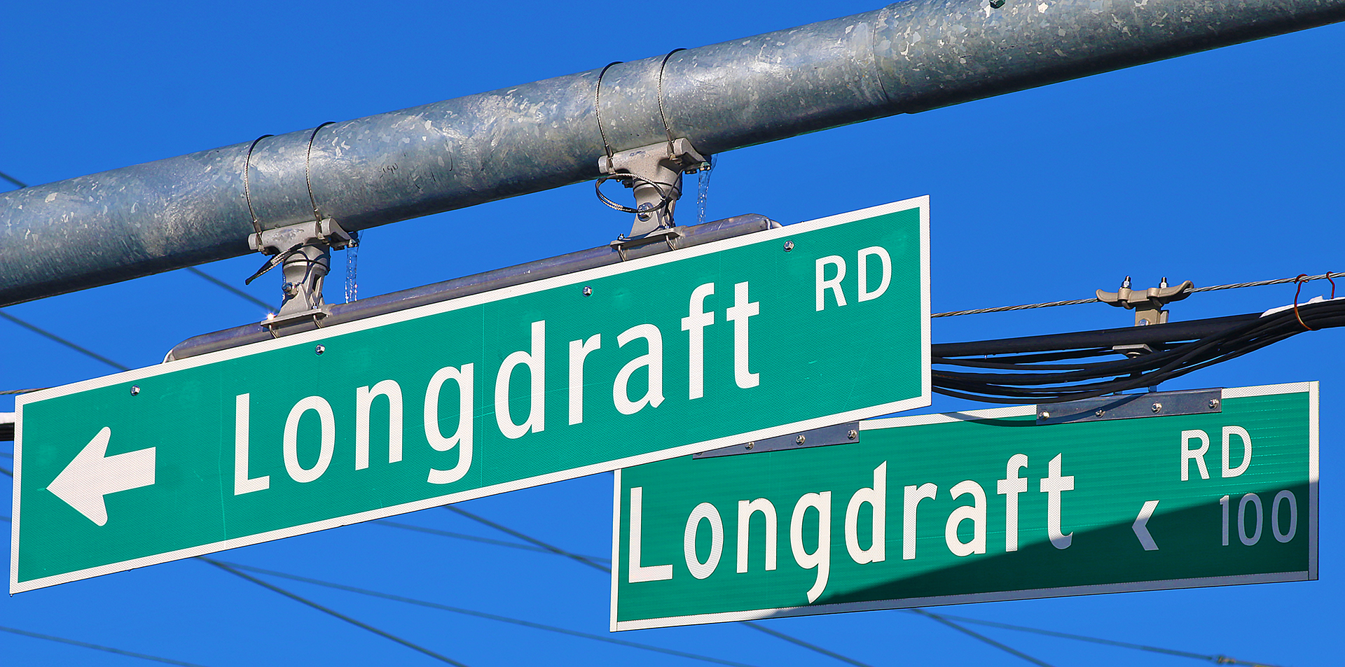
Longdraft Road in Gaithersburg in Maryland was in the process of having its street signs changed from FWHA series C on the lower left of the above photograph to ClearviewHWY 2-W in the foreground.
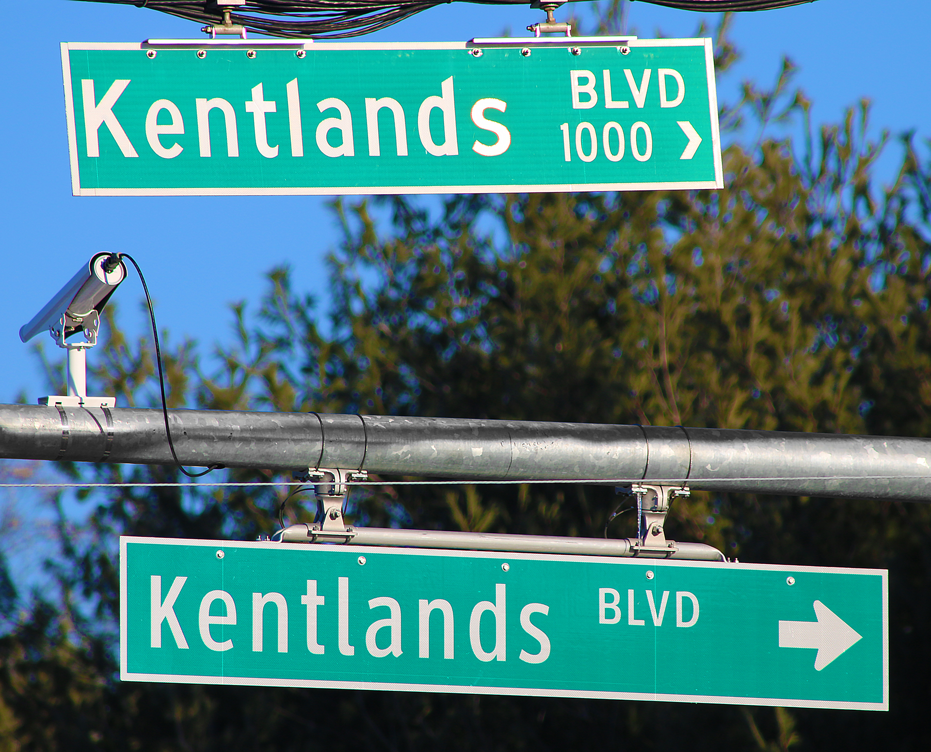
Also in Gaithersburg, Kentlands Boulevard was in the process of having its street signs changed from FWHA series C on the top of the above photograph to ClearviewHWY 2-W at the bottom.
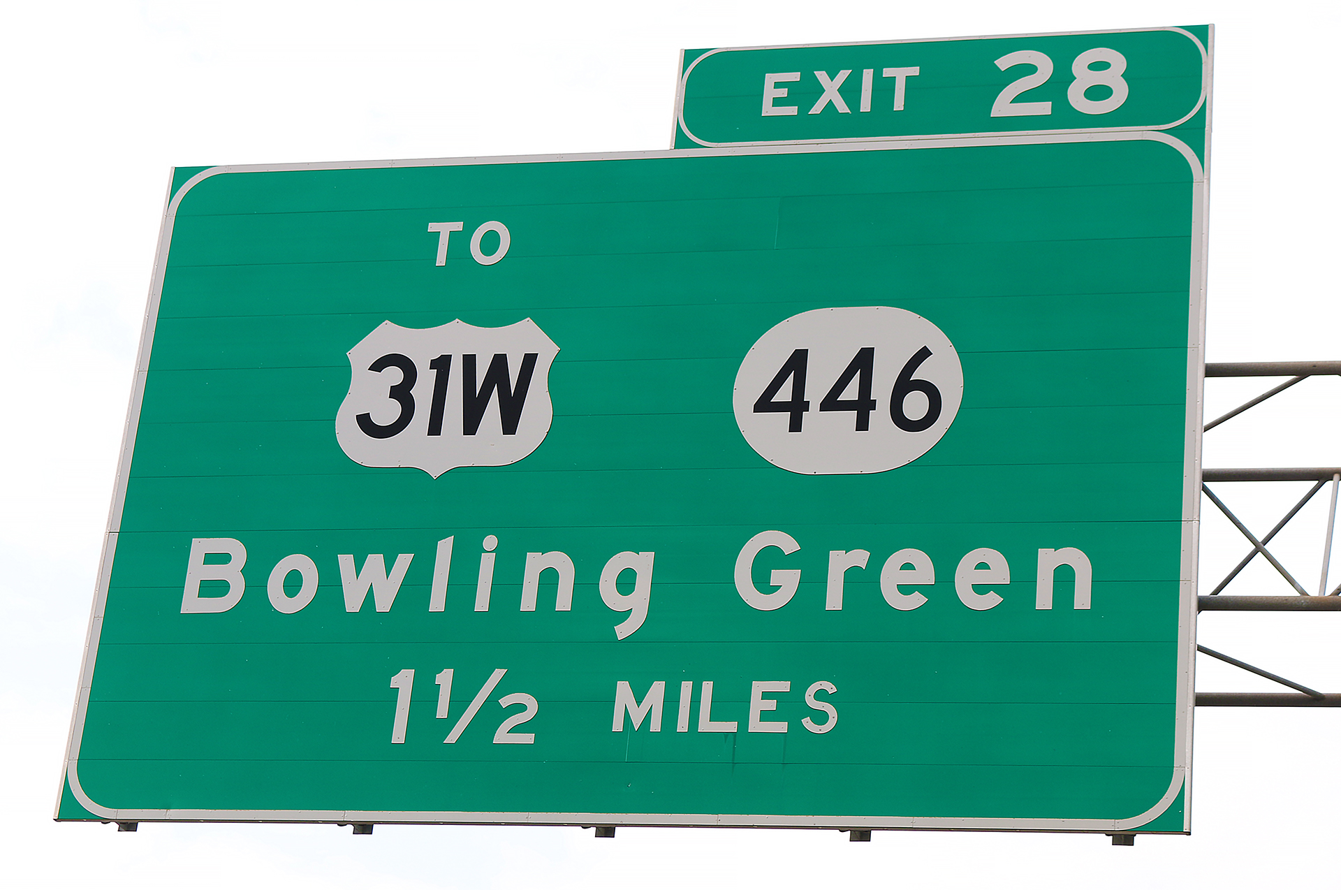
The overhead sign on Interstate 65 for Exit 28 in Bowling Green in Kentucky uses FWHA series E MOD — with the exception of the numbers in the highway shields; and the capital letter S in MILES which mistakenly uses FWHA series D for some reason…
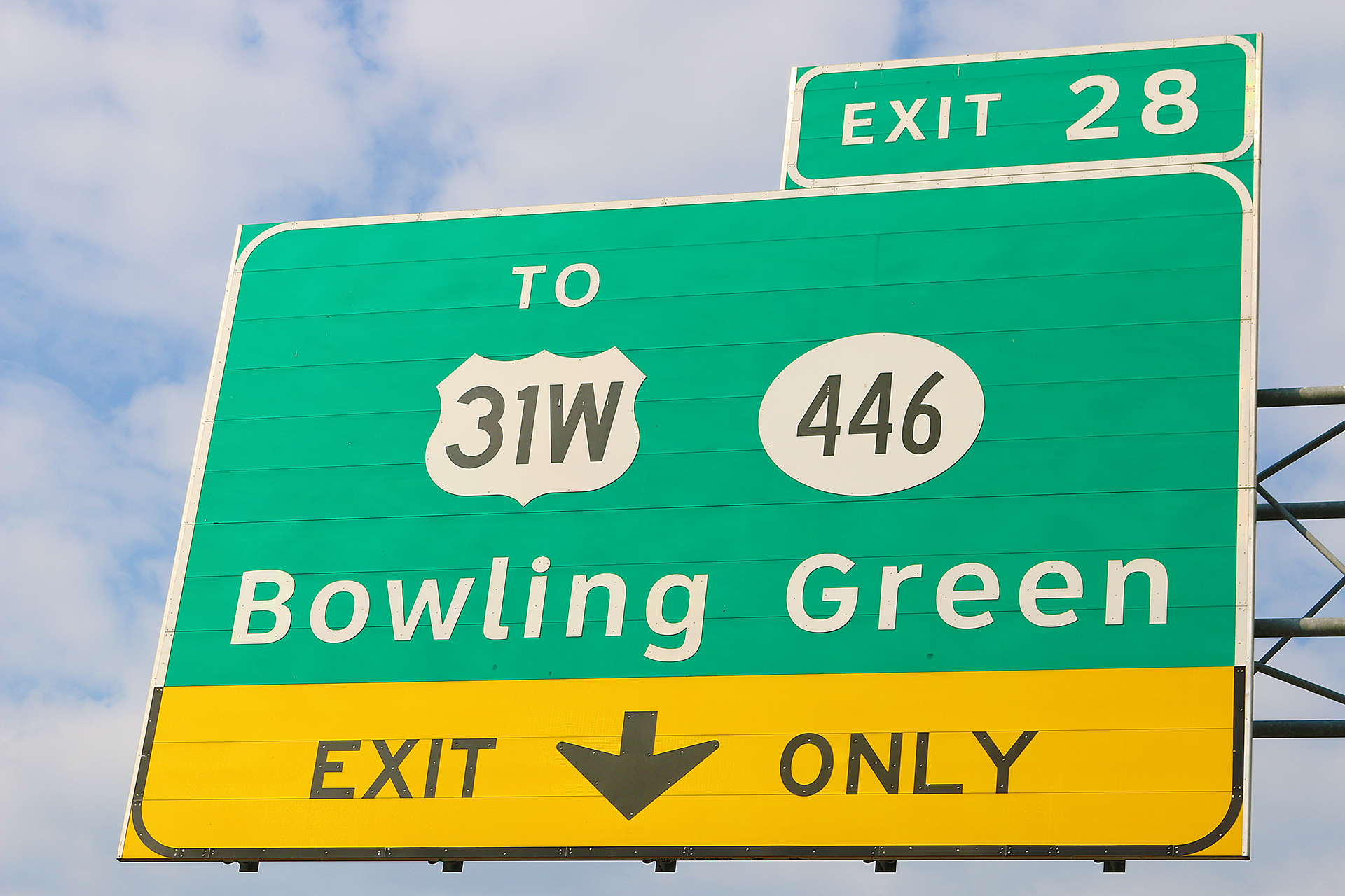
…and one mile down the highway is a similar sign which uses ClearviewHWY 5-W for the words TO and Bowling Green. The remainder of the sign still uses variations of the FWHA series due to restrictions at that time from the Department of Transportation.
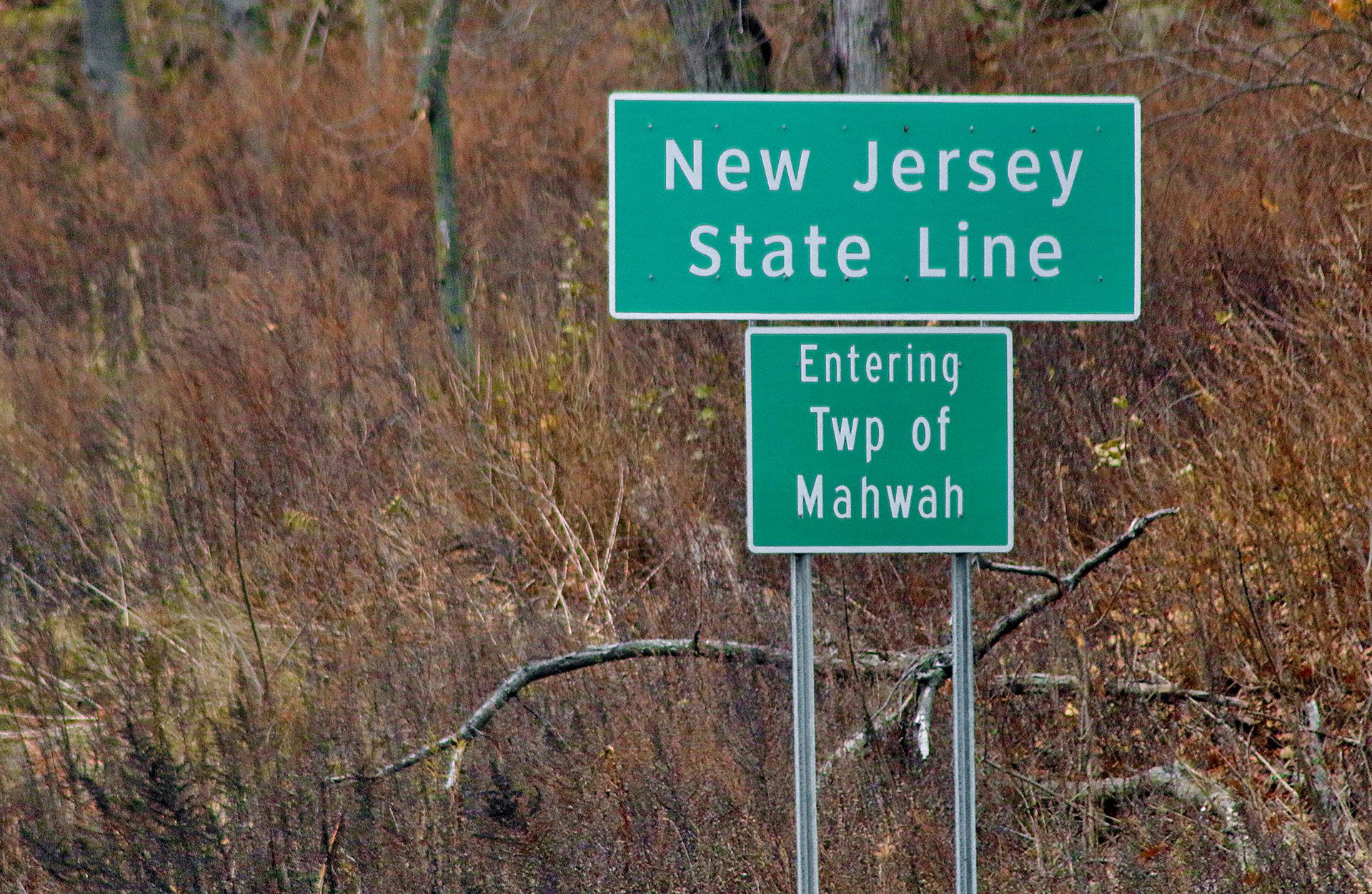
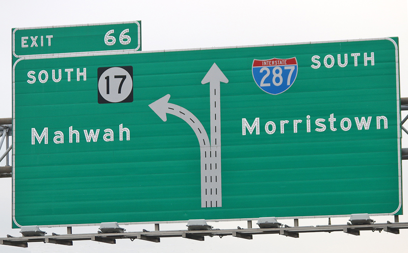
The sign announcing to motorists who are driving south on Interstate 287 from New York that they are crossing the state line into New Jersey uses ClearviewHWY 4-W, while the sign entering the township of Mahwah uses FWHA series C.
Why Two Official Typeface Families For Highways?
As the population of older people was growing significantly over the past few decades, the Federal Highway Administration sought to improve the legibility of the official typefaces that were used on highways and roads throughout the United States in order to increase safety. For example, lower case letters were added to the typefaces in 2003 because legibility was reportedly better than when only capital letters were used on official signs on roads and highways.
Also, a phenomenon called halation was exacerbated when highway signs were transitioned from the traditional button copy lettering to special reflective substrates called retroreflective sheeting. Headlights caused the highly reflective letters to appear to have fuzzy “halos” around and inside of them, which rendered the letters themselves less legible — especially if the spaces inside of the letters appears to “fill in” as a result of the expanding halation effect, which spreads the lights from headlights beyond the boundaries of the actual shapes of the letters. Those inside spaces are known to typographers as counters.
This video from Vox offers a demonstration of the halation effect — as well as a brief history of the FWHA series, which was created in California in 1948.
The design and research team for Clearview focused on the needs of the older driver in 1991 — including increasing counters within letters to reduce the effects of halation. “Years of refinements based on research findings, detail studies of letter-shape and comparative field studies culminated in the final typeface design in early 2002”, according to the research section of the official Internet web site for ClearviewHWY. “The FHWA issued Interim Adoption (IA-5) status in September 2004 allowed states to use Clearview in positive contrast applications. Research was ongoing.”
Cost Is a Factor
Governments which want to license up to five computers with the family of 13 fonts can expect to pay as much as $1,993.00 for the privilege to Terminal Design Incorporated. The same set for one computer is $795.00…
…and this does not include the metal backing of the sign itself; the posts on which the sign is to be installed; and the labor needed to remove the old signs and replace them with the new signs.
Multiply that by hundreds — or, perhaps, thousands — of signs within a state; and the costs tend to increase exponentially.
Confusion: Approved, Then Not Approved, Then Approved Again…
The use of ClearviewHWY was officially granted interim approval by the Federal Highway Administration on Thursday, September 2, 2004 for use on what are known as positive-contrast signage, which consists of lighter letters and numbers on a darker background — such as white letters on a green background as one example. ClearviewHWY was not proven to be more effective on negative-contrast signs on which darker letters and numbers were on a lighter background — such as black letters on a yellow background as one example.
Termination of interim approval of ClearviewHWY as an official typeface was revoked by the Federal Highway Administration on Monday, January 25, 2016 with the conclusion that “the consistent finding among all the research evaluations is that the brightness of the retroreflective sheeting is the primary factor in nighttime legibility.” However, “Existing signs that use the provisional letter style and comply with the Interim Approval [of Clearview] are unaffected by this action and may remain as long as they are in serviceable condition” — which is why they were not removed.
The Federal Highway Administration reinstated the interim approval on Wednesday, March 28, 2018 as per Division L, Title I, Section 125 of the Consolidated Appropriations Act, 2018 of the 115th Congress:
For this fiscal year, the Federal Highway Administration shall reinstate Interim Approval IA-5, relating to the provisional use of an alternative lettering style on certain highway guide signs, as it existed before its termination, as announced in the Federal Register on January 25, 2016 (81 Fed. Reg. 4083).
ClearviewHWY was never added to the Manual on Uniform Traffic Control Devices — or MUTCD — which is the official guide of the Federal Highway Administration that mandates the use of official typefaces and colors on highway signs and other devices whose purpose is to control traffic.
Has Highway Sign Technology Temporarily Gone Backwards?
What many people may not realize is that the FWHA series of typefaces itself underwent minor design changes when the technology transitioned from button copy to reflective material — long before ClearviewHWY was conditionally approved by the Federal Highway Administration.
As one of a number of examples, the lower case button copy c changed from a shape that somewhat resembles a horseshoe on its side…
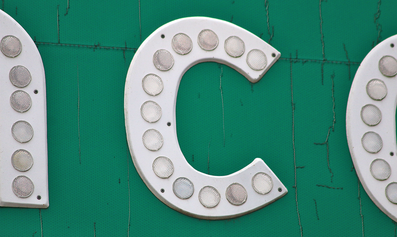
…to the reflective lower case c, which appears to be little more than a circle with a segment cut from it.
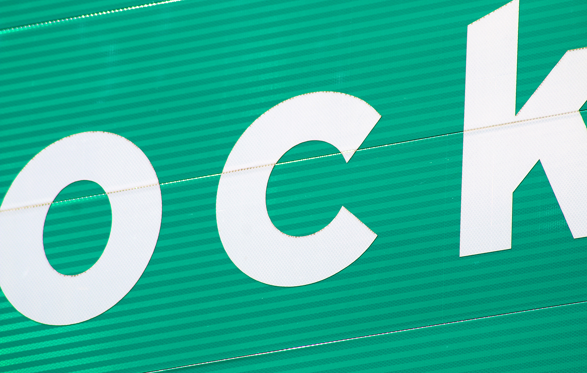
Also, notice how much bolder are the letters. Bolder letters typically have smaller counters because the weight is added both inside and outside of the shape of the letter to maintain design integrity in a typeface. That may work well in many typically uses for design — but not so well on reflective letters on a highway.
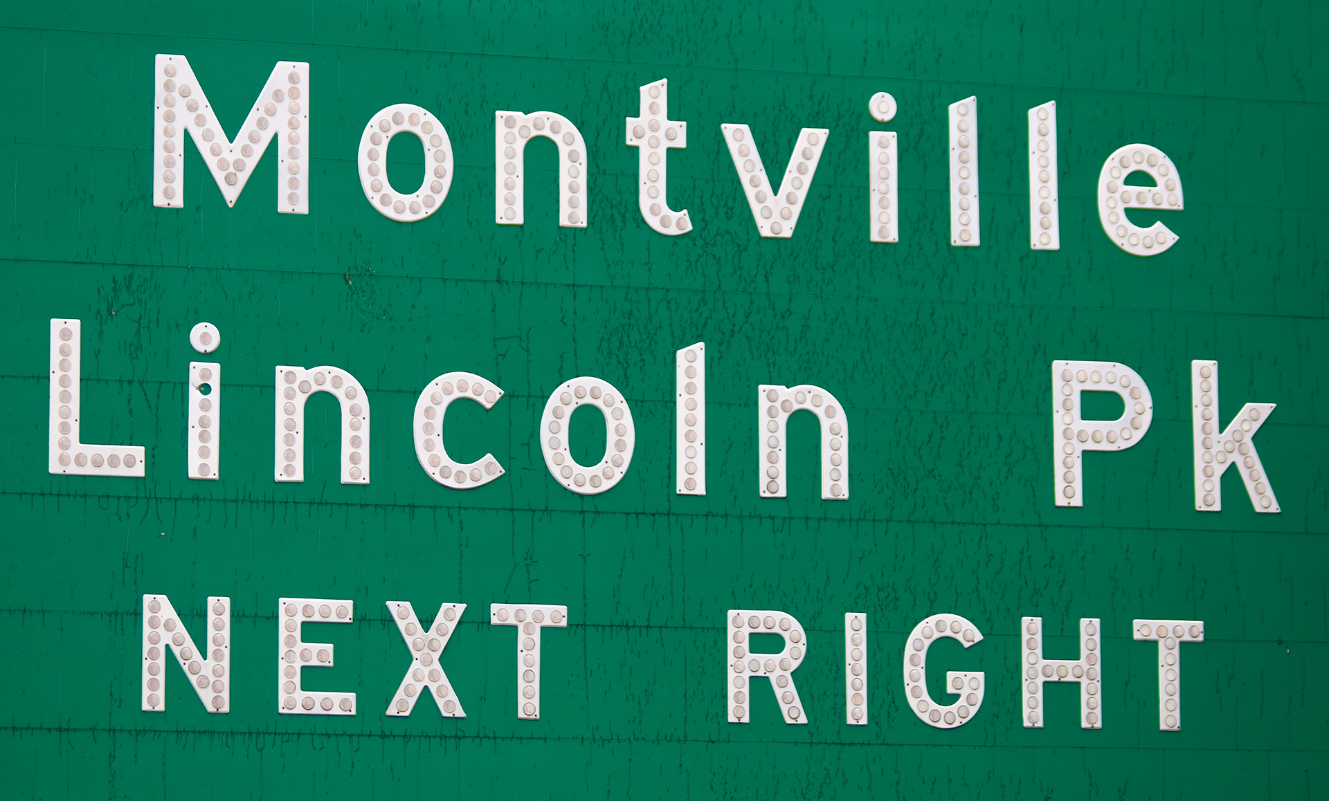
To illustrate the example, compare this button copy highway sign in New Jersey…
…to this reflective highway sign in Georgia.
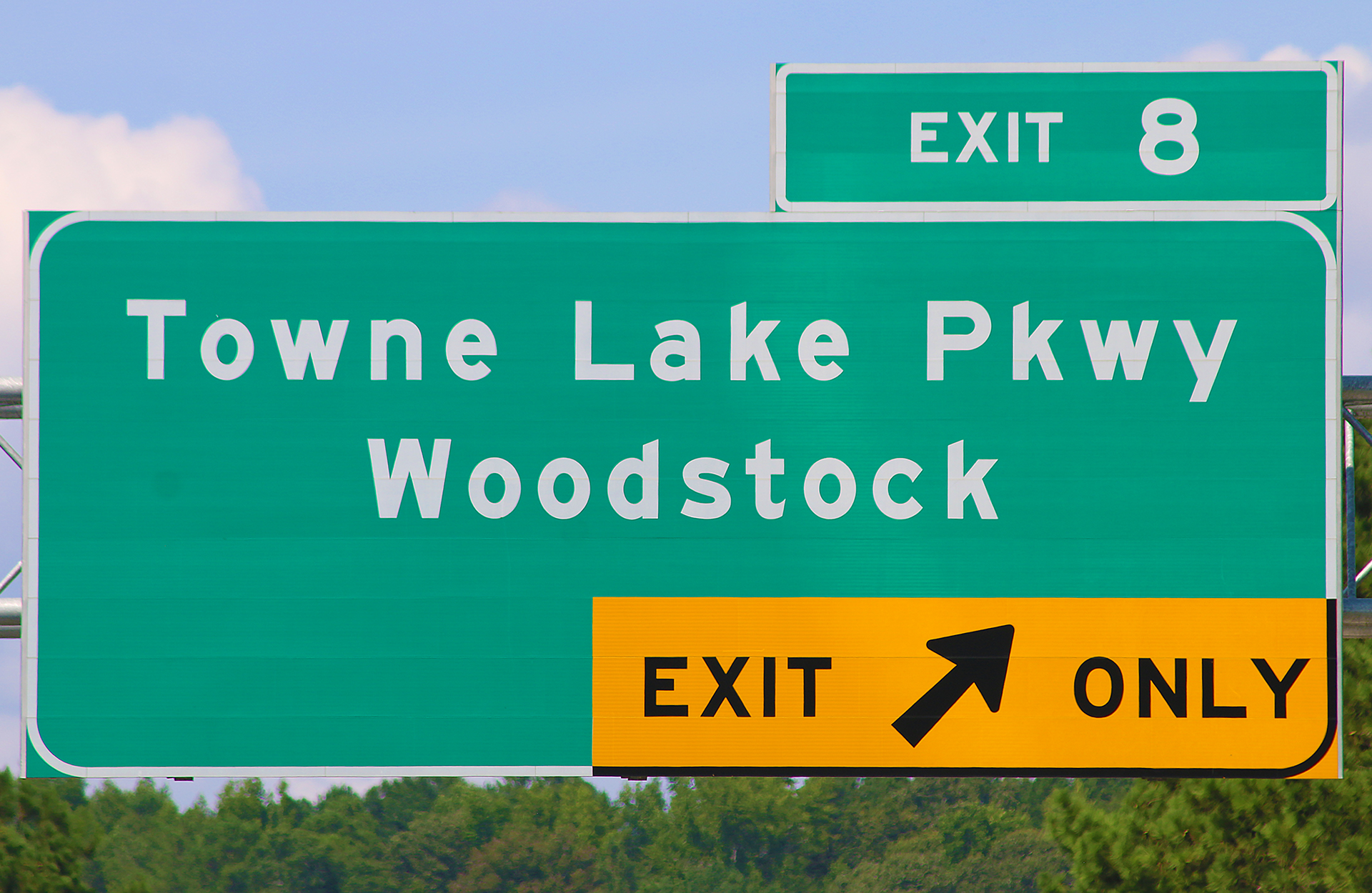
Notice how the counter in the upper part of the lower case e in Towne Lake Parkway appears to be considerably smaller — and therefore significantly more prone to the effects of halation — than the lower case e in Montville.
The counter in the lower case o appears to similarly have suffered from a reduction of space within the letter.
The highway sign in Kentucky has consistently similar issues.
The button copy sign shown in the above photograph on Interstate 287 south in New Jersey also shows better legibility with the counters within the letters themselves.

A Small Sampling of Highway Signs in Other Countries
Just for fun, South Africa has been thrown into the mix, which was converting its highway signs from the FWHA series to a typeface called DIN 1451, which is common on road signs in Germany and other countries in Europe.
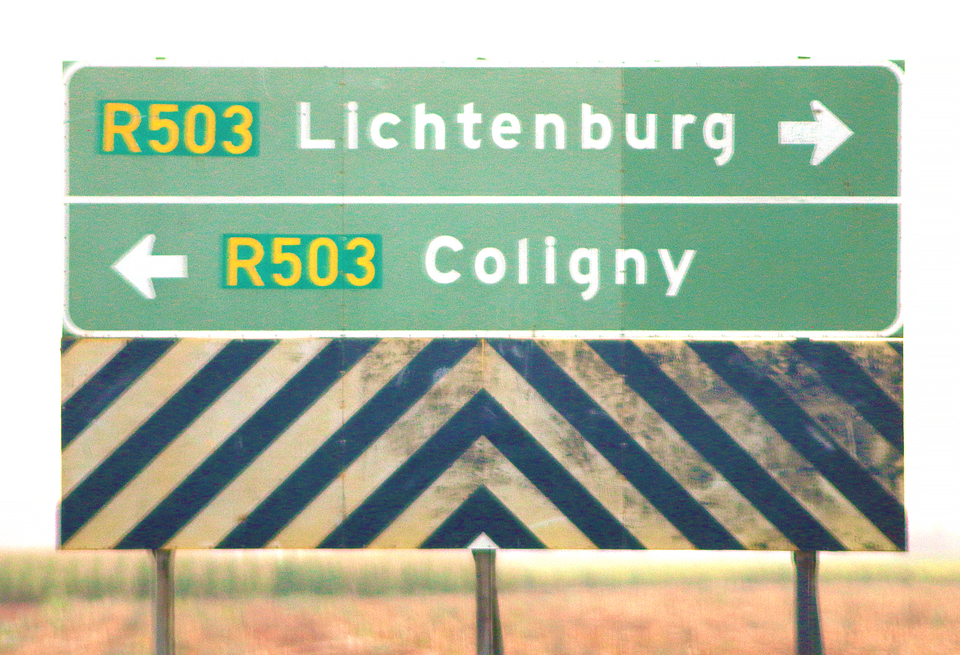
One of the older signs curiously uses FWHA series E, with highway routes in DIN 1451 using yellow numbers on a darker green background.
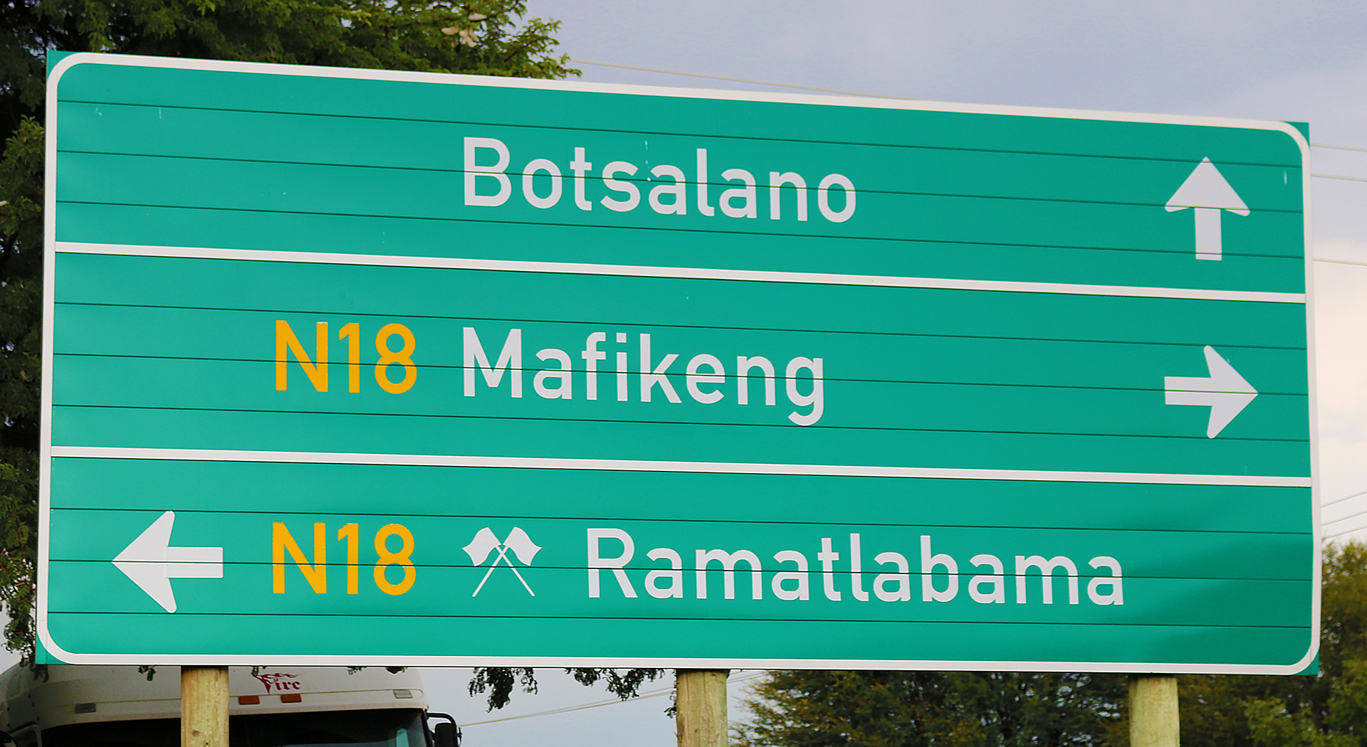
The newer sign in South Africa near its border with Botswana completely uses the DIN 1451 typeface shown in the above photograph…
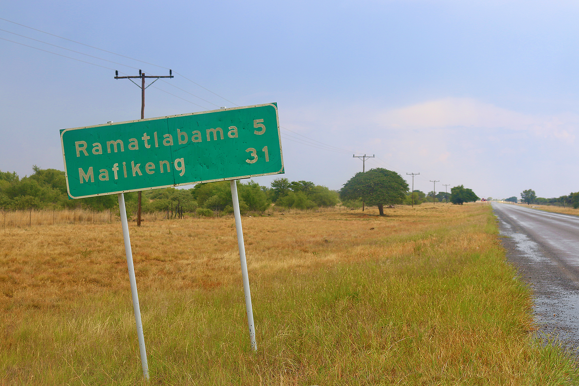
…while the above photograph shows a sign in Botswana near its border with South Africa completely using FWHA series E for comparison purposes.

For the record, the Netherlands uses variations of the FWHA series of typefaces for their highway signs…
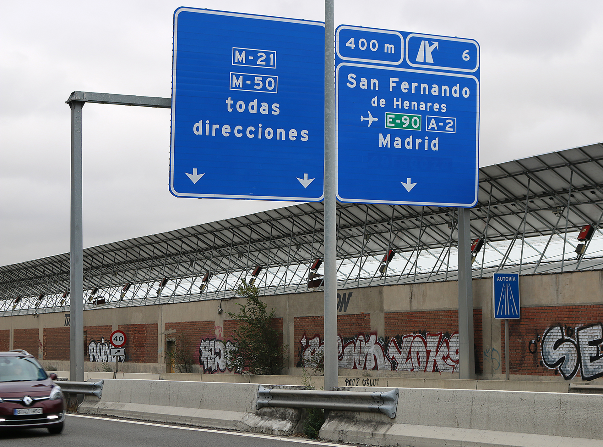
…as does Spain — in Madrid, at least — except for the smaller Autovìa sign, which uses a typeface called Transport that is used in the United Kingdom and in other countries in Europe…
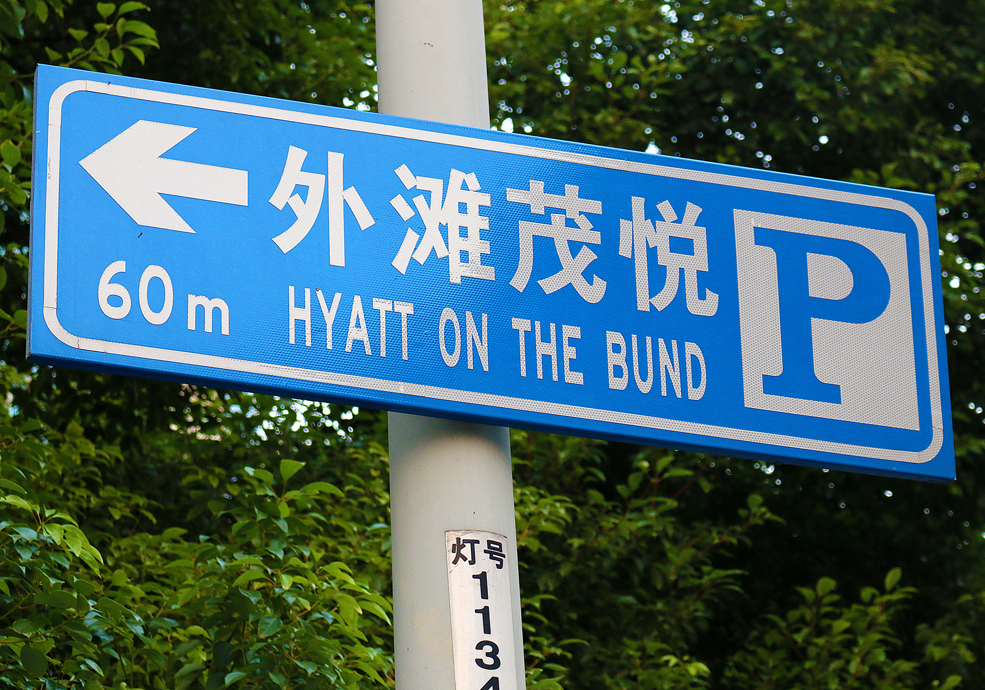
…and a variation of the FWHA series of typefaces was even spotted on a sign in Shanghai in China.
Many airports around the world use the FWHA series D typeface for the illuminated yellow number signs at runways.
Final Boarding Call
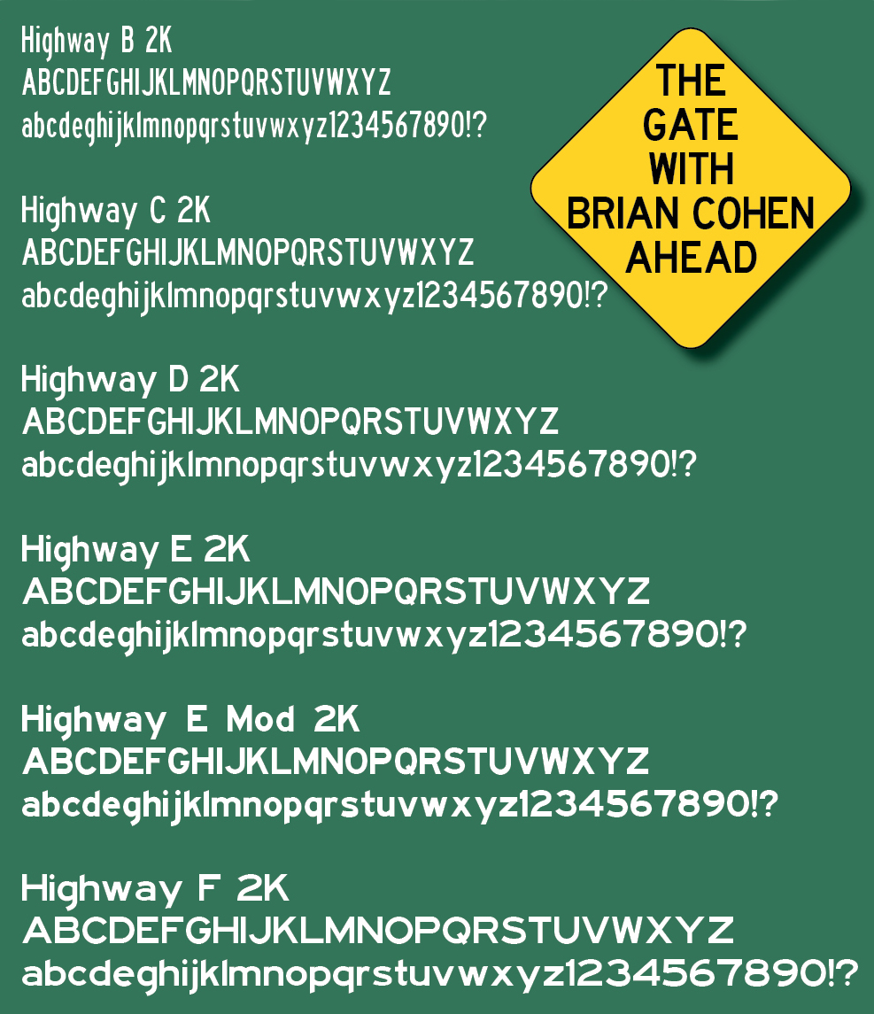
First is this sample of the official FWHA series of typefaces, which was given to me by an employee of the department of transportation of one state and is currently on my computer. I felt like a kid in a candy store when I was given the complete set of the authentic FWHA series of typefaces — and I still do.
I have driven extensively at night and during rain; and I am not convinced that the difference in legibility between ClearviewHWY and the FWHA series is significant enough to officially warrant a switch — especially with the expense involved to create new signs if they are not already replacing signs which are old and too worn to serve their purpose anymore.
Further, I believe that the most legible of all of the typefaces is the original FWHA series as button copy — and I expressed in this article how much I miss it — but I can understand why state governments have transitioned to the new retroreflective sheeting signage that could easily be composed on a computer and output onto a machine as the words are affixed to the metal sign.
Frankly, I do not like the design of ClearviewHWY in any application. It is too antiseptic, cold, mechanical, and just plain ugly for my tastes — and a number of other people apparently share similar opinions in this long discussion at AARoad, to which content was posted at least 2,155 times. ClearviewHWY certainly does not evoke highway to me at all, as does the FWHA series. Perhaps this is more sentimentality and familiarity on my part than actual safety concerns; but I certainly do not like how the city of New York handled the transition from the FWHA series to the ClearviewHWY series of typefaces, which is arguably just as blasphemous as converting the colors of the signage to conform to federal highway standards years ago.
I would just rather the highway signs reverted back to the former button copy letters — but that is too costly and cumbersome to do.
By the way, find out what is tourist-oriented directional signing — and why you should not always trust it…
All photographs ©2014, ©2015, ©2017, and ©2020 by Brian Cohen.
