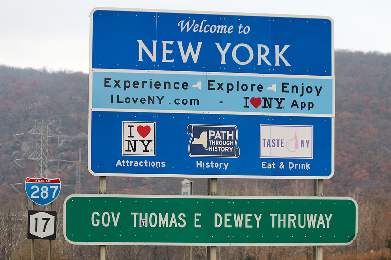
Merely reaching the border of any jurisdiction can invoke excitement — regardless of whether it is a country, state or even city — especially when it is a place to which you have never been before; and especially when a sign is present welcoming you to that place…
Why This Highway Sign in New York Was Controversial
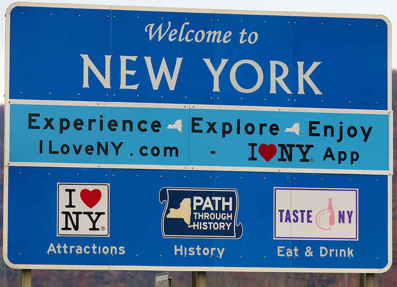
…but one highway sign had been controversial: the one which welcomed visitors to the state of New York which advertised what the state had to offer — as well as how to find out more information via the Internet — with variations of it posted in 514 places around the state at a cost to taxpayers of approximately $15,000.00 for each sign. Messages were affixed to each sign — including the now-famous I♥NY slogan and Pathways Through History, which were considered advertising for the state and not directional in purpose for motorists.
“The use of signs for advertising purposes has been prohibited since the 1960s”, according to this article written by Cristina Corbin of Fox News. Doug Hecox — who is a spokesman for the Federal Highway Administration of the Department of Transportation of the United States — said that the signs in question “specifically fail to comply with the Manual of Uniform Traffic Control Devices and the Highway Beautification Act.”
The article further states that “highway signs that cost taxpayers $8.1 million are illegal, according to the U.S. Department of Transportation, which claims state officials knew the signage violated federal law prior to its installation.”
In February of 2018, a letter was sent from the Federal Highway Administration to transportation officials in the state of New York which threatened that the agency would dock $14 million in funding from the state unless the signs were removed by Sunday, September 30, 2018.
The New York State Department of Transportation completed the removal of all of the large blue tourism signs — which were installed back in 2014 and lined the highways of the state for four years — ahead of schedule in November of 2018 as a result of a deal with the Federal Highway Administration on Friday, September 28, 2018.
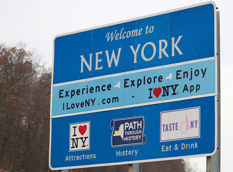
“Under the compromise, most of the 514 signs will be relocated to other attractions, such as parks, historic sites and rest areas. Signs that designate regions, known as motherboards, will remain in place”, according to this article written by Eleanor Lamb of Transport Topics. “The signs have not resulted in a total boondoggle, however. NYSDOT has reported that the signage campaign has driven the tourism industry to more than $100 billion and created approximately 1 million jobs. Maintaining tourism’s economic success will remain an important part of the state’s updated sign campaign.”
Members of the trucking community have been adamantly opposed to the signs because they provided “scant directional guidance or safety messages” and that they “have overwhelmed and distracted truck drivers.” Kendra Hems — who is the executive director of the Trucking Association of New York — blamed a sense of “sign fatigue” which was created by the highway signs for truck drivers; and that sign fatigue could “prompt them to rely on GPS or Google Maps instead of road signage that includes pertinent details such as bridge height.”
Summary
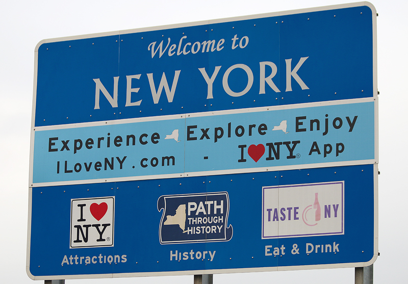
Although the sign in question had been taken down or moved elsewhere throughout the state of New York greater than a year ago, the first question I had was why that sign was not okay with the Federal Highway Administration but tourist-oriented directional signing is okay — even if it does not conform exactly to published requirements.
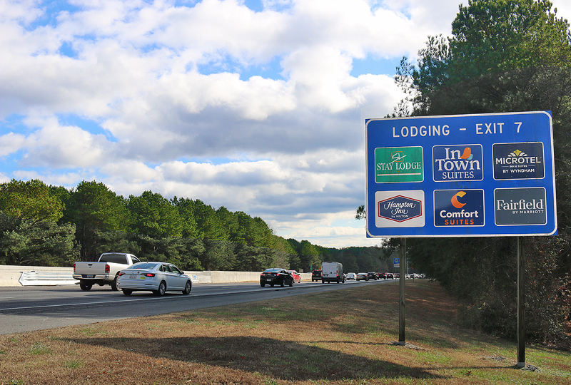
Sure, tourist-oriented directional signing does provide directional assistance to motorists — which is the main purpose of highway signs, after all — but they are still essentially paid advertising by businesses.
Would the sign welcoming visitors to the state of New York have been okay if the federal government of the United States received a share of the funds?
When I drove on Interstate 287 from New Jersey into upstate New York — which is any part of the state of New York north of the five boroughs of the city of New York and Long Island, according to many people who live in those places — and saw that sign, I thought it was repulsive in terms of aesthetics; and yes, too much information was indeed printed on it. The use of the Albertus Pro Roman typeface for the name New York and the use of the Monotype Corsiva Italic typeface for “Welcome to” are poor design choices, in my opinion. To me, New York is not an Albertus Pro Roman typeface type of state.
I personally preferred the more boring “Welcome to New York The Empire State” sign — which used the official typeface of Highway Gothic and not Clearview on a green background — that was used for years before it was replaced…
All photographs ©2017 and ©2019 by Brian Cohen.
