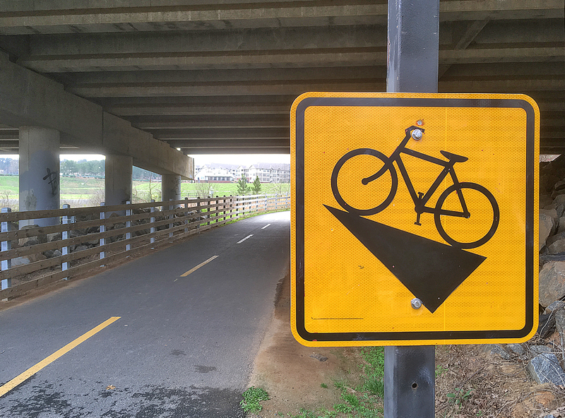
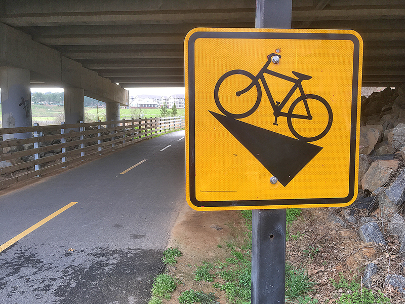
I have been walking a lot lately — simply because I enjoy walking, as evidenced in this article pertaining to walking from the airport in Las Vegas to the city itself — and on a mild day earlier this year, I walked at least eight miles and noticed something which caught my attention.
What is Wrong With This Photograph? Part 29

For this edition of this popular game, can you guess what you believe is wrong — or, at least, quite bizarre — with this photograph?
Please submit your answers in the Comments section below — and I enjoy reading creative answers.
Thank you in advance. As always, I cannot wait to read your answer and feedback…
…and if you are wondering what happened to the article pertaining to What is Wrong With This Photograph? Part 28 as it seems to have been skipped, I recently found an article titled Can You Spot the $11.2 Million Mistake on This Can? which belongs in this series of articles.
Summary
Past articles with which you can participate and play along with the What is Wrong With This Photograph? game include:
- What is Wrong With This Photograph? Part 27
- What is Wrong With This Photograph? Part 26
- What is Wrong With This Photograph? Part 25
- What is Wrong With This Photograph? Part 24
- What is Wrong With This Photograph? Part 23
- What is Wrong With This Photograph? Part 22
- What is Wrong With This Photograph? Part 21
- What is Wrong With This Photograph? Part 20
- What is Wrong With This Photograph? Part 18
- What is Wrong With This Photograph? Part 17
- What is Wrong With This Photograph? Part 16
- What is Wrong With This Photograph? Part 15
- What is Wrong With This Photograph? Part 14
- What is Wrong With This Photograph? Part 13
- What is Wrong With This Photograph? Part 12
- What is Wrong With This Photograph? Part 11
- What is Wrong With This Map of the Continental United States?
- What is Wrong With This Trivia Photograph?
- What is Wrong With This Outback Steakhouse Poster?
- Is There Something Wrong With This Photograph From Avis?
- Can You Spot the $11.2 Million Mistake on This Can?
- What Two Errors Can You Find With This Lavatory Sign?
- Read the Fine Print — A Lesson Taught By the McDonald’s in Hinton
- Was I Too Blinded By Hunger to Read This Sign Correctly?
- What is Wrong With This Article About Bed Bugs?
- What is Wrong With This Burger King Extra Long Fish Sandwich Image?
- What is Wrong With This Photograph? Part 2
- What is Wrong With This Photograph? Part 1
- Answers to Past Articles — Part 2: Airport, Lounge Sign, Fish Sandwich, Bed Bugs, and Airplanes
- Answers to Past Articles — Part 1: Muffin Flavor, Beverage Machine, Pickle, Map, and Steak
All photographs ©2020 by Brian Cohen.

