
After dining on pastrami and corned beef sandwiches at The General Muir — of which I wrote a review of my experience in this article here at The Gate — I happened to be walking around the corner near the headquarters for the Centers for Disease Control and Prevention of the United States recently; and I photographed something which caught my eye near the main entrance of its campus.
What Is Wrong With This Photograph? Part 115
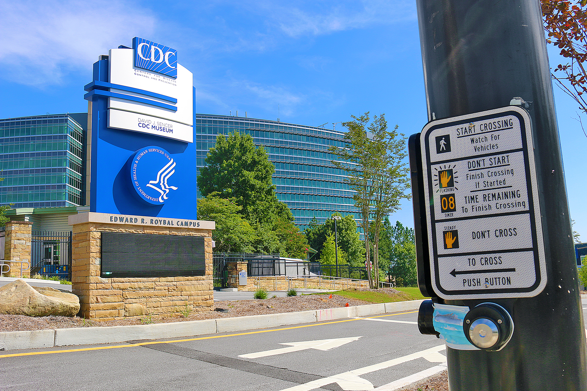
For this edition of this popular game, can you guess what you believe is wrong — or, at least, seemingly quite bizarre — with this photograph?
Please submit your answers in the Comments section below — and I enjoy reading creative answers.
Thank you in advance. As always, I cannot wait to read your answer and feedback.
Access to Past Articles in the What is Wrong With This Photograph? Series
You can refer to this definitive list of past articles of the What is Wrong With This Photograph? series of articles — which also includes articles which reveal the answers — and that list will be continuously updated as additional articles are written and posted here at The Gate. This is to ensure that future articles in this series are not encumbered with a long list of links — especially when viewing and reading them from a portable electronic device.
This will hopefully be considered a positive step towards the reading experience of The Gate on portable electronic devices. Your constructive input as a reader of The Gate is always appreciated.
Final Boarding Call
You are encouraged to submit photographs of your own for this feature at The Gate. When you do, please let me know if you want to have photography credit attributed to you — as well as what is the photograph; and when and where it was taken. If your photograph is selected, it will be featured in a future article here at The Gate.
In the meantime, the answer — or answers — to this article will be included in the next article of answers to the most recent five articles in the series of What is Wrong With This Photograph? articles.
Photograph ©2021 by Brian Cohen.
